Before And After
- Dirigible Plugins
- Home ›
- Dirigible Plugins ›
- Extended Blocks ›
- Before And After
Before And After
Let your users compare images directly. Upload two images and the block will take care of the rest.
Usage
Our Before and After Block is a unique and fun way to display images you are wanting to compare. The obvious use is to display the before and after shots of something, but get creative with it. This block is honestly fun as it allows you to juxtapose two images and calls for your visitors to interact with the slider. Try it out!


Parent Settings
Really the only setting here is to simply add your images, the block does the rest! After selecting your images, on the frontend, your users will be able to drag between these images to compare.
Block Width
Blocks can be set to one of three widths in the editor: Default, Wide, or Full. Blocks will interact with adjacent blocks differently depending on their width.
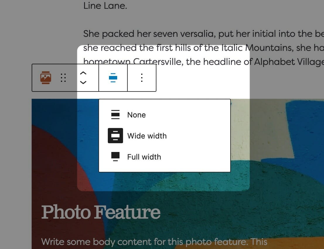
Adjusting Block Width
The block width setting is found in your block context bar, which will show up above the current block that you have selected. A block that supports the block widths will show its current width icon in the context bar, and clicking it will allow you to change the width.
If you have the Top Toolbar setting selected, the block context bar will always show at the top of your page, not at the top of your block.
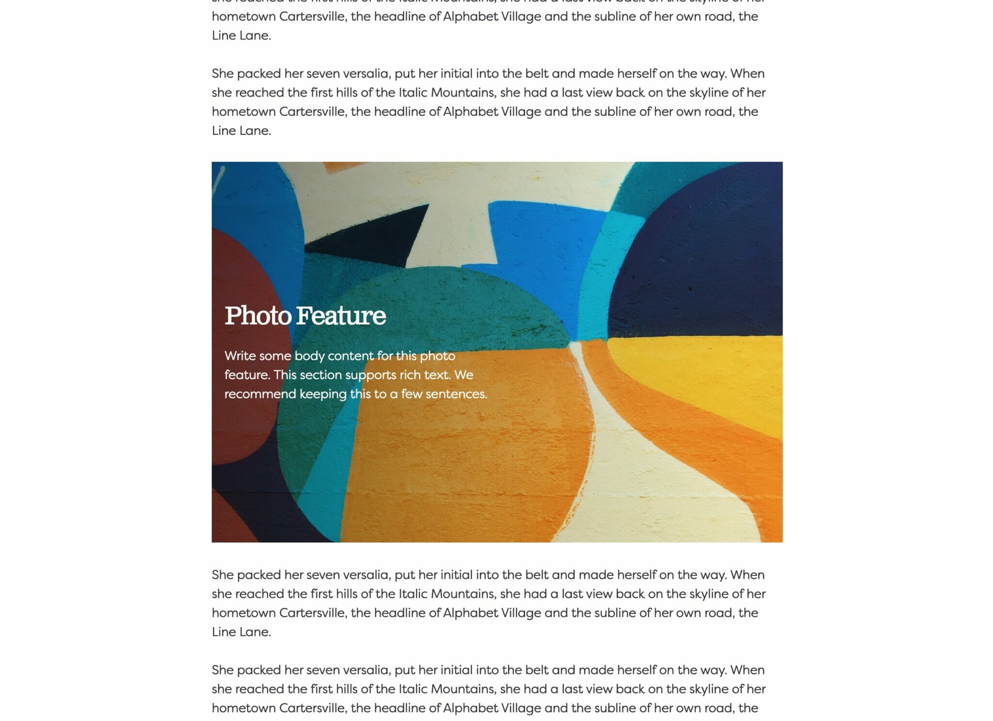
Default Width
The default width of your content is determined by the value set in your Customizer. You can find this setting under Styles » Widths » Content Width. This is the default width of most text-based content and most blog pages. We recommend keeping this set so that your content retains maximum readability, which most studies agree is around 50-60 characters per line.
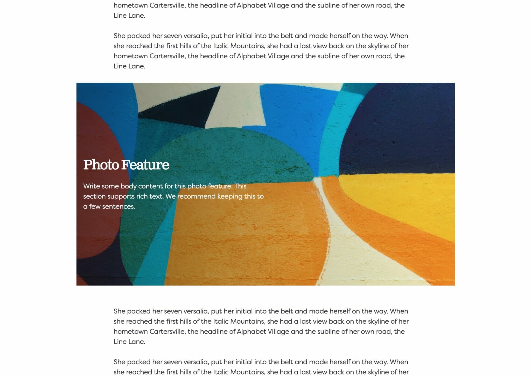
Wide Width
Wide width content will take up 75% of the available width on the page or the default content width set on your site—whichever is larger. In effect, this makes content take up more of the available screen real estate. When used in conjunction with other wide width blocks, you can shape your webpages in many different ways.
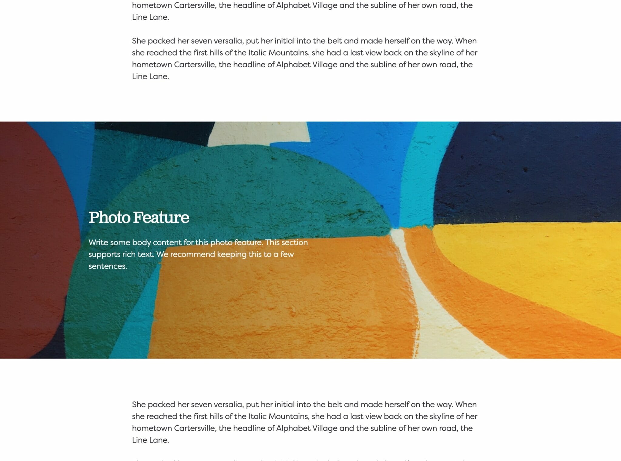
Full Width
Full width content will always take up 100% of the available width on the page. When placed next to default or wide width content, margin will be applied to the full width block to give it some room to breath. When two full width blocks are placed next to each other, however, they will suction together and form a cohesive unit with no margin in between them.