

Featured Content Hero
- Dirigible Plugins
- Home ›
- Dirigible Plugins ›
- Extended Blocks ›
- Featured Content Hero
Featured Content Hero
Guide your users to featured content of any kind.
Usage
Use the Featured Content Hero to guide your users by displaying featured posts or pages.
Parent Settings
The parent block (named Featured Content Hero in the editor) only has parent block settings.
Block Width
Blocks can be set to one of three widths in the editor: Default, Wide, or Full. Blocks will interact with adjacent blocks differently depending on their width.
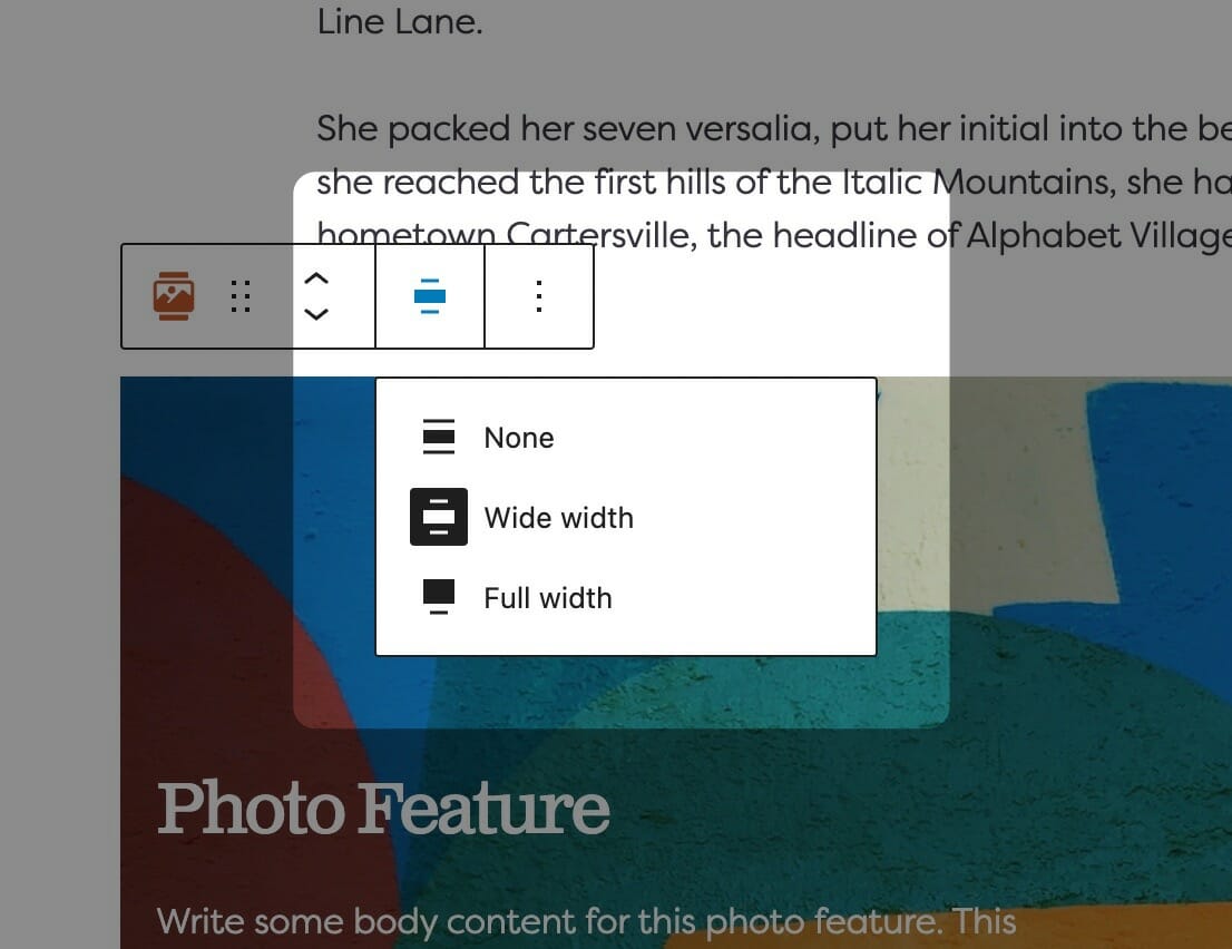
Adjusting Block Width
The block width setting is found in your block context bar, which will show up above the current block that you have selected. A block that supports the block widths will show its current width icon in the context bar, and clicking it will allow you to change the width.
If you have the Top Toolbar setting selected, the block context bar will always show at the top of your page, not at the top of your block.
Default Width
The default width of your content is determined by the value set in your Customizer. You can find this setting under Styles » Widths » Content Width. This is the default width of most text-based content and most blog pages. We recommend keeping this set so that your content retains maximum readability, which most studies agree is around 50-60 characters per line.
Wide Width
Wide width content will take up 75% of the available width on the page or the default content width set on your site—whichever is larger. In effect, this makes content take up more of the available screen real estate. When used in conjunction with other wide width blocks, you can shape your webpages in many different ways.
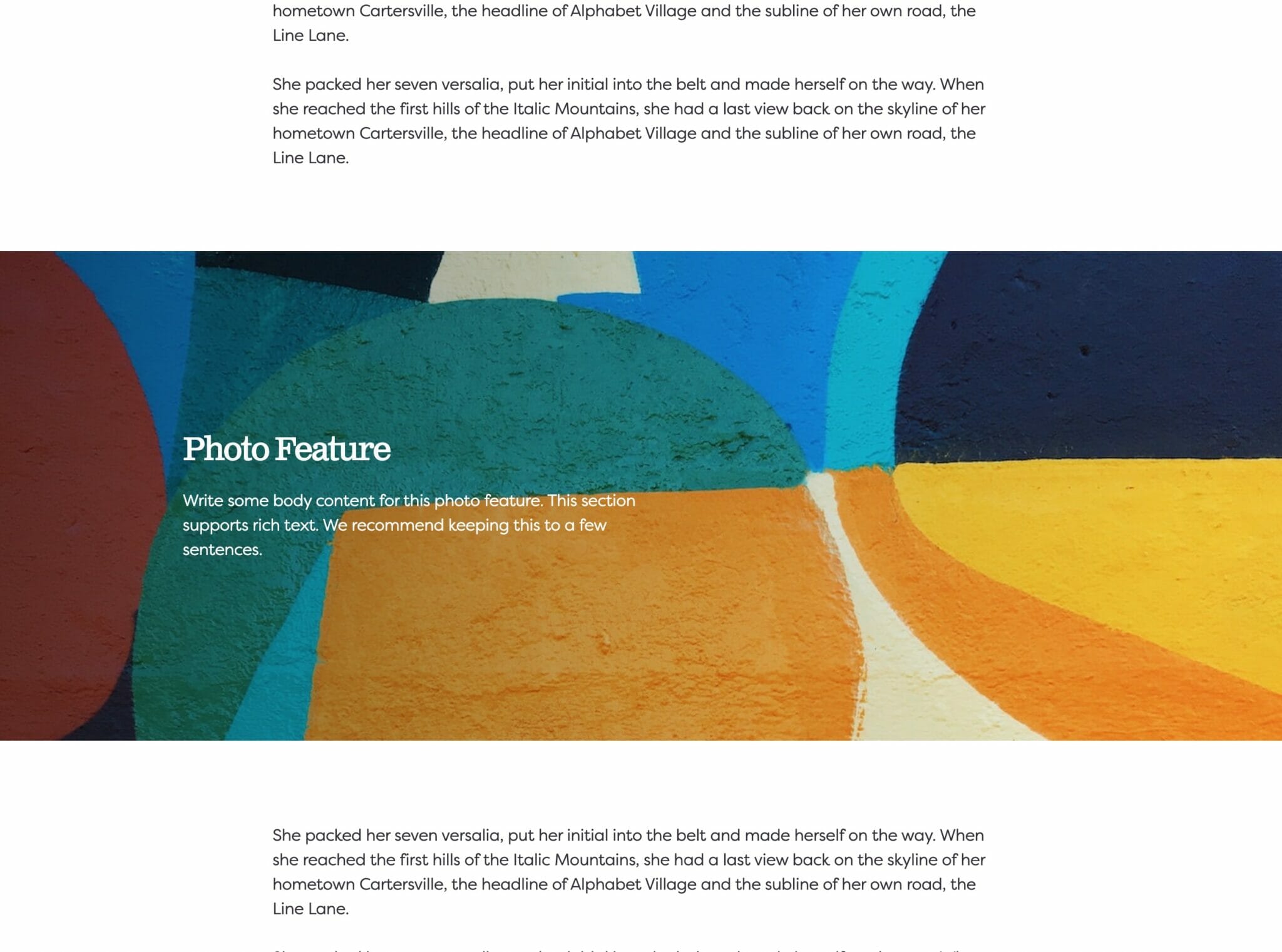
Full Width
Full width content will always take up 100% of the available width on the page. When placed next to default or wide width content, margin will be applied to the full width block to give it some room to breath. When two full width blocks are placed next to each other, however, they will suction together and form a cohesive unit with no margin in between them.
Text Style
The Text Style (sometimes called Headline Style) option controls the display of your text.
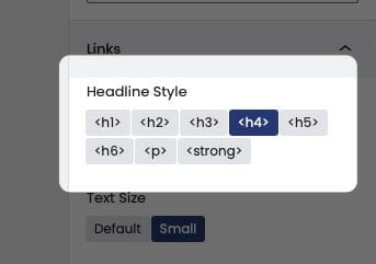
The Text Style (or Headline Style) will default to a different value depending on the block, but can be changed to any of the other available options. These styles are defined in your Customizer under Styles. For more information on changing your styles visit Customizing Styles.
One important thing to note is that this only changes how the headlines appear visually. The underlying html will be determined by the block that uses this features.
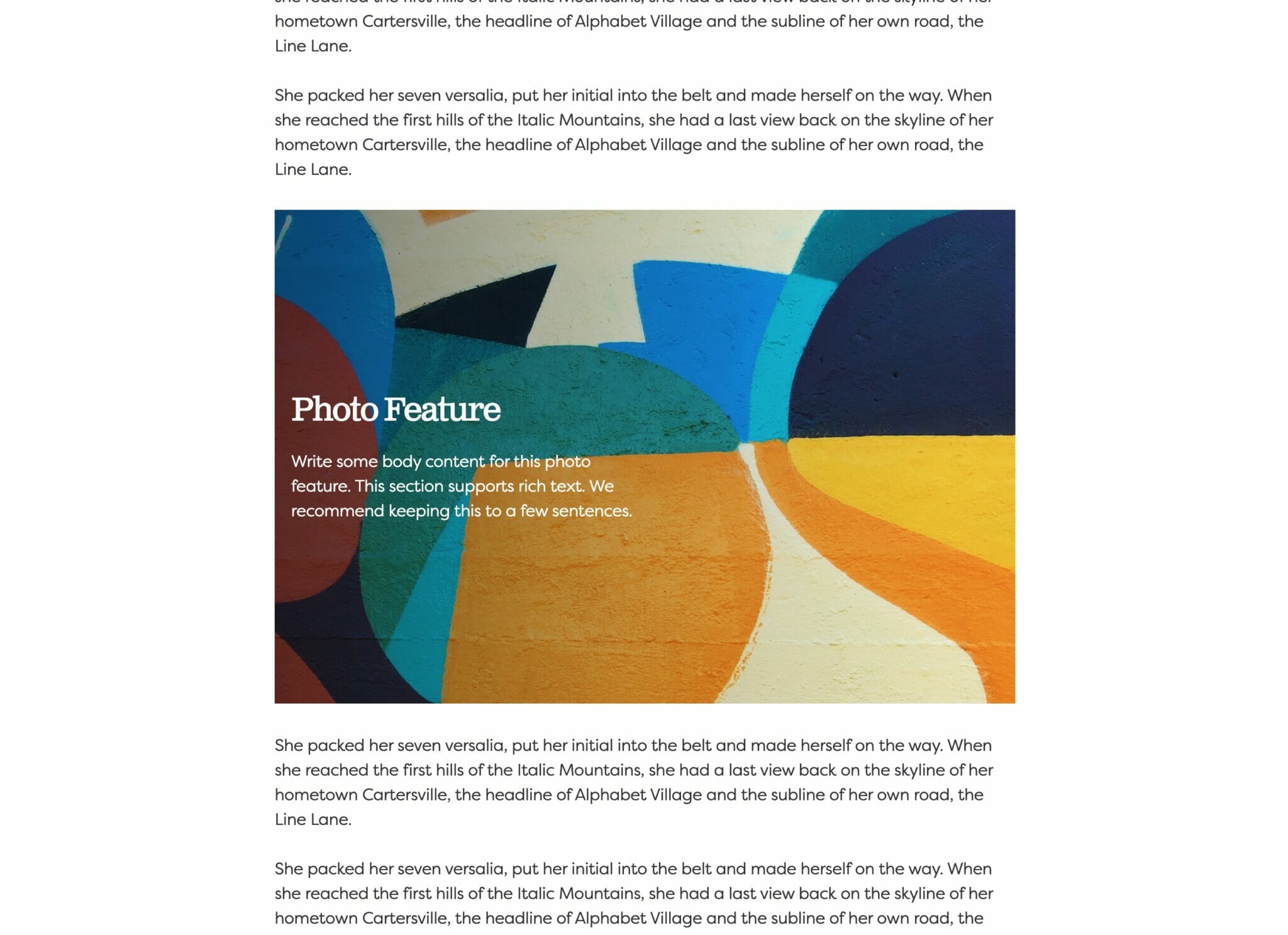
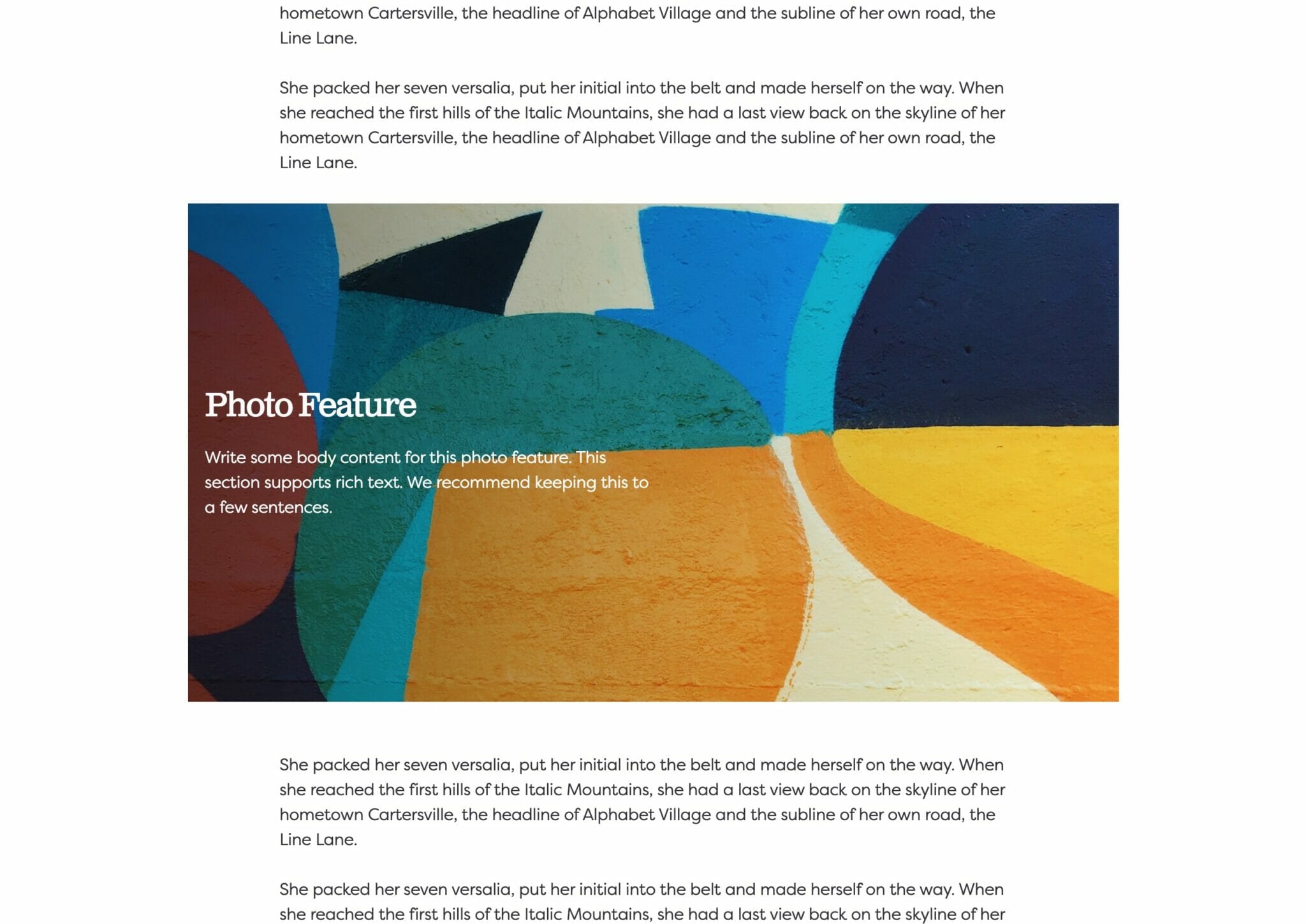
Content Select
Feature three pieces in your content hero block. You can select from any of your WordPress content: Pages, Post, and Media. Within each piece you select you can edit their Headline, Subheadline, and Background Image.
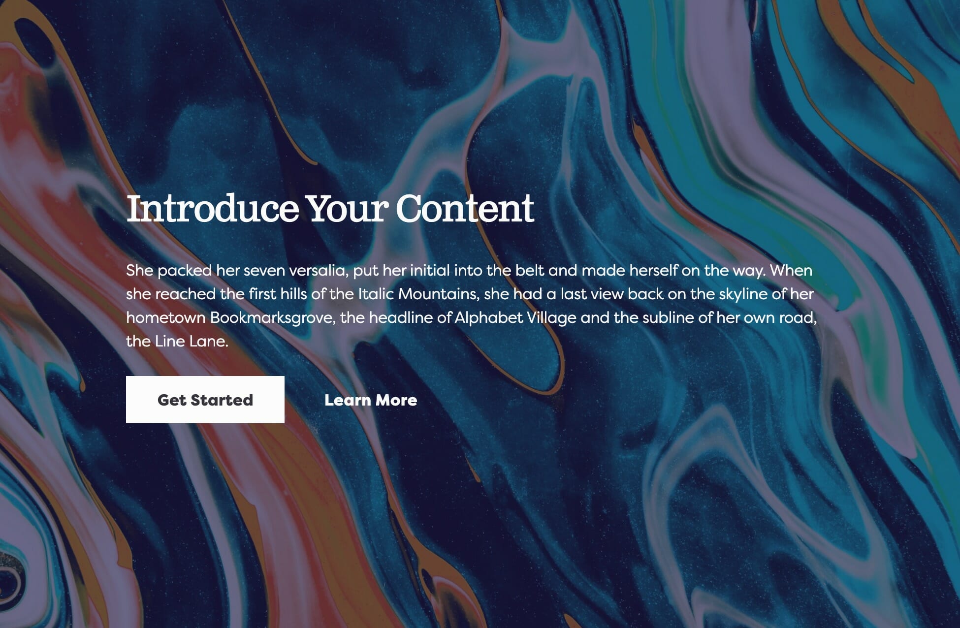
Background Image
Use a photo from your media library or upload a new one to use as a background.
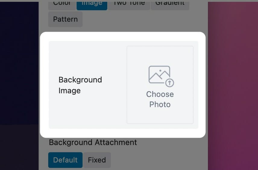
Choose a Background Image
You can choose a background image in the block sidebar by clicking on the ‘Choose Photo’ button. You’ll be prompted to select a photo from your media library or upload a new one.
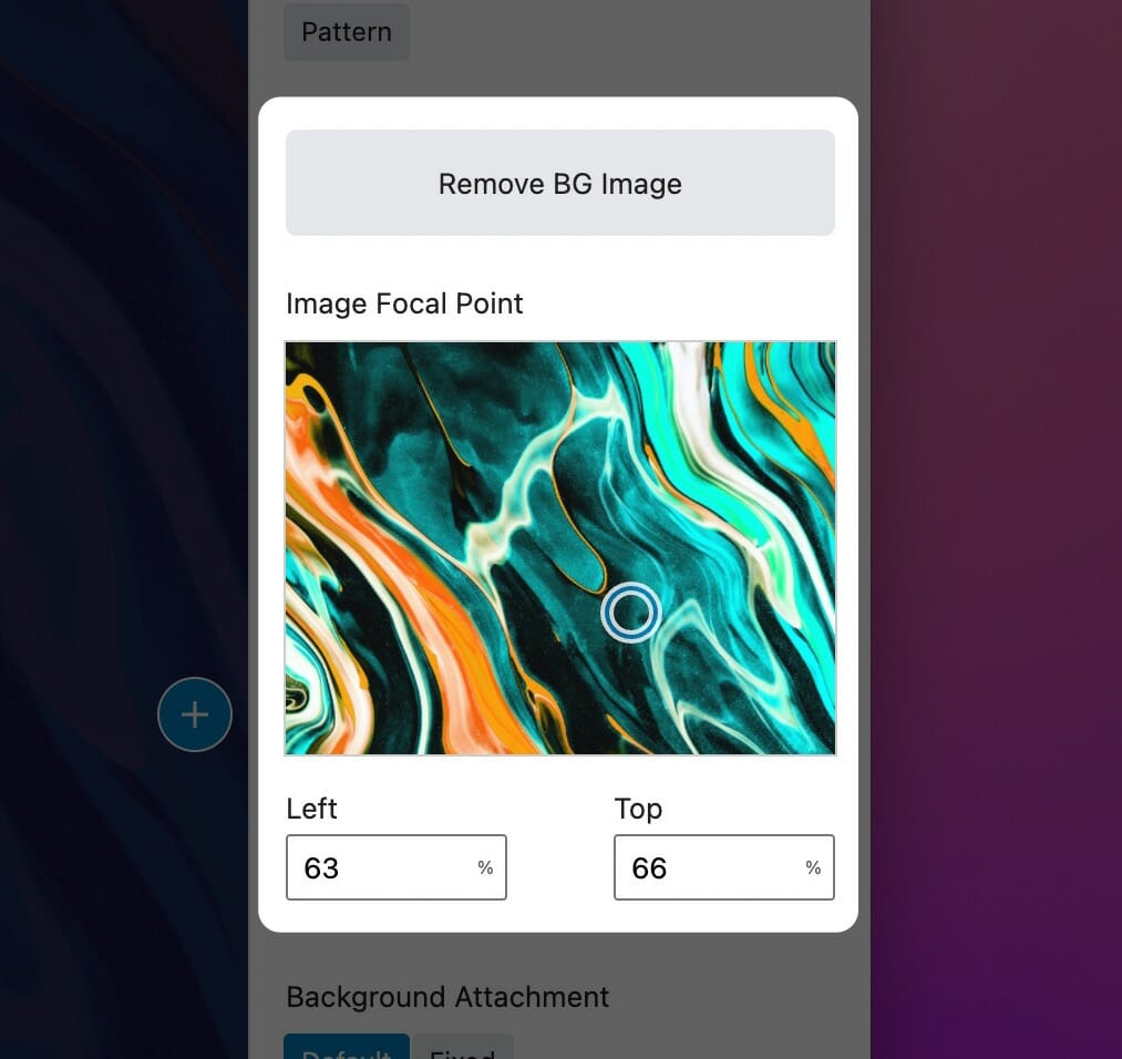
Once you’ve selected a photo to use as your background, new options will take the place of the one you used to select the photo. The first is a simple button to remove the image that you’ve selected, allowing you to start this over.
The second is the Focal Point selector. This tool allows you to select the most important point of your photo that your website will try to always keep visible. Because of the responsive nature of the web, images used as a background must stretch and cover the area when viewed on different device sizes, but this focal point allows you to keep what’s important in frame.
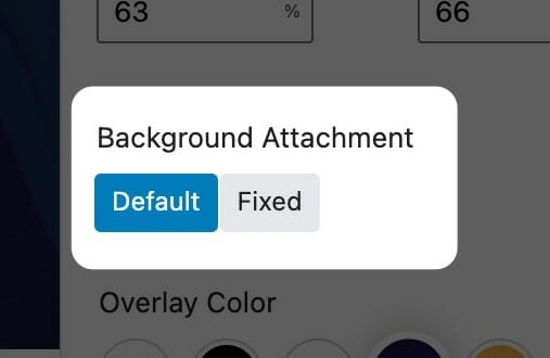
Background Attachment
Some blocks allow you to set the background attachment. A background with Fixed attachment will remain anchored to the browser window as the user scrolls, creating a parallax effect.
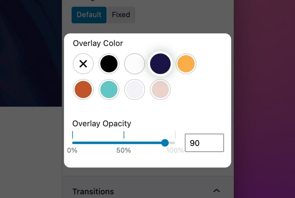
Set an Overlay
Whether you need to darken or tint an image to maintain the legibility of text on top of it or as a stylistic choice, there are many situations where you’ll want to add an overlay to your background image. The overlay tool in your block sidebar lets you choose a color from your palette (with the addition of pure black or pure white). The overlay opacity slider will determine how much overlay to apply to the background image, with 100% being solid color.
Select X as the overlay color to disable the overlay completely, or set its opacity to 0%.