

Breakout Grid
- Dirigible Plugins
- Home ›
- Dirigible Plugins ›
- Extended Blocks ›
- Breakout Grid
Breakout Grid

Breakout Grid
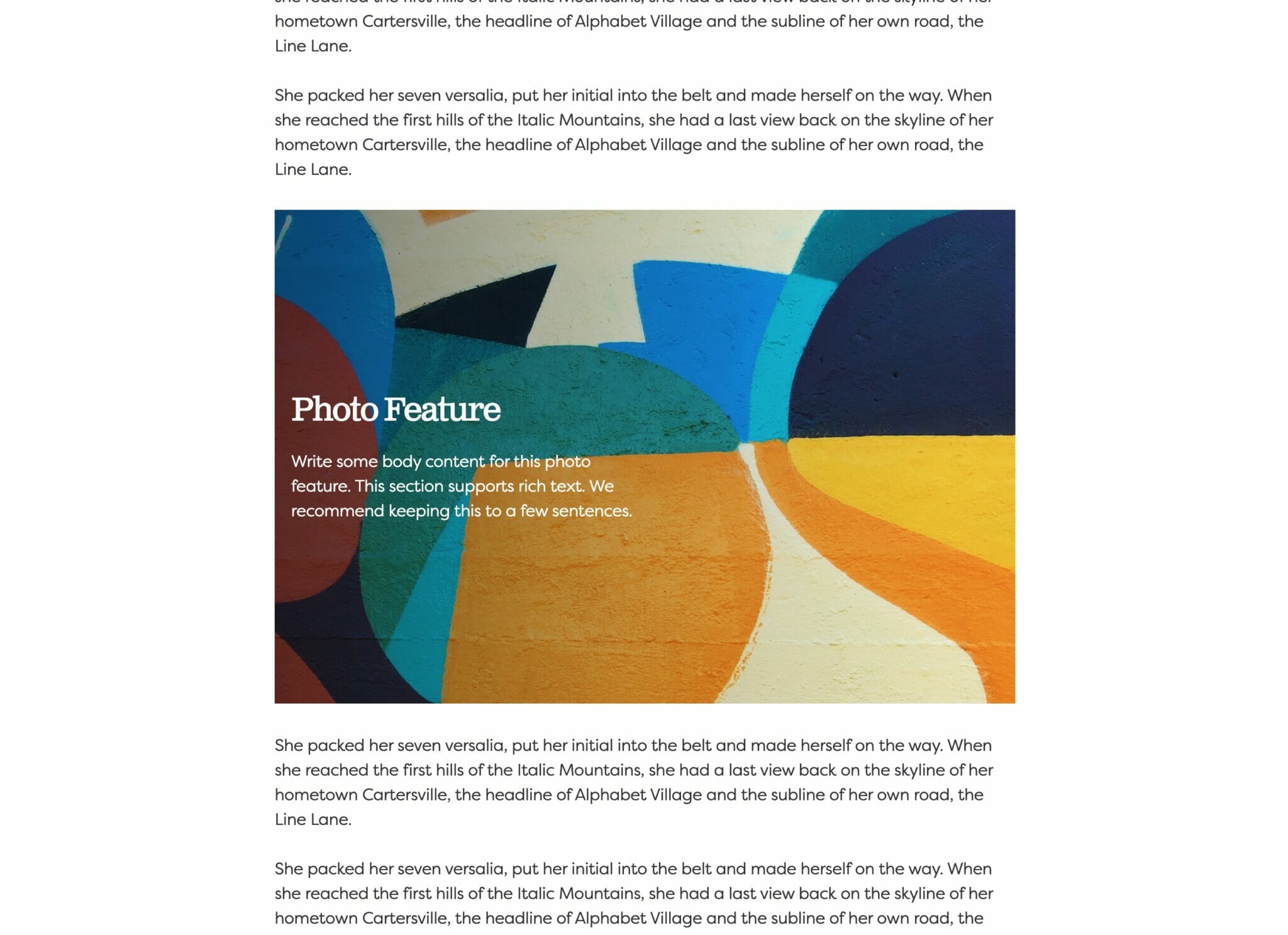
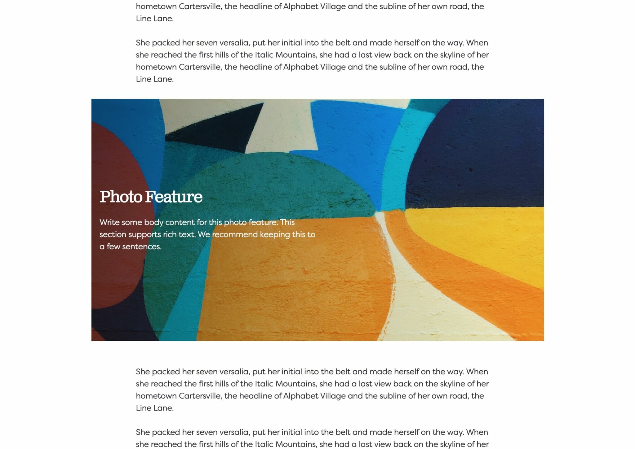
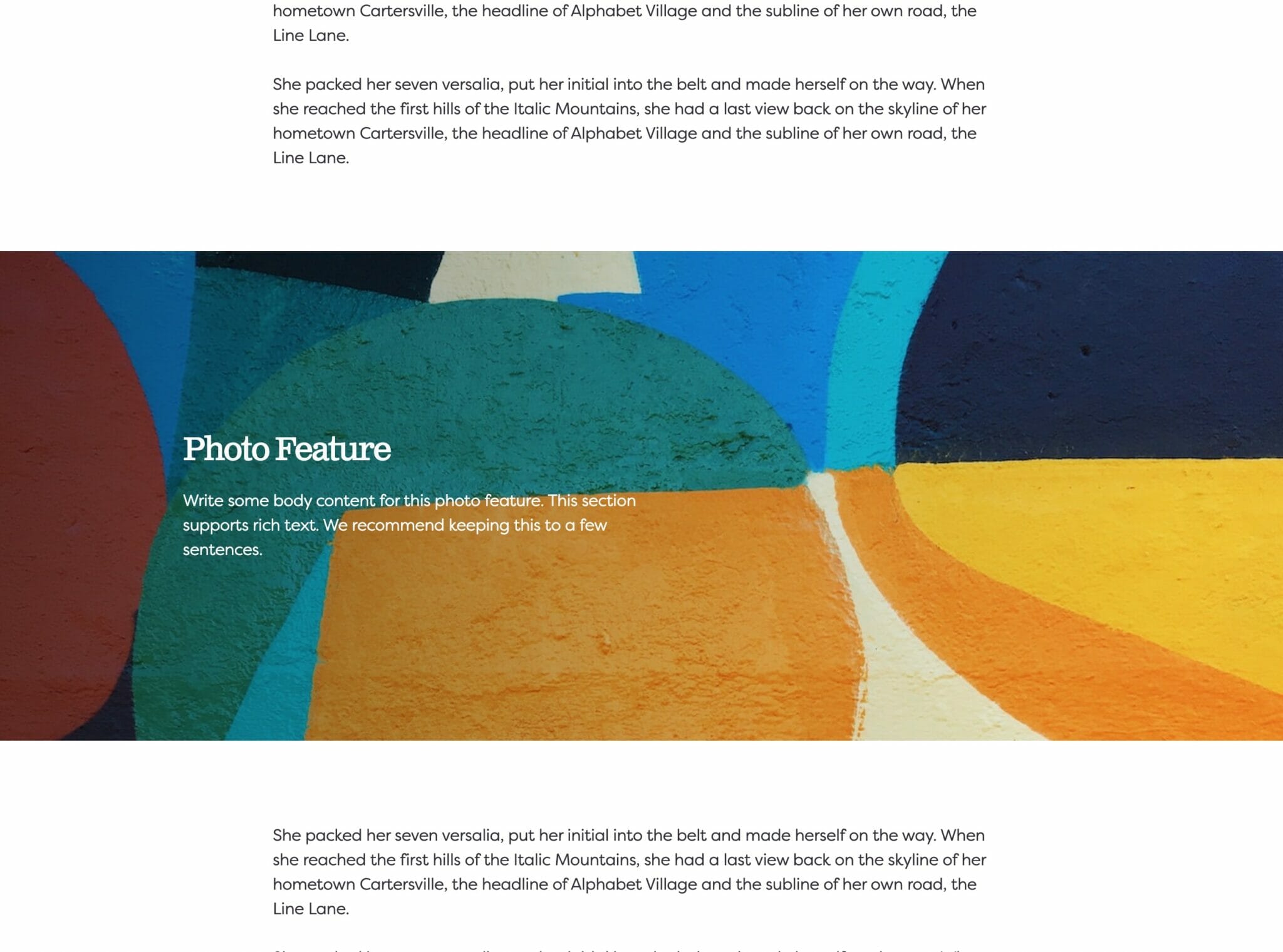
Example
Add a grid that breaks out from an overarching idea.
Another One
An eye-catching and attractive display of content that your viewers will love.
And Another
Place important & helpful information here expanding on content or to generate a list.
Usage
Breakout Grid is another stylish block to take advantage of when presenting content on your site. Use it to supplement existing content, to display a list, or highlight specific points. Utilize the Breakout Grid for however it best fits your site!
Parent Settings
The parent block (named Breakout Grid in the editor) has the following settings.
Block Width
Blocks can be set to one of three widths in the editor: Default, Wide, or Full. Blocks will interact with adjacent blocks differently depending on their width.
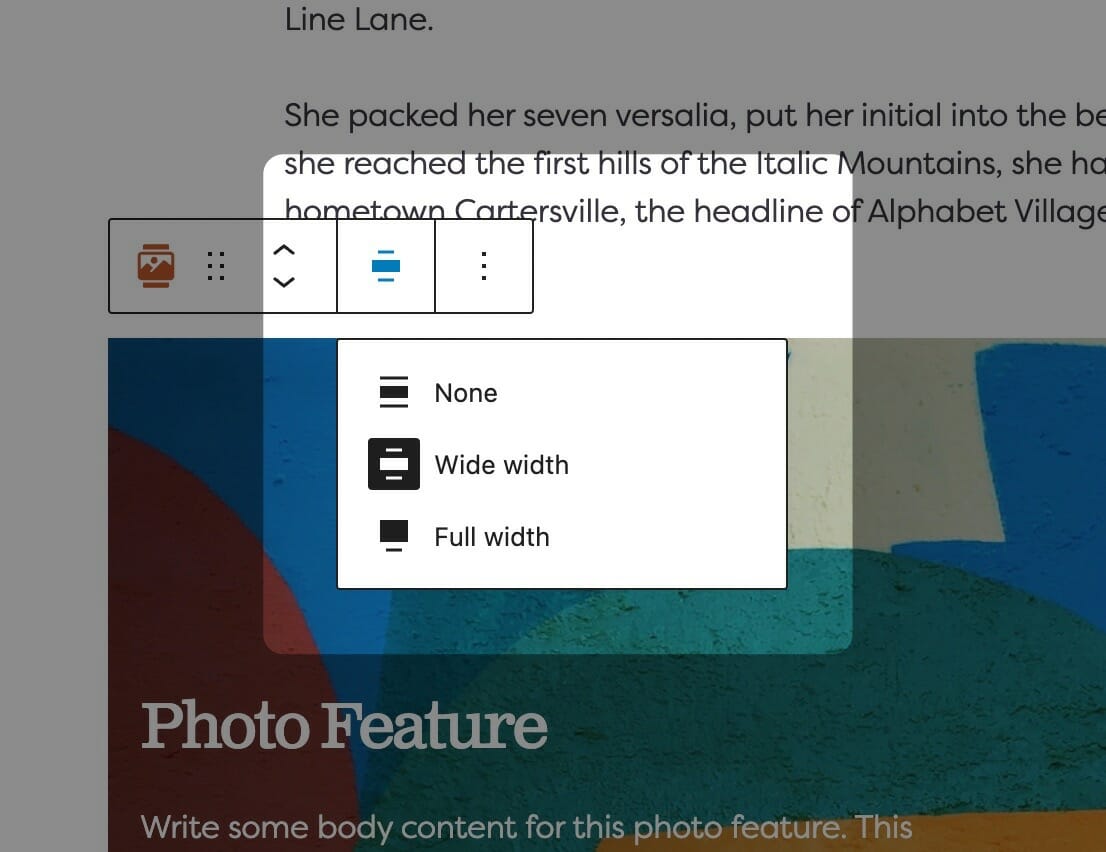
Adjusting Block Width
The block width setting is found in your block context bar, which will show up above the current block that you have selected. A block that supports the block widths will show its current width icon in the context bar, and clicking it will allow you to change the width.
If you have the Top Toolbar setting selected, the block context bar will always show at the top of your page, not at the top of your block.
Default Width
The default width of your content is determined by the value set in your Customizer. You can find this setting under Styles » Widths » Content Width. This is the default width of most text-based content and most blog pages. We recommend keeping this set so that your content retains maximum readability, which most studies agree is around 50-60 characters per line.
Wide Width
Wide width content will take up 75% of the available width on the page or the default content width set on your site—whichever is larger. In effect, this makes content take up more of the available screen real estate. When used in conjunction with other wide width blocks, you can shape your webpages in many different ways.
Full Width
Full width content will always take up 100% of the available width on the page. When placed next to default or wide width content, margin will be applied to the full width block to give it some room to breath. When two full width blocks are placed next to each other, however, they will suction together and form a cohesive unit with no margin in between them.
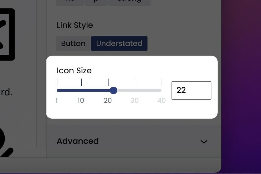
Icon Size
Use the icon size control to adjust the size of any icons contained within the block. This block-level control ensures all of the icons’ appearance will be consistent.
You can adjust the icon size from the block sidebar using the icon size range control. This numbers on the scale represent a sliding scale that is not in real units (like pixels), but instead a sliding scale. Pick the one you think looks the best!
If you are editing a block with Inner Blocks, be sure to select the parent block to adjust the icon size of it’s Inner Blocks. We’ve made this a parent block control so you can quickly and uniformly adjust the size of all the icons it contains, rather than having to adjust each child block.
Text Style
The Text Style (sometimes called Headline Style) option controls the display of your text.
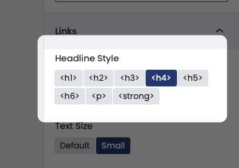
The Text Style (or Headline Style) will default to a different value depending on the block, but can be changed to any of the other available options. These styles are defined in your Customizer under Styles. For more information on changing your styles visit Customizing Styles.
One important thing to note is that this only changes how the headlines appear visually. The underlying html will be determined by the block that uses this features.

Label
Add a label to your cards.
Headline
Additionally, enter in a headline for each card.
Body
Expand on your content in the body field.