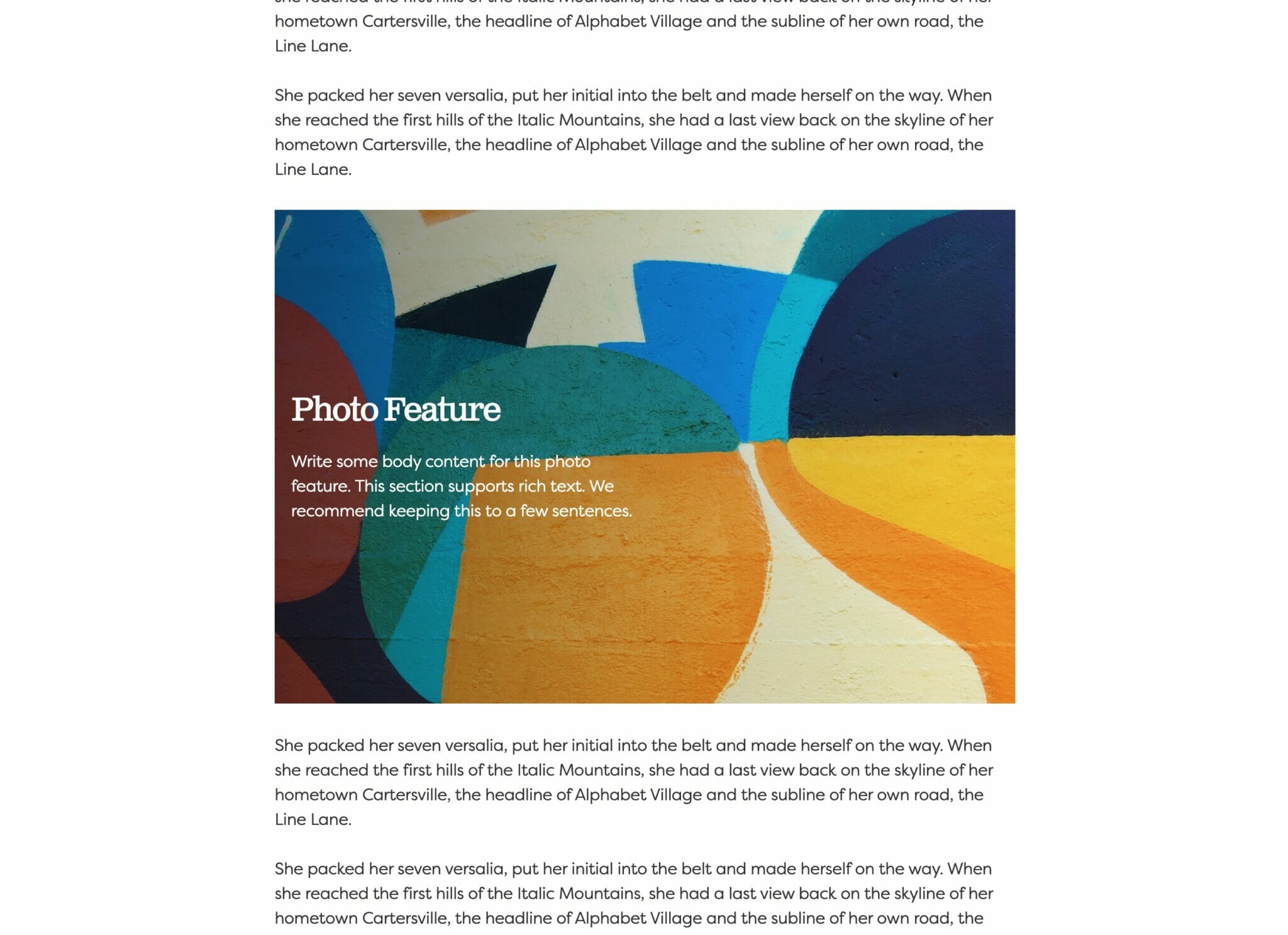
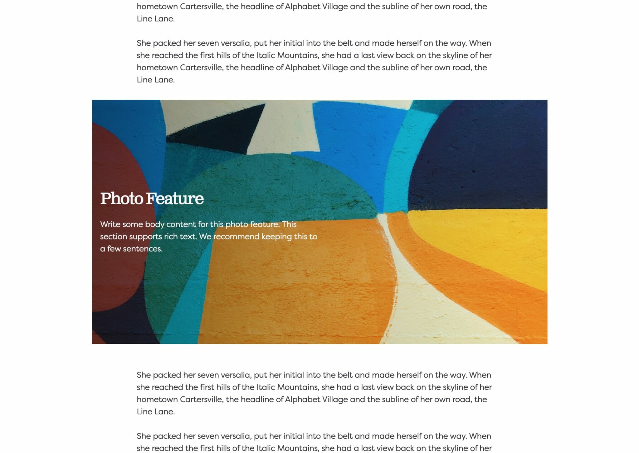
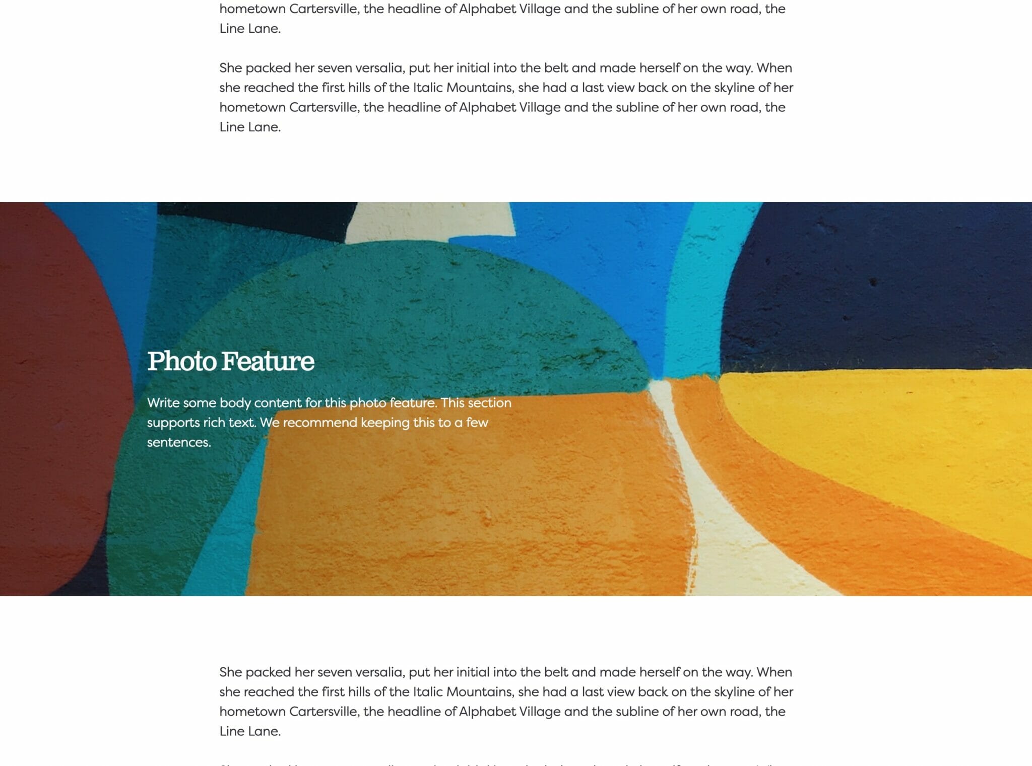
An interactive grid that displays more information on hover.
Usage
Our Overlay Grid is similar to our Grid Block, but instead has the option to display your information over top of the grid’s cards. The use here is mostly for the look of your site, although the Overlay Grid also calls for more interaction from your users leaving them with a pleasant impression of your site. But, again, no one block is better than the other, it’s simply all about how you want your website to look and feel for your users.
Parent Settings
The parent block (named Overlay Grid in the editor) only has parent block settings allowing for a more unified and consistent look to your Overlay Grid. Let’s go over the settings.
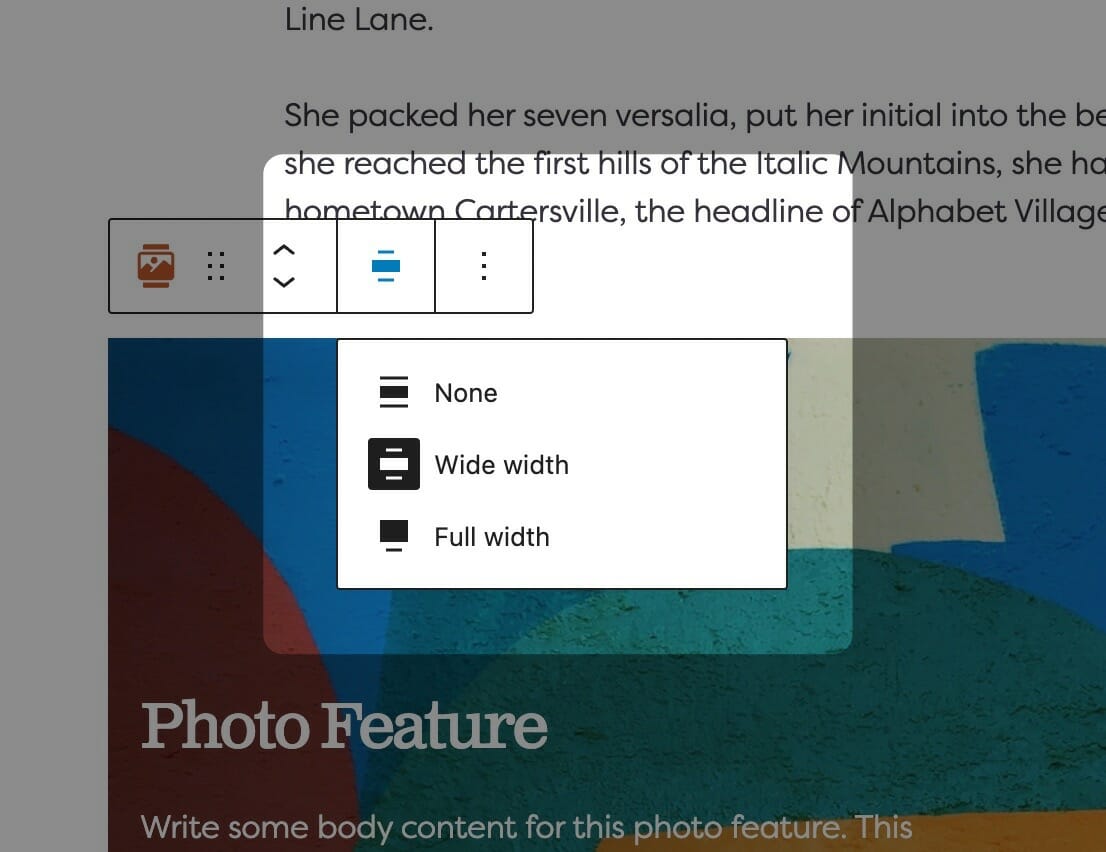
Block Width
Blocks can be set to one of three widths in the editor: Default, Wide, or Full. Blocks will interact with adjacent blocks differently depending on their width.
Adjusting Block Width
The block width setting is found in your block context bar, which will show up above the current block that you have selected. A block that supports the block widths will show its current width icon in the context bar, and clicking it will allow you to change the width.
If you have the Top Toolbar setting selected, the block context bar will always show at the top of your page, not at the top of your block.
Default Width
The default width of your content is determined by the value set in your Customizer. You can find this setting under Styles » Widths » Content Width. This is the default width of most text-based content and most blog pages. We recommend keeping this set so that your content retains maximum readability, which most studies agree is around 50-60 characters per line.
Wide Width
Wide width content will take up 75% of the available width on the page or the default content width set on your site—whichever is larger. In effect, this makes content take up more of the available screen real estate. When used in conjunction with other wide width blocks, you can shape your webpages in many different ways.
Full Width
Full width content will always take up 100% of the available width on the page. When placed next to default or wide width content, margin will be applied to the full width block to give it some room to breath. When two full width blocks are placed next to each other, however, they will suction together and form a cohesive unit with no margin in between them.
Show MoreShow Less
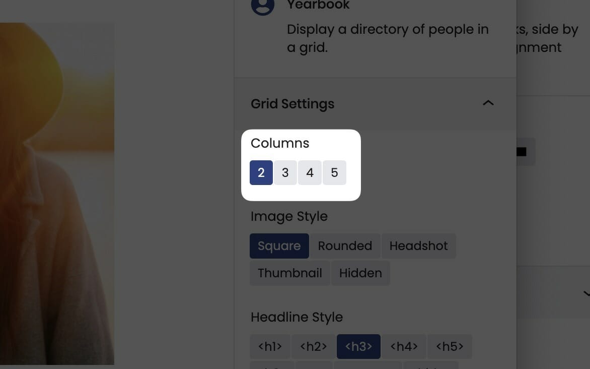
Columns
The Columns field determines the maximum amount of cards allowed per row.
Most blocks that support columns can be set anywhere from two cards per row to five. You’ll find the columns control in the block sidebar, and you’ll need the parent block selected in order to access this setting.
No matter how many items per row you have your Grid block capped at, it will seamlessly break cards to the next row depending on viewport size until it reaches the maximum allowed.
On mobile, the cards will automatically adjust and re-layout to show fewer cards per row, so you won’t have to worry about your content being too small.
Show MoreShow Less
Text Position
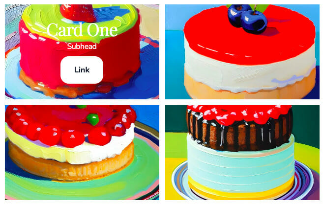
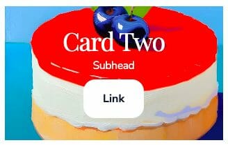
You have two options for Text Position: Either Inside or Outside. Inside will display your text overlaying the grid card (as seen in the beginning gif), while the Outside option places your text underneath each card image (which is how the Grid block displays as well).
Keep in mind, your Text Position selection has its own settings for Overlay Style and Text Behavior/Text Align.
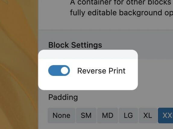
Reverse Print
Toggling reverse print will flip the colors from your standard palette to white, which increases contrast and readability when text is placed on dark backgrounds.
You’ll find the reverse print toggle in the block sidebar. Enabling reverse print will affect the block its enabled on as well as everything inside of it. If the block contains Inner Blocks, reverse print will cascade to all descendants.
We recommend using reverse print whenever a block has a dark background and using white text would increase its contrast. While you can set text color on core blocks like Headings and Paragraphs, we strongly recommend using the block-level reverse print instead. This way, you’ll be able to quickly toggle all the content if you change the background color in the future. All Inner Blocks will respect the reverse print setting, even those without color settings themselves.
To read more about contrast requirements on the web, visit here.
Show MoreShow Less
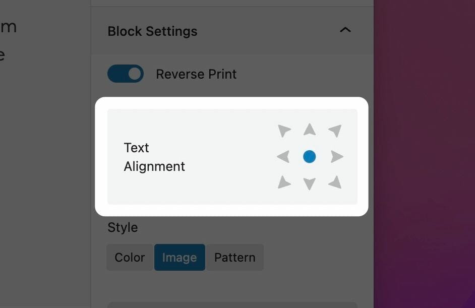
Block Text Alignment
Choose the text alignment of the selected block.
Choosing a Block Text Alignment
The text alignment option allows you to place your text anywhere inside of the child block. This is more useful than trying to control the alignment of each inner child block element, and is a combination of text position and text alignment. For example, setting the text to the lower right hand corner will not only position the text in the lower righthand corner, but also set right text alignment on all children.
Note: Because right text alignment is generally used compositionally on desktop, text set to be right aligned will automatically revert to left alignment on mobile to give your users the best experience.
Show MoreShow Less
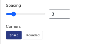
Spacing & Corners
Spacing allows you to adjust the gap between your cards. You can make them as wide as you’d like to separate your cards or have them displayed flush with each other.
With Corners, you can select between a Sharp or Rounded look for your cards. See examples below.
Sharp
Rounded
Text Style
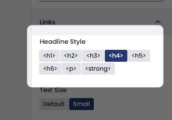
The Text Style (sometimes called Headline Style) option controls the display of your text.
The Text Style (or Headline Style) will default to a different value depending on the block, but can be changed to any of the other available options. These styles are defined in your Customizer under Styles. For more information on changing your styles visit Customizing Styles.
One important thing to note is that this only changes how the headlines appear visually. The underlying html will be determined by the block that uses this features.
Show MoreShow Less
Link Style
You can select from three styles of link display:
Button
Understated
Hidden
Note: You only have the option to adjust Link Style if the Inside Text Position is selected. If the Outside Text Position is selected, your link displays as an overlay of the cards, and can have the appearance indirectly altered by changing the Overlay Style.
Adding Cards
To add cards, scroll to the bottom of the block settings on the right hand side. At the bottom in the section titled Cards, you’ll want to click the blue Add Card Button. You can add as many cards as you want and from here you can edit the individual fields of each card: Image, Overlay Image, Headline, Subheadline, and Link.