

Grid
- Blocks
- Section
- Buttons
- Counters
- Blocks
- Comparison Table
- Columns
- Breadcrumbs
- Call To Action
- Landing Page
- Tabs
- YouTube
- FAQ
- Grid
- Hero
- Media Callout
- Site Preview
- Jump Nav
- Jump Link
- Link-in-Bio
- Logos
- Marquee
- Map
- Media and Text
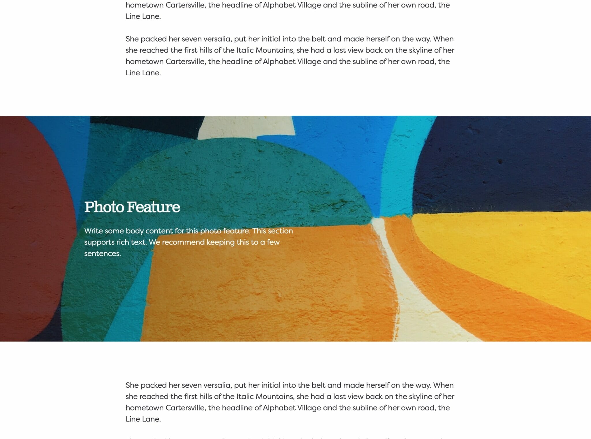
- Photo Feature
- Posts
- Price List
- Quote Blocks
- Quotes
- Slider
- Structured List
- Socials
- Timeline
- Yearbook
- Vignette
- Video Gallery
Grid
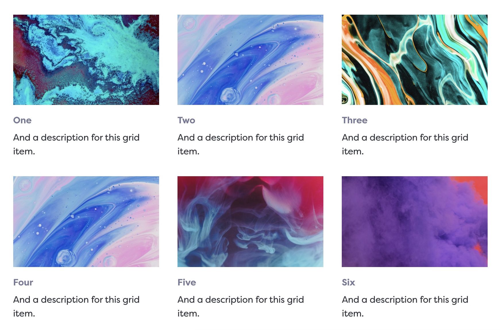
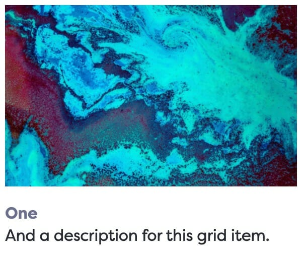
Grid on the frontend.
Arrange different types of cards in a grid that looks great at any viewport size.
Usage
Grids are a common UX pattern. While you can approximate this pattern with the core Columns block, our Grid block removes the guesswork.
The Grid block will seamlessly reformat itself as the viewport size changes, and can contain five types of cards: the Image card with a photo at the top (which is the default card), a Text card without the photo, an Icon card that replaces the photo with an icon, a Video card that displays a video on top, and a YouTube card with an embedded video at the top.
Parent Settings
The parent block (named Grid in the editor) has the following settings. To access these settings, you must have the parent block selected.
Block Width
Blocks can be set to one of three widths in the editor: Default, Wide, or Full. Blocks will interact with adjacent blocks differently depending on their width.
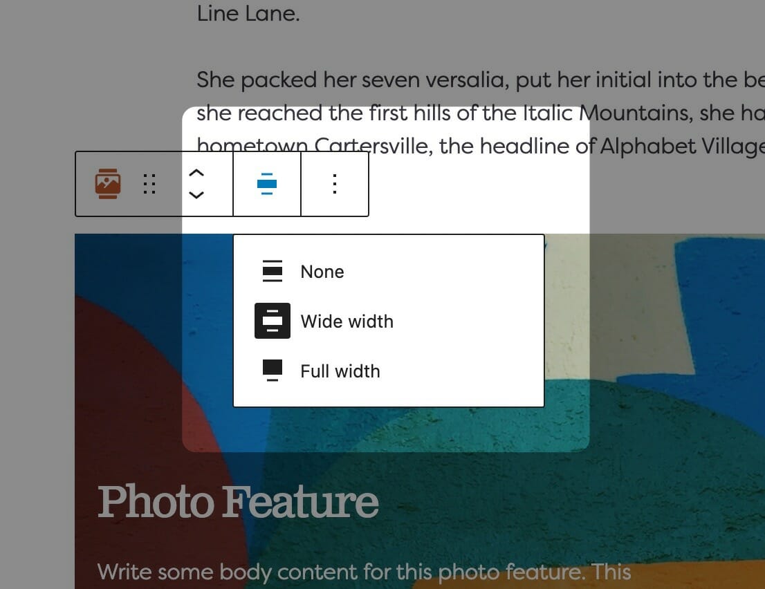
Adjusting Block Width
The block width setting is found in your block context bar, which will show up above the current block that you have selected. A block that supports the block widths will show its current width icon in the context bar, and clicking it will allow you to change the width.
If you have the Top Toolbar setting selected, the block context bar will always show at the top of your page, not at the top of your block.
Default Width
The default width of your content is determined by the value set in your Customizer. You can find this setting under Styles » Widths » Content Width. This is the default width of most text-based content and most blog pages. We recommend keeping this set so that your content retains maximum readability, which most studies agree is around 50-60 characters per line.
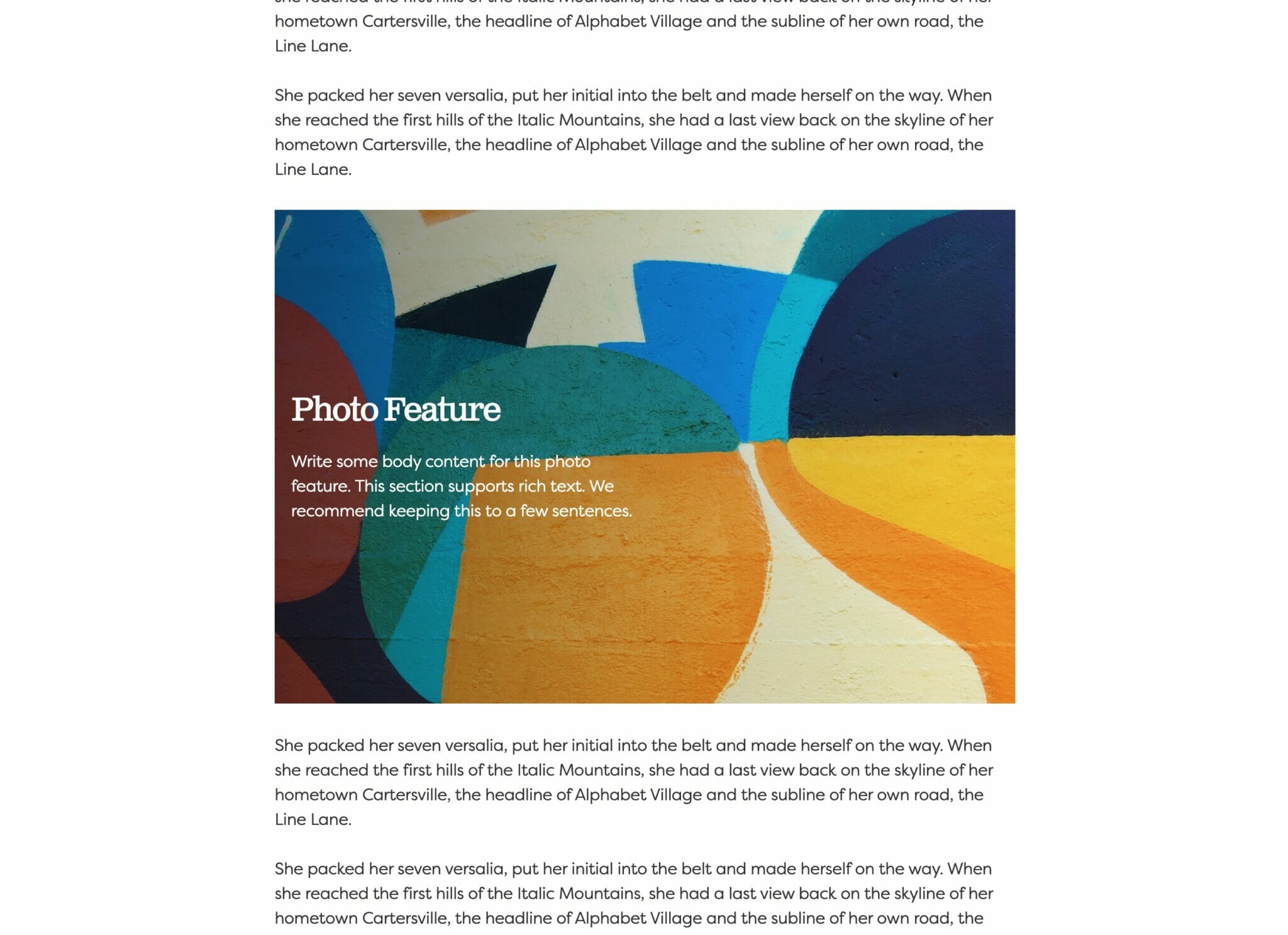
Wide Width
Wide width content will take up 75% of the available width on the page or the default content width set on your site—whichever is larger. In effect, this makes content take up more of the available screen real estate. When used in conjunction with other wide width blocks, you can shape your webpages in many different ways.
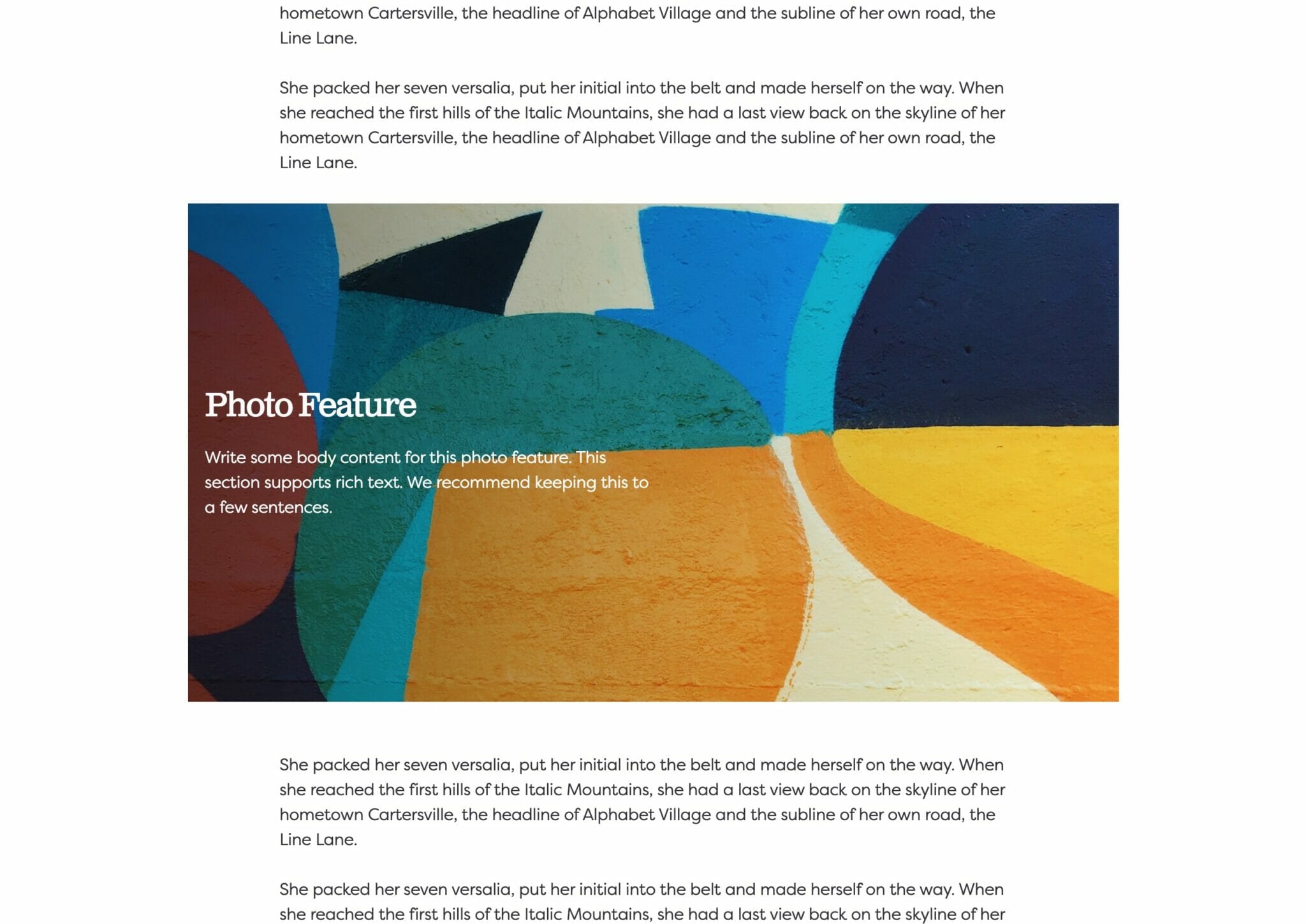
Full Width
Full width content will always take up 100% of the available width on the page. When placed next to default or wide width content, margin will be applied to the full width block to give it some room to breath. When two full width blocks are placed next to each other, however, they will suction together and form a cohesive unit with no margin in between them.
Columns
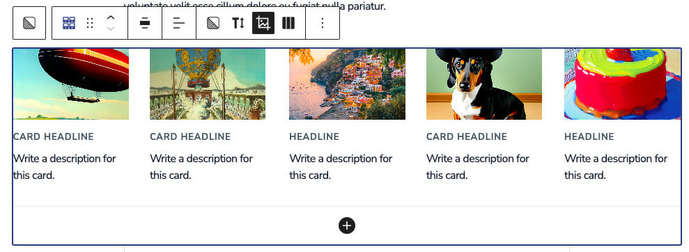
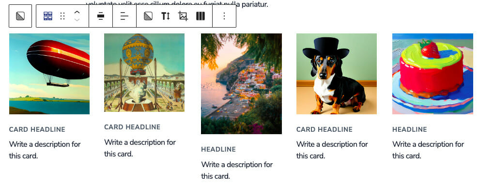
The Columns field determines the maximum amount of cards allowed per row. No matter how many items per row you have your Grid block capped at, it will seamlessly break cards to the next row depending on viewport size until it reaches the maximum allowed.
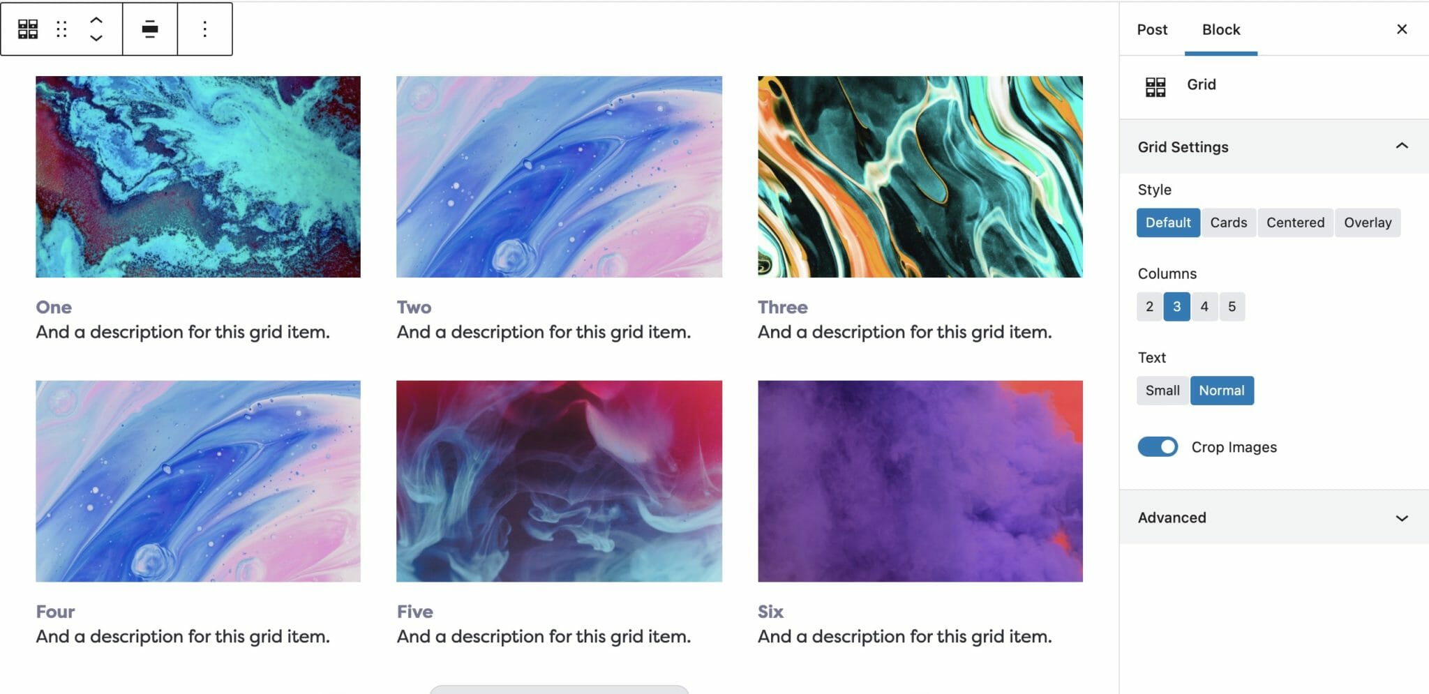
Three cards per row.
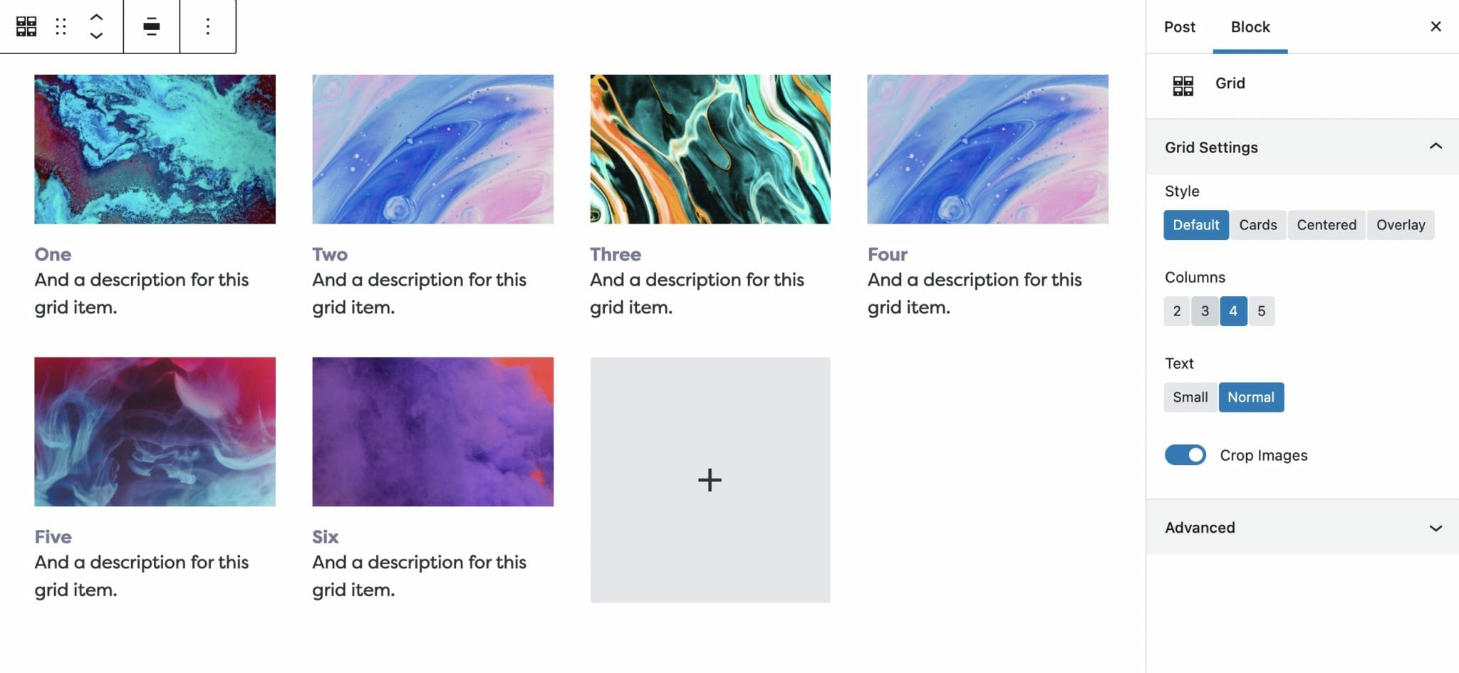
Four cards per row.
Text
Text Size can be toggled on or off in the Block Toolbar and switches the text size between the Small and Normal options. Normal text size is the same as any other paragraph tag on your size, while small is the same as a <small> tag. These sizes can be set in the customizer. This does not affect the Card Headline.
Small text
Normal text
Image Aspect Ratio
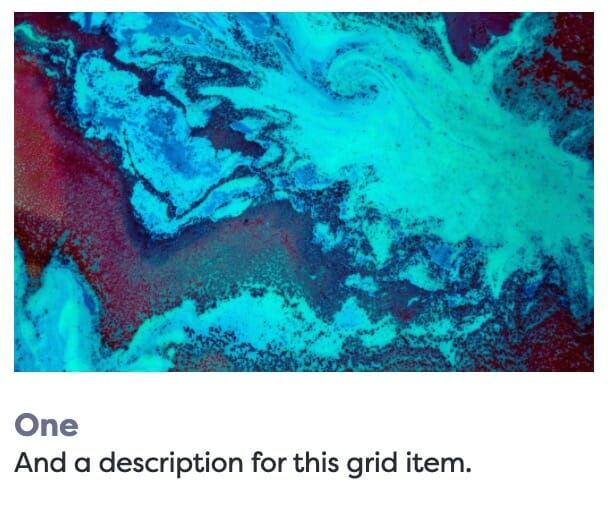
Changes the header images to a uniform crop. Selecting from Default, None, 1:1, 1:2, 2:1, 4:3, 9:16, or 16:9.
Crop Images enabled.
Crop Images disabled.
Link
When a child card is focused, the Link field appears in the block editor sidebar. You can choose to link to any on-site content, or enter an off-site URL.
The style of your link can be toggled under the Link Style in the parent settings, which allows you to switch between Understated or Button. The link will appear at the bottom of the card(s). The text of the link defaults to “Learn More”, but you can click into the link to edit the link text in the same way you can edit any other text on the cards.
From the parent settings also toggle on/off the fields where you want your link to appear.
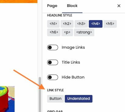
You’re able to toggle the link style in the sidebar when the Grid Block is selected.
You can edit the link text inline.
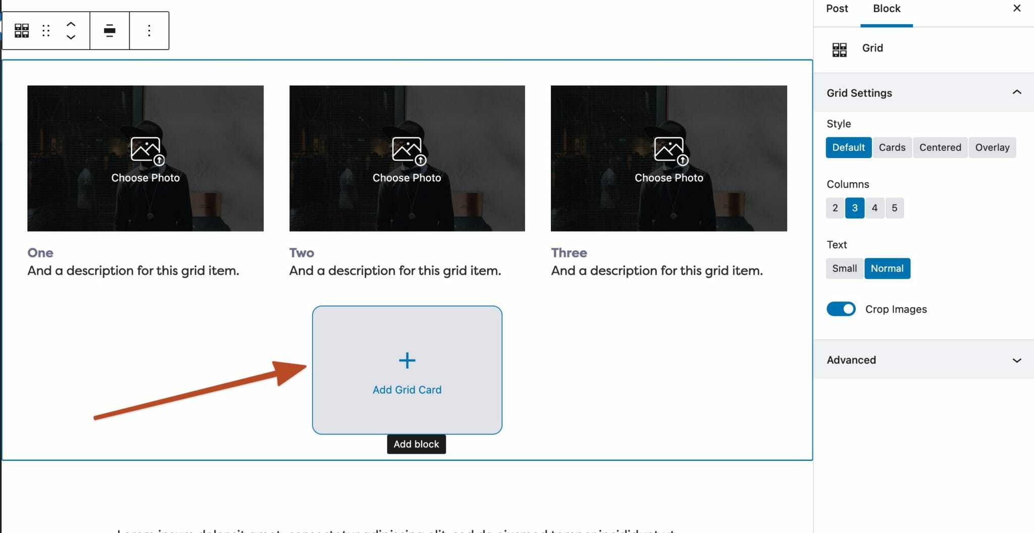
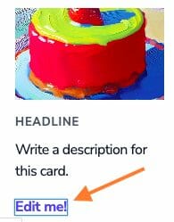
Adding Cards
To add a card to your Grid block, click on the prompt in the editor.
Child Settings
The Grid supports different types of child cards, including Icon cards, Image cards, Text cards, Video cards, and Youtube cards. When you create a new Grid, it will appear populated with Image cards, but you can delete, add, or edit the cards however you’d like.
Card Types
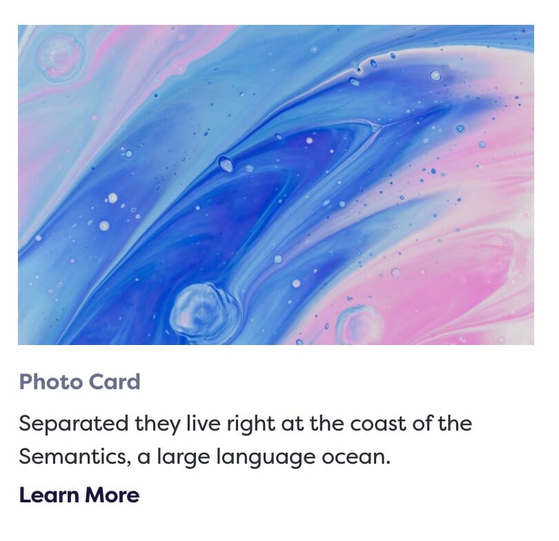
Photo Card
The default card is the photo card, which displays an image at the top. You can determine if the photo is cropped in the parent block toolbar. You can enter a Link in the sidebar or toolbar when the specific card is selected.
You can change the photo by clicking on it or changing it in the sidebar.
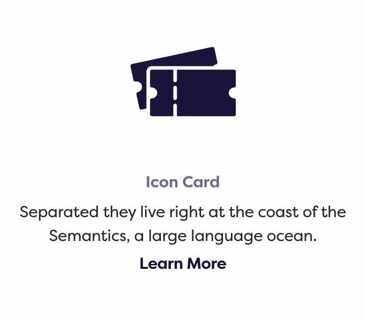
Icon Card
In addition to a Link field, the Icon Card also has an Icon Size field, which can be found and set in the sidebar of the parent settings near the bottom.
You can change the icon by clicking on it or changing it in the sidebar.
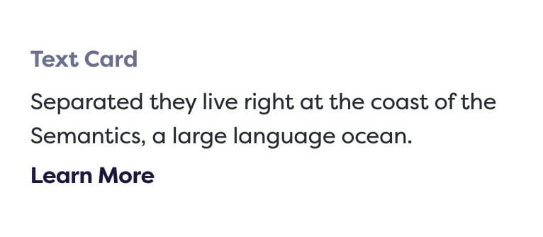
Text Card
The simplest of all the cards, this card still supports the Link field.
Video Card
The Video Card works the same as the photo card, but with a video instead. To change the video, just click on it.
The video will autoplay on loop, muted.
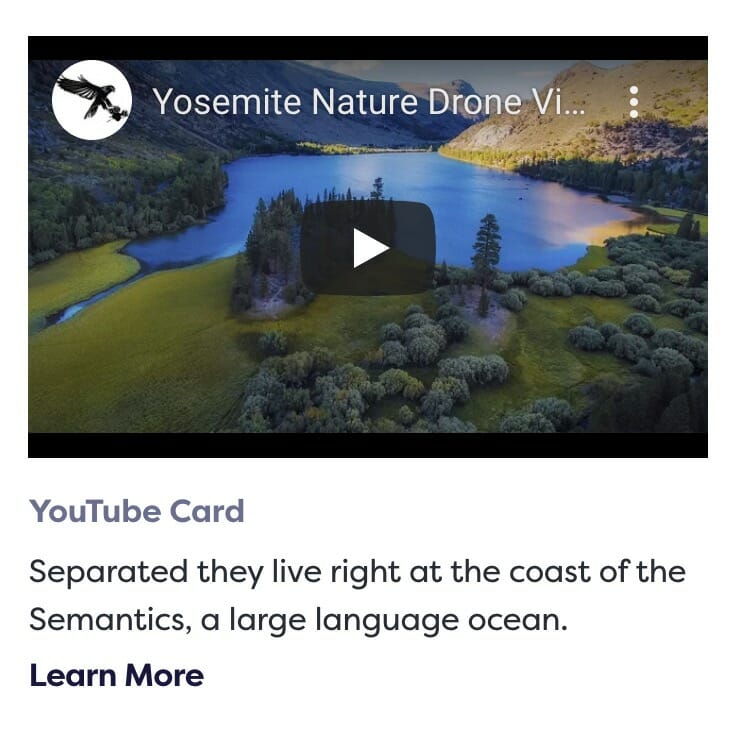
YouTube Card
The YouTube card places an embedded YouTube iFrame at the top of the card and has support for the Link field. To change the video, enter the Video ID in the sidebar.
To find the Video ID, use the text after the v= portion of the url. For example, the video ID is the bolded text in the link:
www.youtube.com/watch?v=LTvFsTbyILg
Note
Although in most cases you’ll have grids filled with the same type of cards, you can mix and match any way you please!