

Yearbook
- Blocks
- Section
- Buttons
- Counters
- Blocks
- Comparison Table
- Columns
- Breadcrumbs
- Call To Action
- Landing Page
- Tabs
- YouTube
- FAQ
- Grid
- Hero
- Media Callout
- Site Preview
- Jump Nav
- Jump Link
- Link-in-Bio
- Logos
- Marquee
- Map
- Media and Text
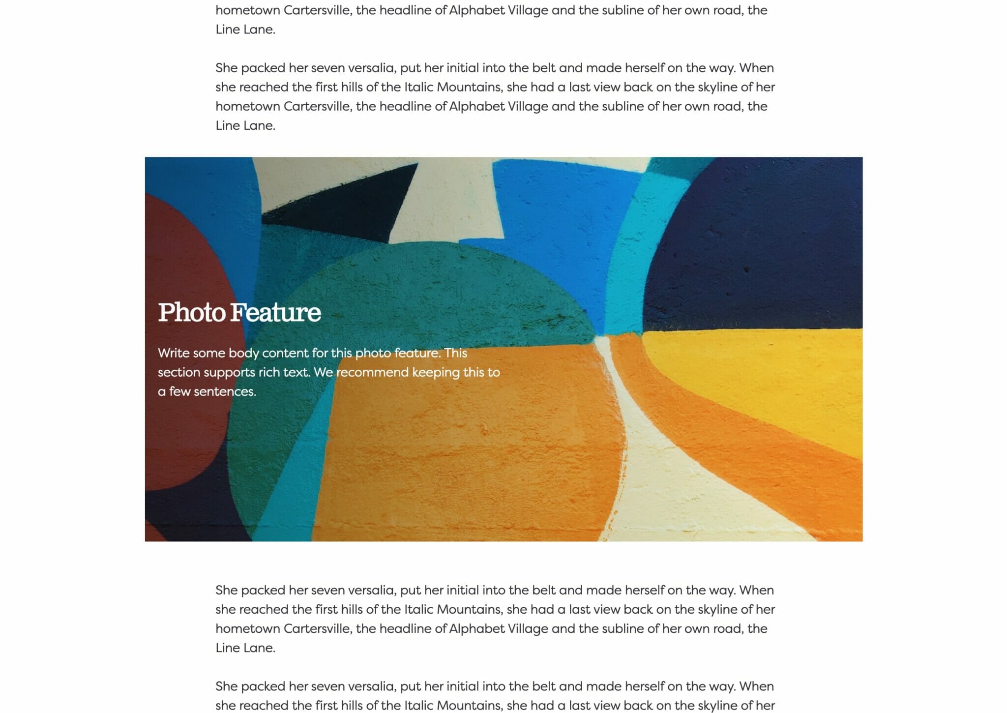
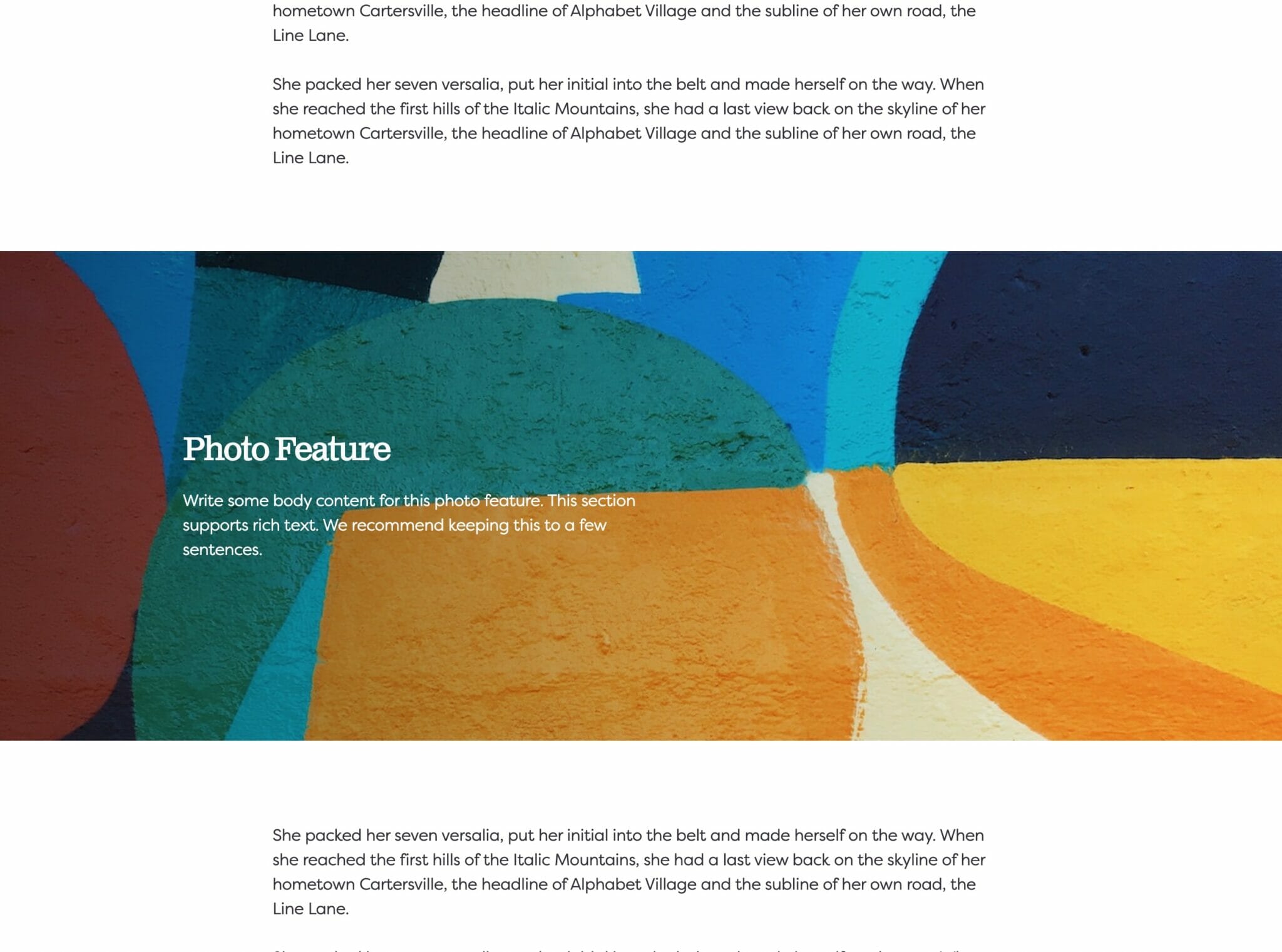
- Photo Feature
- Posts
- Price List
- Quote Blocks
- Quotes
- Slider
- Structured List
- Socials
- Timeline
- Yearbook
- Vignette
- Video Gallery
Yearbook
Yearbook on the frontend.
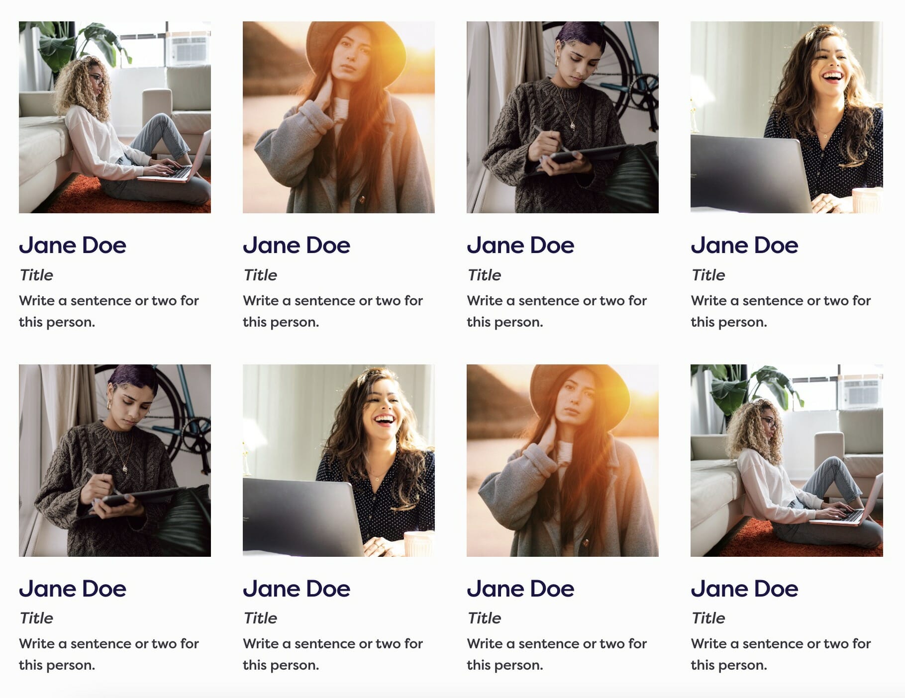
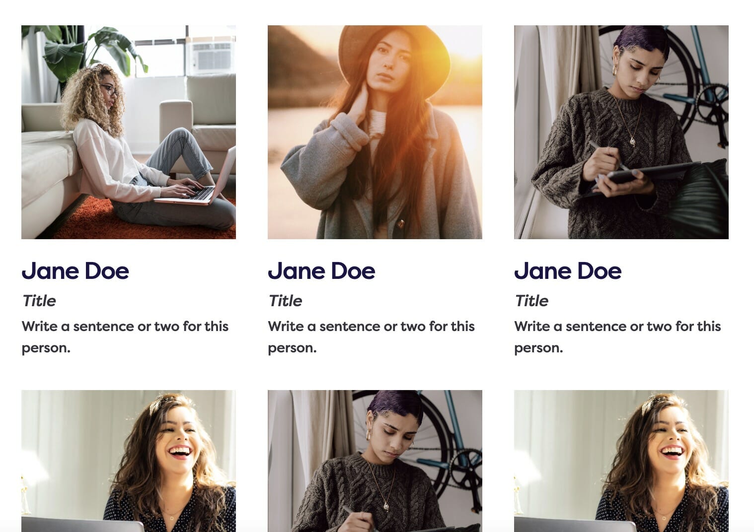
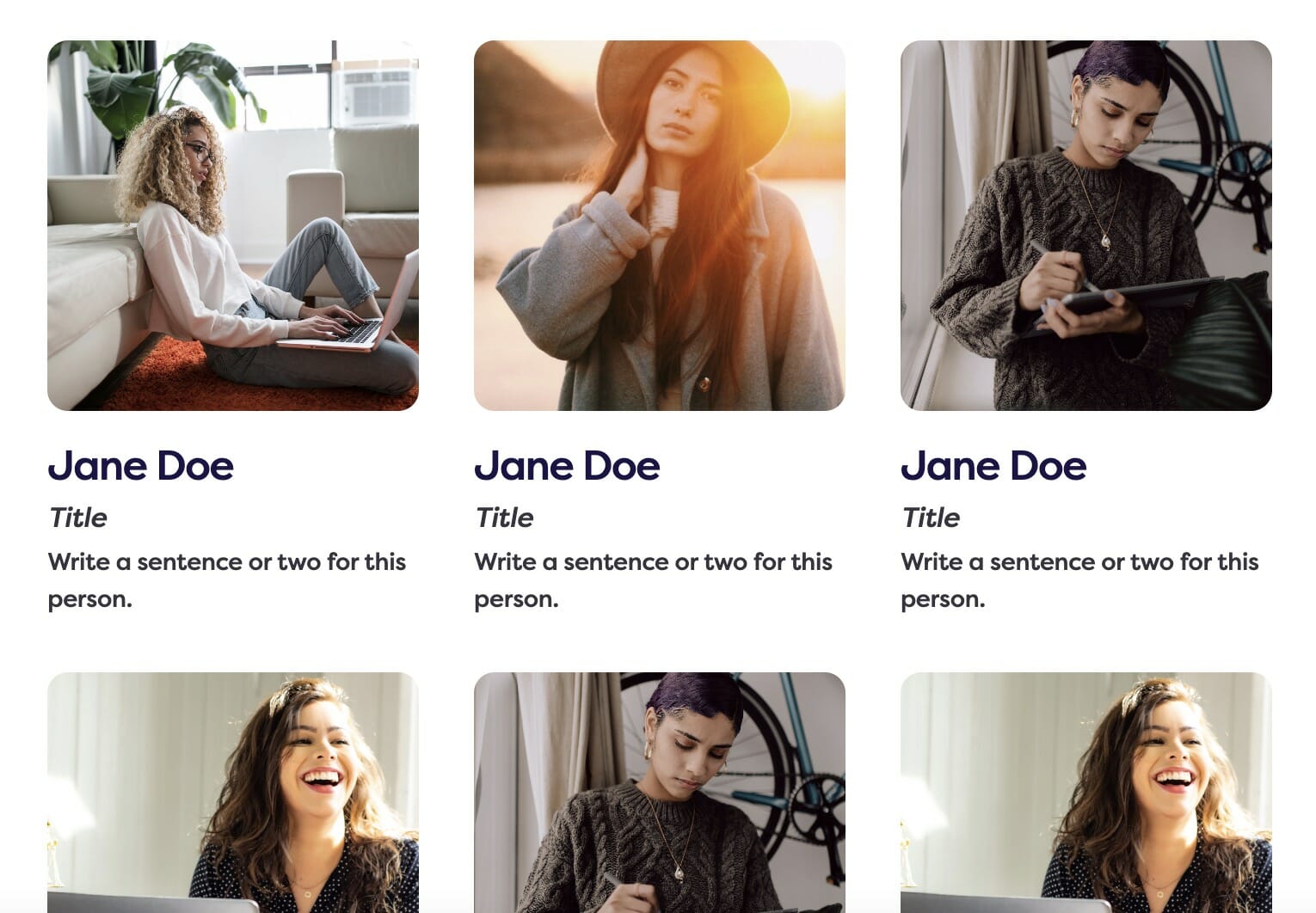
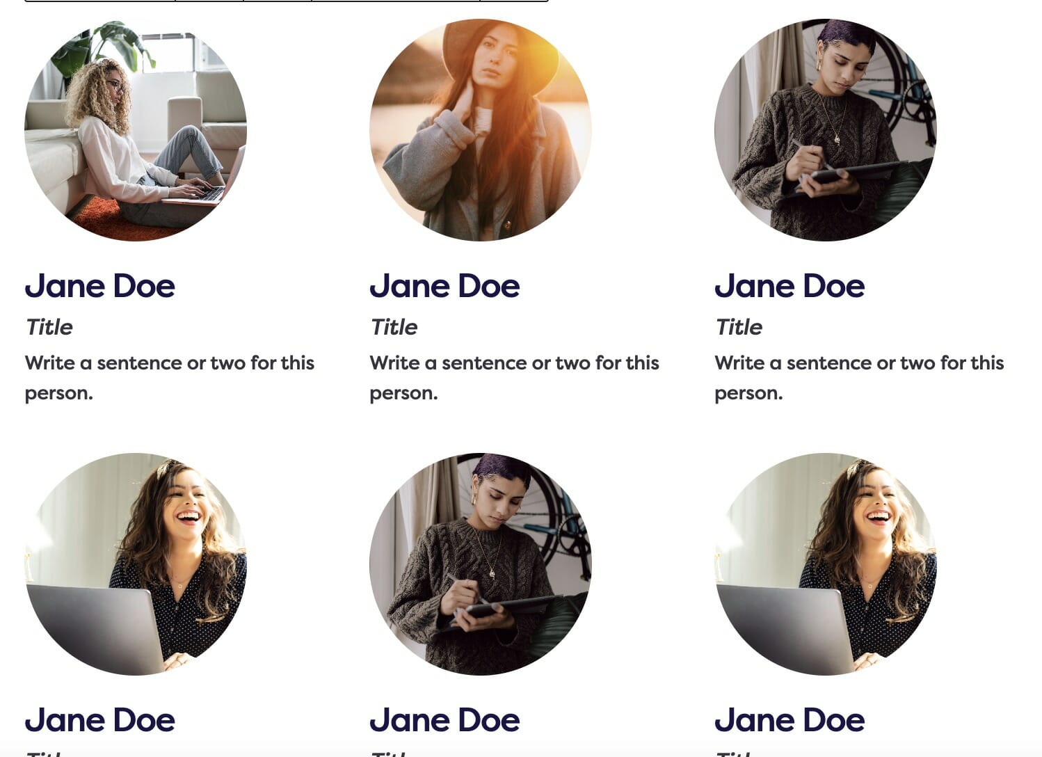
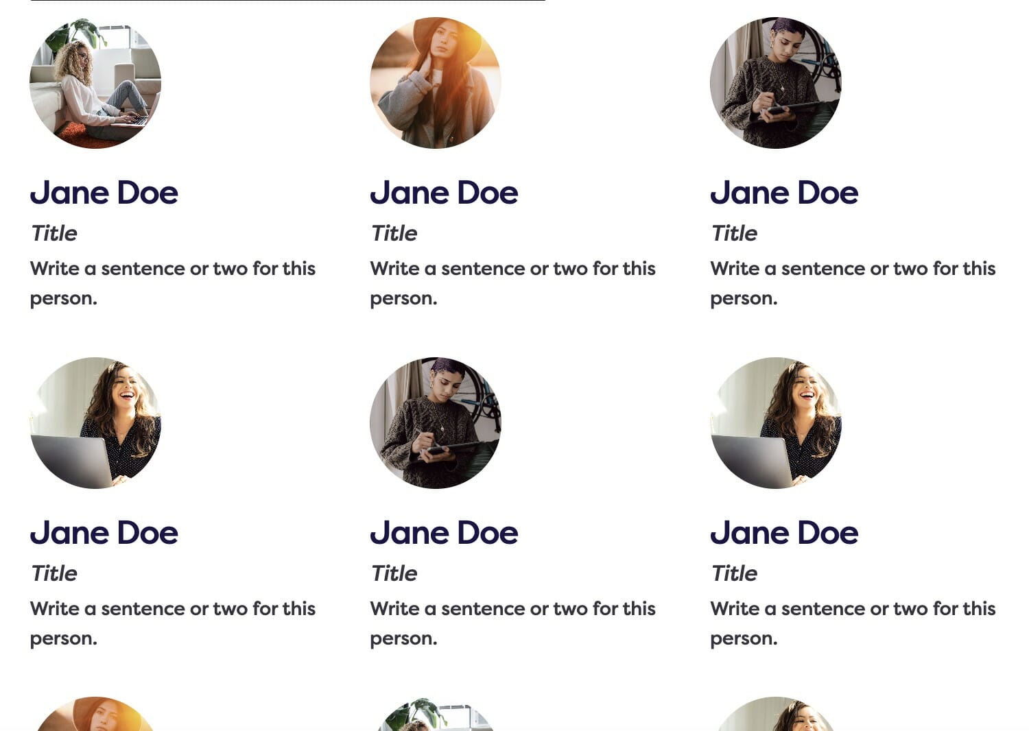
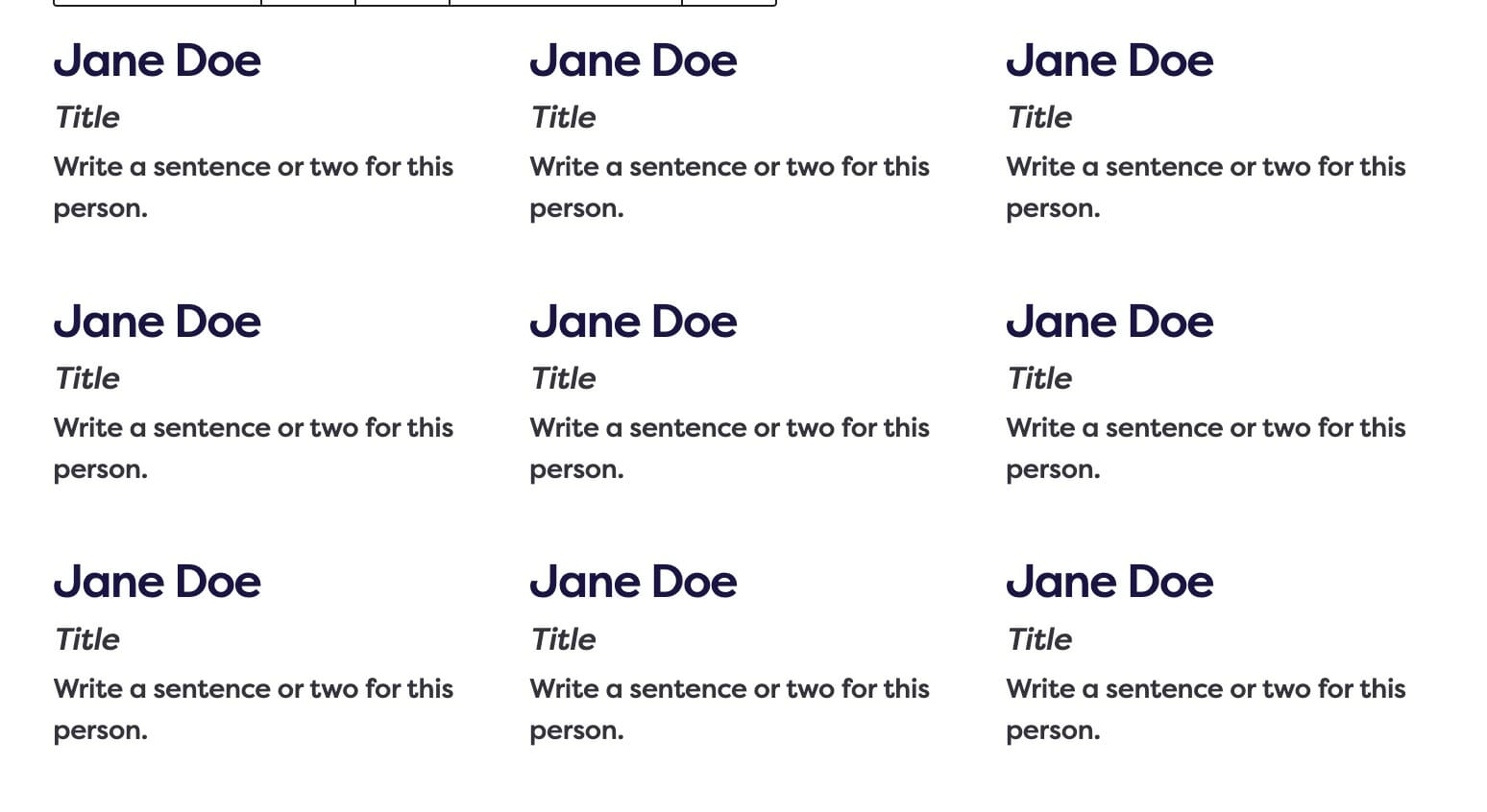
Display a directory of people in a grid.
Usage
If you need to display a directory of people, but don’t need the full functionality of the people plugin, the Yearbook plugin gives you an easy way to do that. While you can approximate this pattern with the core Columns block, our Yearbook block removes the guesswork.
The Yearbook block will seamlessly reformat itself as the viewport size changes and has a variety of display options.
Parent Settings
The parent block (named Yearbook in the editor) has the following settings. To access these settings, you must have the parent block selected.
Block Width
Both the Headline and Subheadline text styles can be changed.
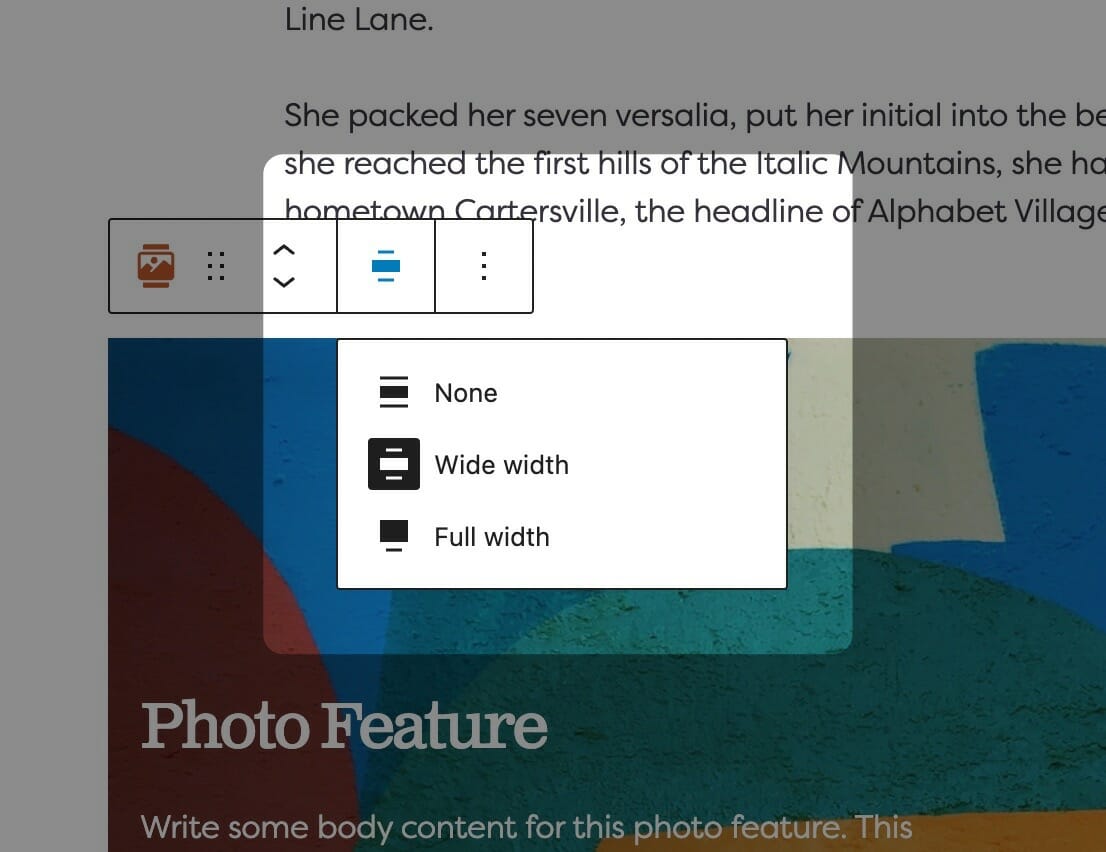
Adjusting Block Width
The block width setting is found in your block context bar, which will show up above the current block that you have selected. A block that supports the block widths will show its current width icon in the context bar, and clicking it will allow you to change the width.
If you have the Top Toolbar setting selected, the block context bar will always show at the top of your page, not at the top of your block.
Default Width
The default width of your content is determined by the value set in your Customizer. You can find this setting under Styles » Widths » Content Width. This is the default width of most text-based content and most blog pages. We recommend keeping this set so that your content retains maximum readability, which most studies agree is around 50-60 characters per line.
Wide Width
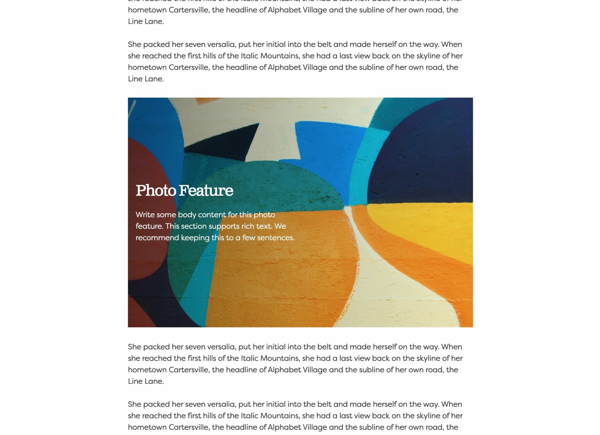
Wide width content will take up 75% of the available width on the page or the default content width set on your site—whichever is larger. In effect, this makes content take up more of the available screen real estate. When used in conjunction with other wide width blocks, you can shape your webpages in many different ways.
Full Width
Full width content will always take up 100% of the available width on the page. When placed next to default or wide width content, margin will be applied to the full width block to give it some room to breath. When two full width blocks are placed next to each other, however, they will suction together and form a cohesive unit with no margin in between them.
Columns
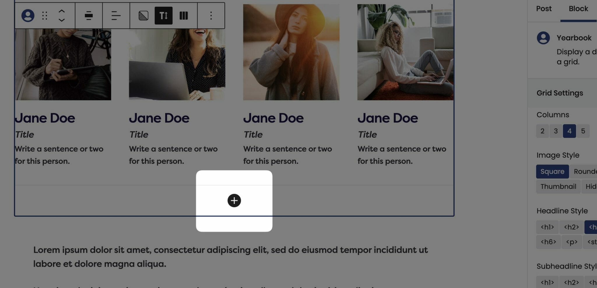
The Columns field determines the maximum amount of cards allowed per row.
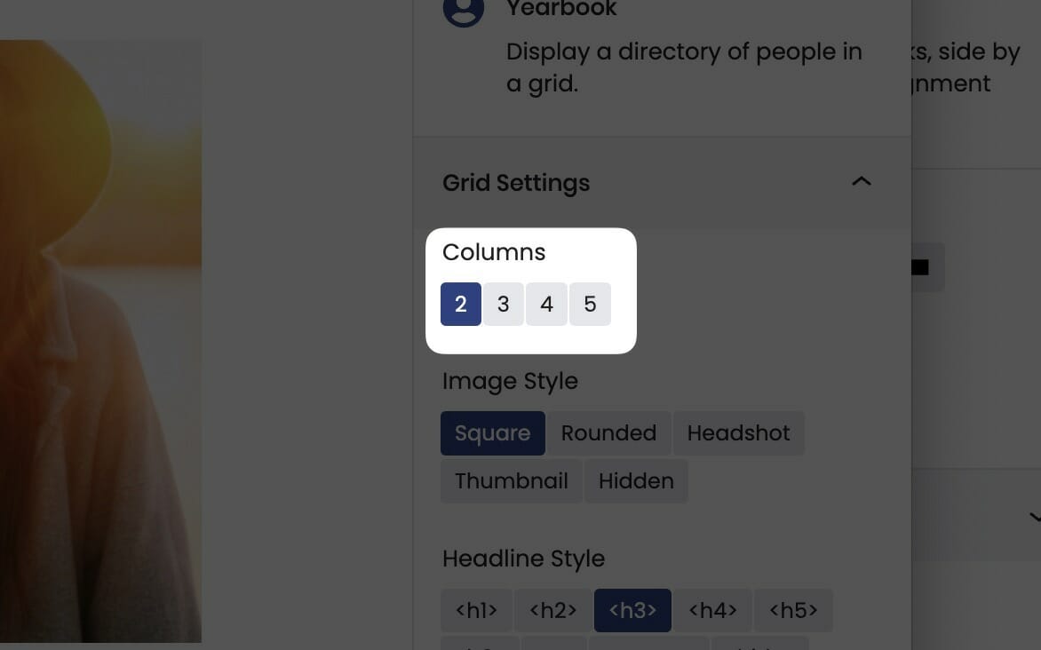
Most blocks that support columns can be set anywhere from two cards per row to five. You’ll find the columns control in the block sidebar, and you’ll need the parent block selected in order to access this setting.
No matter how many items per row you have your Grid block capped at, it will seamlessly break cards to the next row depending on viewport size until it reaches the maximum allowed.
On mobile, the cards will automatically adjust and re-layout to show fewer cards per row, so you won’t have to worry about your content being too small.
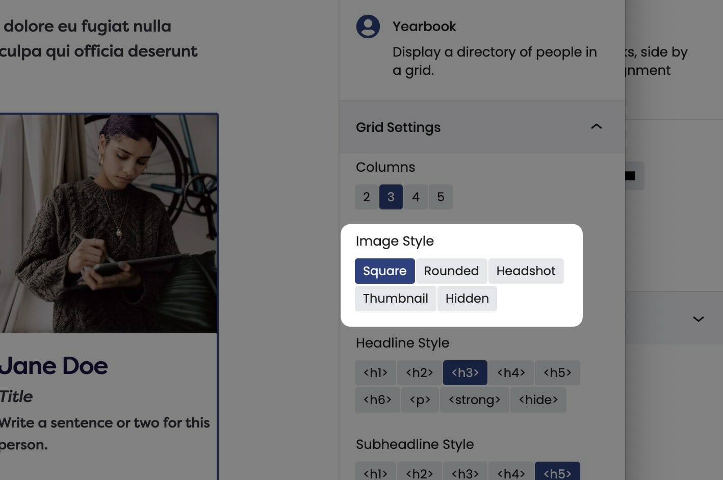
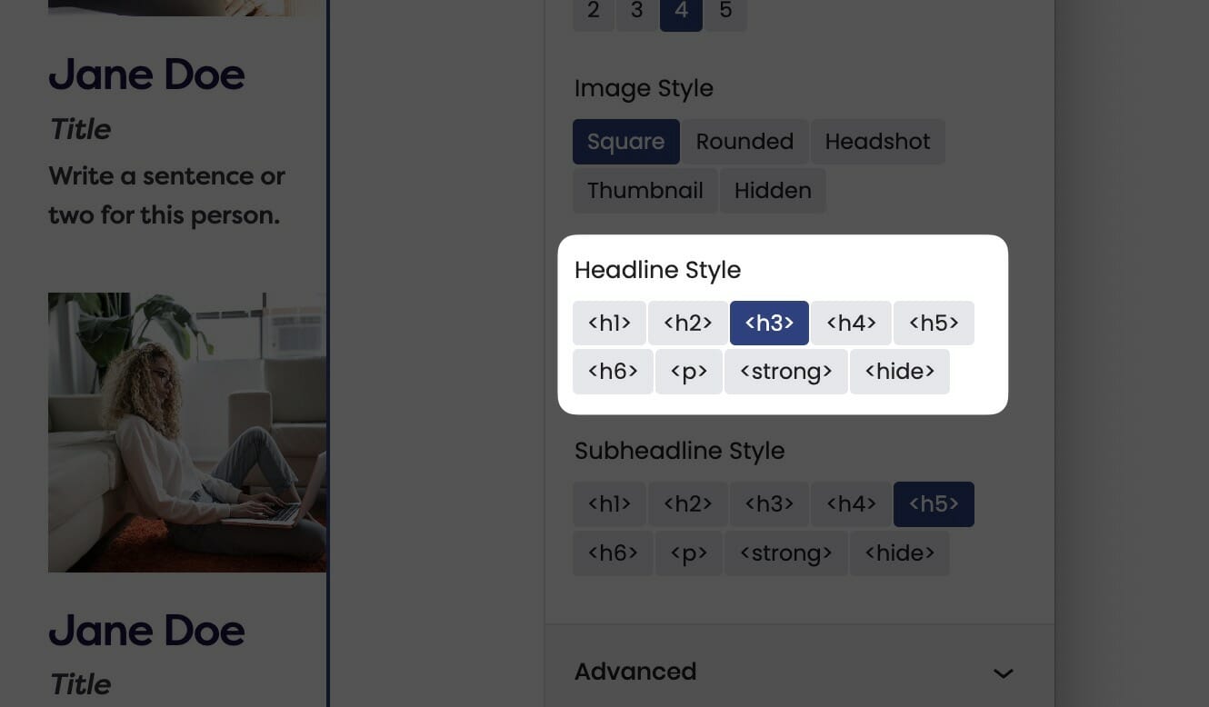
Image Style
You can check the style used to display images. The style selected here will change the appearance of every card within the Yearbook. This setting is in the block sidebar.
Square
Rounded
This style respects the site-wide border radius setting.
Headshot
Thumbnail
This is the same as headshot, just smaller.
Hidden
Get those images outta here!
Text Style
Both the Headline and Subheadline text styles can be changed.
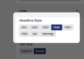
The Text Style (or Headline Style) will default to a different value depending on the block, but can be changed to any of the other available options. These styles are defined in your Customizer under Styles. For more information on changing your styles visit Customizing Styles.
One important thing to note is that this only changes how the headlines appear visually. The underlying html will be determined by the block that uses this features.
Child Settings
The Yearbook contains child cards, and you can add as many as you like. Each card supports an Image, Name, Title, and Body that can be edited inline. Simply click into where you’d like to edit and start typing!

Image Focal Point
After selecting an image, you can set its focal point in the block sidebar by clicking and dragging the focal point to the most important part of the image.

Changing the Image
After selecting an image, you can change it by either using the image swap button in the toolbar or by removing it in the sidebar.
Adding Cards
To add a card, click on the prompt in the editor.