Close Menu
  1. Columns

Columns

Two container blocks, side by each, each with alignment functionality.


Usage

This block is similar to the core Columns block that Gutenberg provides, but with added functionality to ensure it looks good on both mobile and desktop. Our Columns has two child blocks, a left and a right column. Each child block allows for control over text alignment, and can hold a subset of other blocks inside of it.

Most blocks are allowed—only very complex blocks are excluded from being put inside of Columns. For this reason, you will only be able to drag allowed blocks from outside of these blocks to the inside of them.

Like all Dirigible blocks, our Columns have a blue icon to prevent confusion and differentiate from the core Columns block.

Parent Settings

The parent block (named Columns in the editor) has the following settings. To access these settings, you must have the parent block selected.

Parent Block

This block consists of the parent Columns block two Column children. You’ll only be able to control block-wide styles from the parent block.

In general, the parent block will handle styling and block options that all the child blocks will inherit. While editing a child block, you’ll be able to change the block settings and content related to that child block only. For example, while editing a card in a Grid block, you’ll be able to change the headline and button link, but you’ll need to select the parent Grid block in order to change the number of cards in each row.

For this reason, you’ll often find yourself selecting the parent block of a child block. There are a couple really simple ways to do this.

While a child block is selected, the parent block will show up in the block control bar above it to the far left. Click it to quickly select the parent.

You can quickly traverse up the block tree by clicking on the path bar at the bottom of the page.

Open list view by clicking its icon in the toolbar to the top left of your page. From there, you can more easily navigate blocks on your page.

Show More Show Less

Block Width

Blocks can be set to one of three widths in the editor: Default, Wide, or Full. Blocks will interact with adjacent blocks differently depending on their width.

Adjusting Block Width

The block width setting is found in your block context bar, which will show up above the current block that you have selected. A block that supports the block widths will show its current width icon in the context bar, and clicking it will allow you to change the width.

If you have the Top Toolbar setting selected, the block context bar will always show at the top of your page, not at the top of your block.

Default Width

The default width of your content is determined by the value set in your Customizer. You can find this setting under Styles » Widths » Content Width. This is the default width of most text-based content and most blog pages. We recommend keeping this set so that your content retains maximum readability, which most studies agree is around 50-60 characters per line.

Wide Width

Wide width content will take up 75% of the available width on the page or the default content width set on your site—whichever is larger. In effect, this makes content take up more of the available screen real estate. When used in conjunction with other wide width blocks, you can shape your webpages in many different ways.

Full Width

Full width content will always take up 100% of the available width on the page. When placed next to default or wide width content, margin will be applied to the full width block to give it some room to breath. When two full width blocks are placed next to each other, however, they will suction together and form a cohesive unit with no margin in between them.

Show More Show Less

Block Size

Change the size of your blocks.

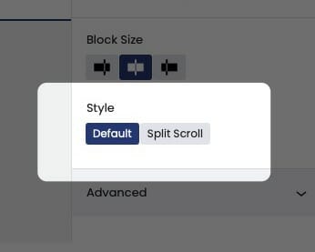
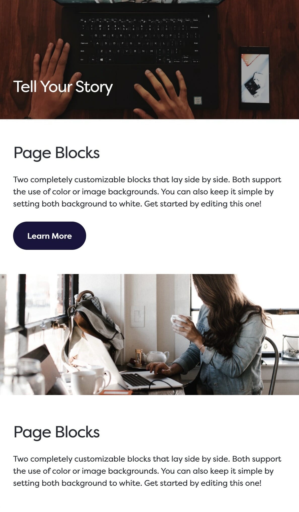
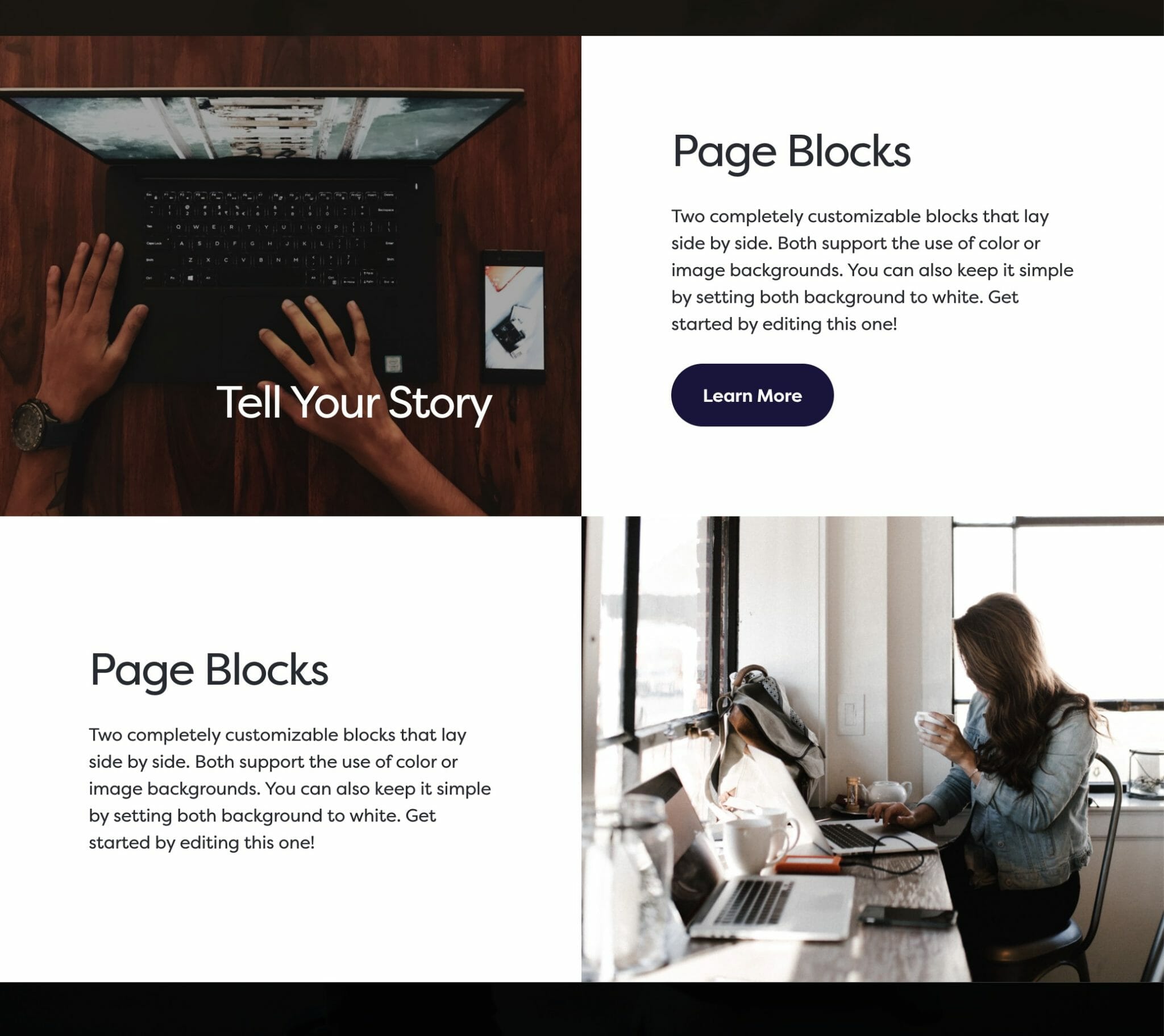
Adjusting the size of your Dirigible Blocks

The sizing option will change the size of blocks on desktop. This is independent from the Swap Blocks setting, which means that even if you toggle the Swap Blocks option, if the left block is set to be larger, the leftmost block will always be the larger one regardless of which one is being presented on the left.

The default setting makes each block evenly sized (50%). With either of the other two options selected, the sizes are based on the golden ratio, with the larger block set to 61.8% and the smaller block set to 38.2%.

Show More Show Less

Split Scroll

Pins your content to either the top or bottom of the window as the user scrolls.

Block Split Scroll

The split scroll option pins your content to either the top or bottom of the window as the user scrolls. This will only affect the desktop experience.

Show More Show Less

Swap Blocks

Change the order of the blocks on desktop.

The Swap Blocks setting is used to change the order of the blocks on desktop and not on mobile.

This is an important distinction and can be used to control the flow of your website on mobile, giving your users the best mobile experience possible.

Even if Swap Blocks is enabled, displaying your media on the righthand side on desktop, the media block will still appear above your content on mobile.

Mobile swap blocks example.

Example mobile stacking.

The same blocks viewed on desktop. In this example, the second Blocks group has Swap Blocks enabled.

Show More Show Less

Child Settings

Each of the two children of the Columns group has the same settings and are interchangeable, but they will default to the common UX pattern of ‘photo on side, content on the other’. However, you can make these hold whatever you’d like—make it your own and explore the possibilities!

Block Text Alignment

Choose the text alignment of the selected block.

Choosing a Block Text Alignment

The text alignment option allows you to place your text anywhere inside of the child block. This is more useful than trying to control the alignment of each inner child block element, and is a combination of text position and text alignment. For example, setting the text to the lower right hand corner will not only position the text in the lower righthand corner, but also set right text alignment on all children.

Note: Because right text alignment is generally used compositionally on desktop, text set to be right aligned will automatically revert to left alignment on mobile to give your users the best experience.

Show More Show Less

Columns