Close Menu
  1. Hero

Hero

A hero block on the frontend of a website.

Hero on the frontend.

Introduce a page in an attractive way with correct title tags.

Usage

Utilizing a Hero at the top of your page is a common UX pattern, and we’ve made it easy with the Hero block. We’ve also included a site-wide switch in the customizer where you can set whether you want your navigation to blend seamlessly with the Hero on pages where it is the first block, or if you’d like it to remain separate.

A hero block on the frontend of a website.

Seamless hero.

Hero block with the navigation separate from the hero.

Separate hero.

Content Fields

The Hero block can have four different content fields, Headline, Subheadline, Button, and Logo. You can edit these inline or in the sidebar. If you delete a field (such as the headline field), it will remove it from the inline editor. You can always get it back by typing in the sidebar.

Field mapping for the hero block.

For these content fields, you can either edit them inline or in the sidebar. If a field is empty, it will be removed from block editor.

If you include a Logo, a secondary Size field will appear. This will adjust the logo width in pixels and the height will adjust to maintain its aspect ratio. We suggest using an SVG here. The only way to remove a logo once you’ve added one is to hit the Remove Logo button.

If a Button Link exists, you can edit the Button Text by clicking into the default ‘Learn More’ text and typing.

The Headline field is set in the page as an <h1> tag, and the Subheadline field is set as an <h2> to ensure semantic HTML structure.

Appearance Fields

The Hero is a highly used and recognizable UX pattern, so much so that we automatically include on at the top of new pages. Because this is such a universal pattern, we include a lot of appearance options for you to sculpt the hero to fit your page, including Text Alignment, Style, Size, Reverse Print, Text Box, and Type.

The Type field allows you to toggle the background type for the block and works in the same way as the Background Block. The options include Color, Image, Pattern, or Video.

Block Text Alignment

Choose the text alignment of the selected block.

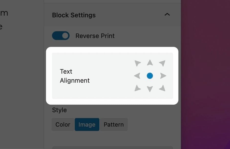
Choosing a Block Text Alignment

The text alignment option allows you to place your text anywhere inside of the child block. This is more useful than trying to control the alignment of each inner child block element, and is a combination of text position and text alignment. For example, setting the text to the lower right hand corner will not only position the text in the lower righthand corner, but also set right text alignment on all children.

Note: Because right text alignment is generally used compositionally on desktop, text set to be right aligned will automatically revert to left alignment on mobile to give your users the best experience.

Show More Show Less

Style

The Style option defaults to the Default headline style, where the <h2> subheadline field is displayed with the <p> style set in the customizer. If you choose the Large Headlines option, the <h2> subheadline field will display with the <h2> style set in the customizer.

Hero with the Default headline style.

Default

Hero with the Large Headlines style selected.

Large Headlines

Size

The Size switch sets the height of your hero block. The height you choose determines the height on both mobile and desktop. When set to Auto, the hero will be the same as a Small hero on desktop but will expand to fit its content on mobile. When the Full Page Hero toggle is selected, the size is ignored and the hero will automatically fill the entire screen.

Hero size small.

Small

Hero size medium.

Medium

Hero size large.

Large

Full page hero.

Full Page Hero

Text Box

Improve the contrast of text on an image background.

Make your text readable.

The Text Box field wraps the block content in a container with a background applied. This will respect the setting of the Reverse Print field, swapping palettes depending on its setting. The colored text background will immediately produce contrast ratios that render the text legible against any type of background, often negating the need for use of the Overlay field.

Text box with reverse print enabled.

Text box with reverse print disabled.

Show More Show Less

Text Style

The Text Style (sometimes called Headline Style) option controls the display of your text.

The Text Style (or Headline Style) will default to a different value depending on the block, but can be changed to any of the other available options. These styles are defined in your Customizer under Styles. For more information on changing your styles visit Customizing Styles.

One important thing to note is that this only changes how the headlines appear visually. The underlying html will be determined by the block that uses this features.

Show More Show Less

Background Color

Choose any color from your palette to create a background.

Background Image

Use a photo from your media library or upload a new one to use as a background.

Background Pattern

Use a repeatable pattern as a background.

Choosing a Background Color

You can choose a color from the block sidebar that will fill your block with a background color. The color options presented here will be colors from your site’s color palette, which you can edit in the Customizer. When using a dark background color, be sure to toggle the Reverse Print option to make sure your text remains legible.

Choose a Background Image

You can choose a background image in the block sidebar by clicking on the ‘Choose Photo’ button. You’ll be prompted to select a photo from your media library or upload a new one.

Once you’ve selected a photo to use as your background, new options will take the place of the one you used to select the photo. The first is a simple button to remove the image that you’ve selected, allowing you to start this over.

The second is the Focal Point selector. This tool allows you to select the most important point of your photo that your website will try to always keep visible. Because of the responsive nature of the web, images used as a background must stretch and cover the area when viewed on different device sizes, but this focal point allows you to keep what’s important in frame.

Set an Overlay

Whether you need to darken or tint an image to maintain the legibility of text on top of it or as a stylistic choice, there are many situations where you’ll want to add an overlay to your background image. The overlay tool in your block sidebar lets you choose a color from your palette (with the addition of pure black or pure white). The overlay opacity slider will determines how much overlay to apply to the background image, with 100% being solid color.

Select X as the overlay color to disable the overlay completely, or set its opacity to 0%.

Background Attachment

Some blocks allow you to set the background attachment. A background with Fixed attachment will remain anchored to the browser window as the user scrolls, creating a parallax effect.

Choose a Background Pattern

You can choose a background pattern in the block sidebar by clicking on the ‘Choose Pattern’ button. You’ll be prompted to select an image from your media library or upload a new one. This can be any image, but we recommend SVG (or PNG if SVG isn’t available) and we suggest using a pattern that repeats seamlessly.

Select a Background Size

The Background Size range field will scale the background pattern. Choose a size that looks good on both desktop and mobile.

The Background Size control in action. Be sure to select one that not only looks good, but also doesn’t get in the way of your content.

Set an Overlay

The overlay tool in your block sidebar lets you choose a color from your palette (with the addition of pure black or pure white). The overlay opacity slider determines how much overlay to apply to the background image, with 100% being solid color. With most patterns, you’ll be able to completely tint your pattern with an overlay color, so if you upload one pattern SVG file in black or white you’ll be able to use it in any of your site’s palette colors simply by using the overlay tool.

Select X as the overlay color to disable the overlay completely, or set its opacity to 0%.

Background Attachment

Some blocks allow you to set the background attachment. A background with Fixed attachment will remain anchored to the browser window as the user scrolls, creating a parallax effect.

Hero