

Timeline
Show a company history, milestones, or events along a vertical timeline.
Usage
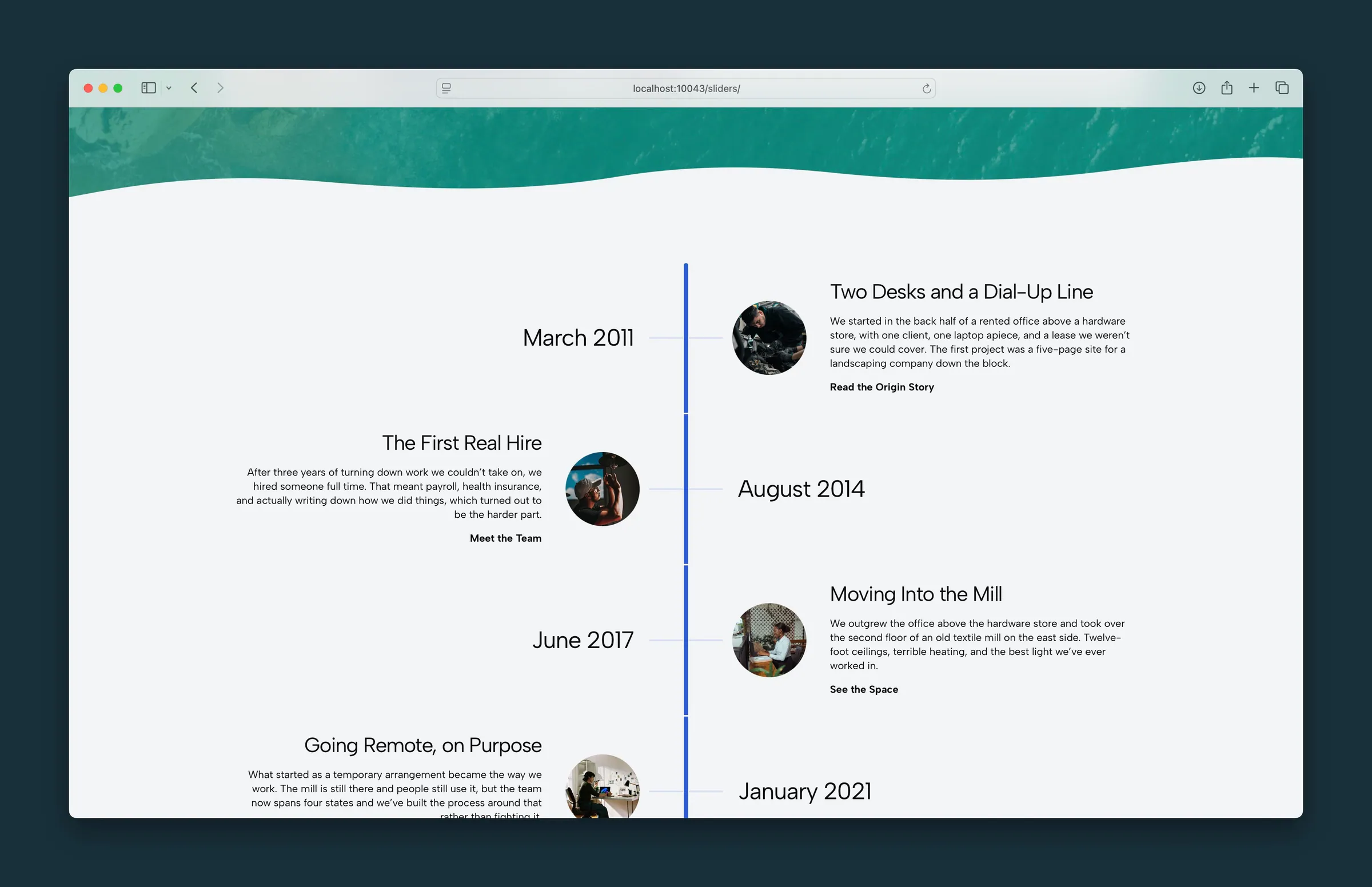
Timeline shows entries in order along a vertical bar. Use it for company history, project milestones, product releases, or anything with a clear order. Each entry has a Key label on the bar (usually a date, but it can be anything), a Title, body text, and an optional photo and link.
The block starts with three sample Timeline Card entries. Add more with Add Timeline Entry when the Timeline block is selected.
Entries aren't sorted by date. They show in the order you arrange them, so drag them in List View to reorder.
The timeline bar uses your site's primary color.
Parent and child blocks
The outer Timeline block holds one or more Timeline Card entries.
Select Timeline for the layout. Select a single Timeline Card to edit its key, title, text, image, or link.
Layout (parent)
Under Settings:
- Layout: Alternating (default) or Uniform
- Alternating: on screens 600px and wider, entries switch sides of the bar in a zigzag.
- Uniform: every entry sits on the same side, with more room for text and larger round photos.
On phones, entries stack with the key label turned sideways along the bar, and every other entry gets a subtle background band.
Entry fields (child)
Each Timeline Card has:
- Key: a short label on the bar, typed directly on the canvas. The placeholder suggests a date like "May 1999," but years, quarters, or version numbers work too.
- Title: the entry headline, edited on the canvas or in the Title sidebar field.
- Body: paragraphs and lists below the title.
Image (child)
An optional round photo beside the entry. Use Choose Image in the sidebar to add one.
Photos are cropped to circles and shown fairly small in Alternating layout, larger in Uniform. After choosing a photo, use Image Focal Point to keep the important part in the circle.
Link (child)
Add a Link URL in the sidebar to show link text below the body (default Learn More). Click the link text on the canvas to change it.
With a link set, Style appears:
- Understated (default): a text link
- Button: a button
Clear the URL to remove the link.
Block width
Timeline supports Wide and Full alignment from the block toolbar and starts at Wide.
Tips
- Choose Layout first. Uniform gives more room for photos and longer text.
- Keep Key labels short so they fit beside the bar on phones.
- For numbered steps joined by a line rather than dated milestones, use Step by Step.
Screenshots
Front-end
-
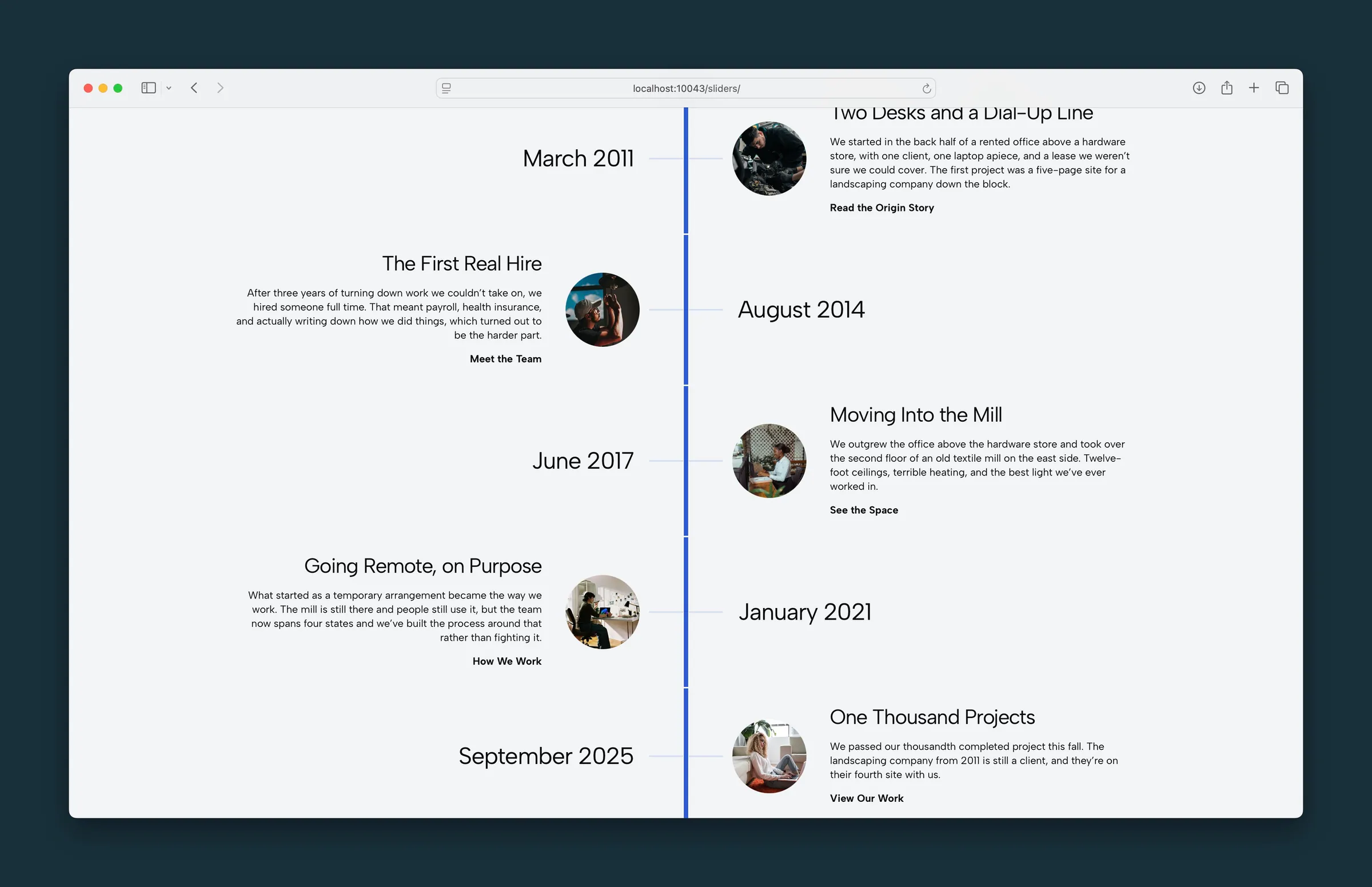
The full alternating timeline, from March 2011 through September 2025. -
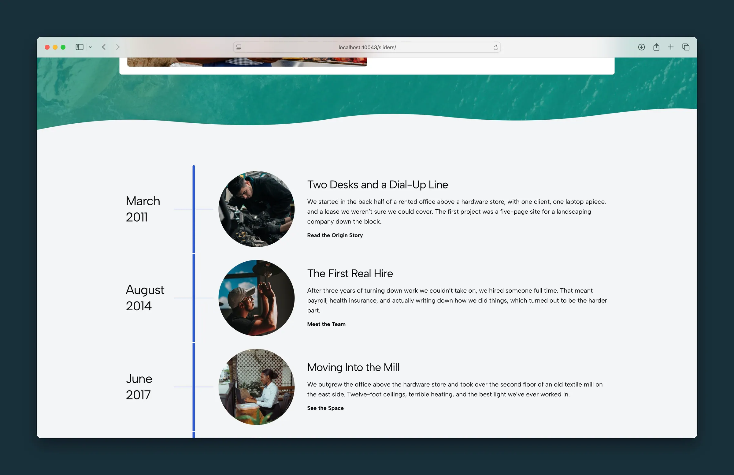
Uniform layout — dates on the left, photo and story on the right.
Editor
-
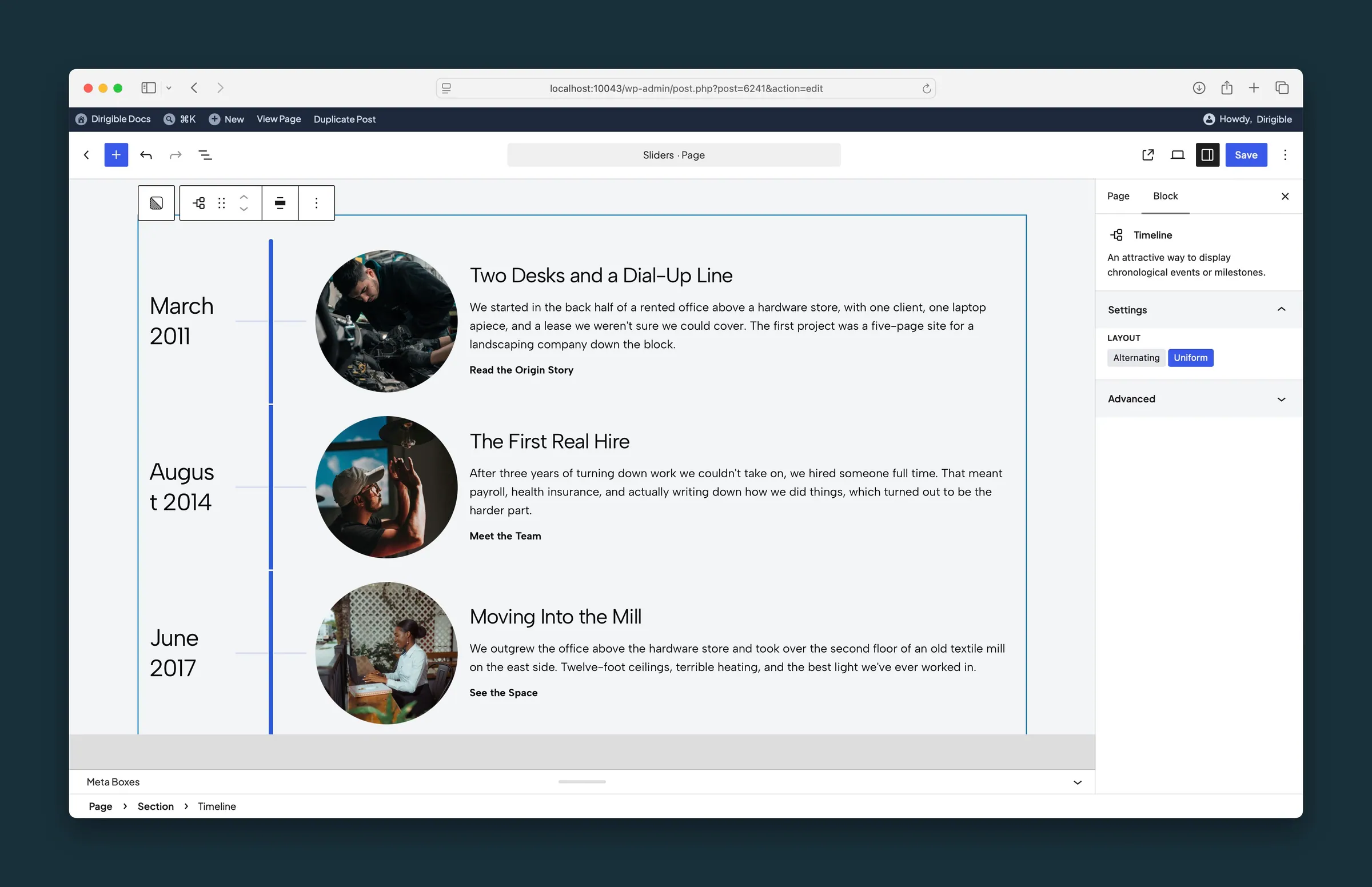
Timeline selected, with Layout set to Uniform. -
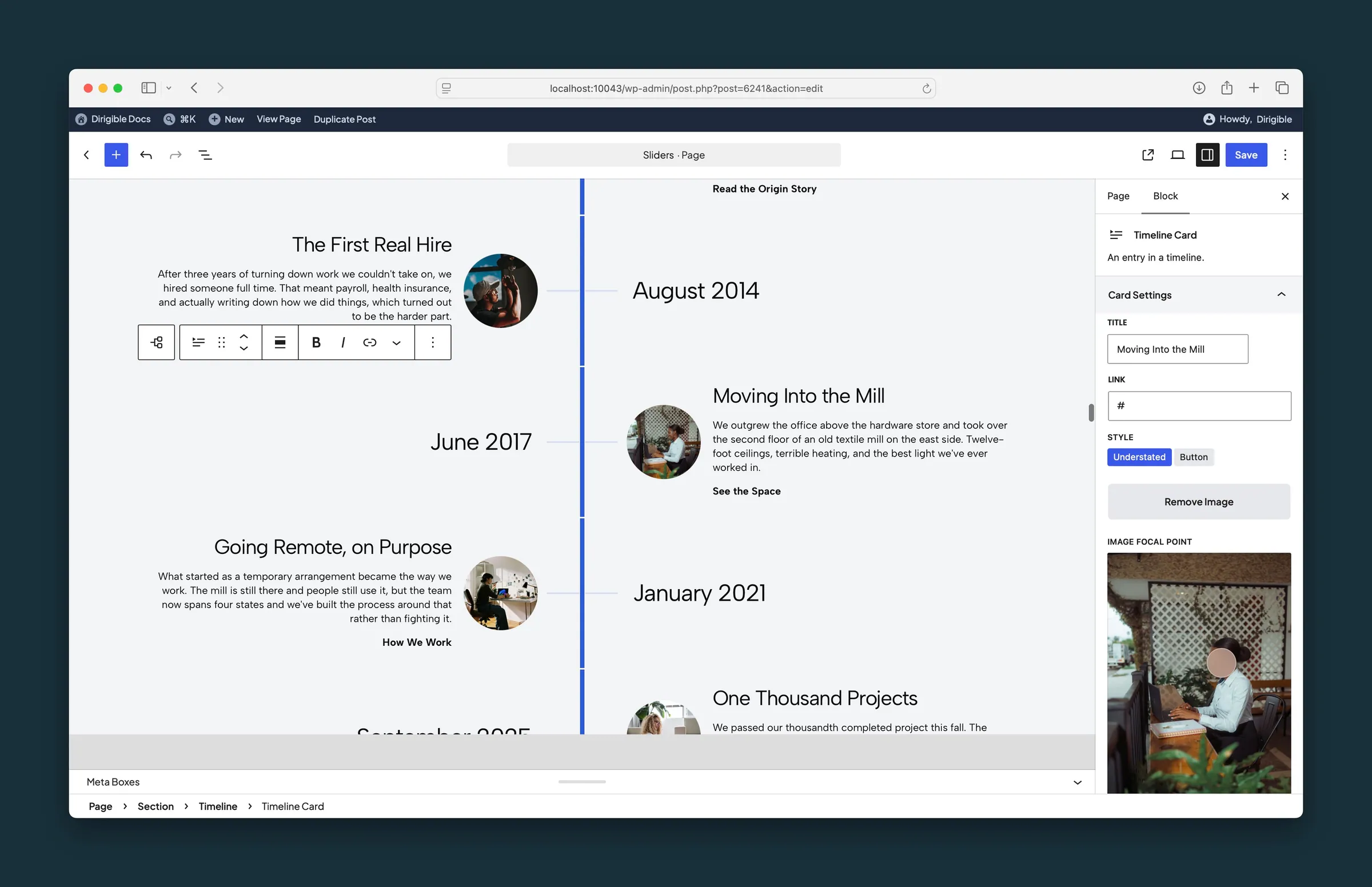
A Timeline Card selected — title, link, link style, and image focal point.
Settings
Settings
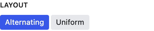
Alternating zigzags entries from side to side of the bar on wider screens. Uniform keeps every entry on one side, with more room for text and larger photos.
Card Settings
The event title. You can also edit it on the block.
Where this event links. Style appears after you add a URL.
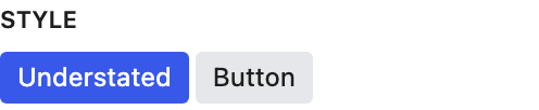
How the event link looks. Only appears after you set Link URL.
- Understated defaultA text link.
- ButtonA filled button.
Drag the dot to the part of the image that should stay in view. Appears after you choose an image. It follows the image's focal point from the Media Library until you move it here; after that it's this block's own.