Close Menu
  1. Landing Page

Landing Page

Create a standalone web page to direct your visitors.


Usage

A landing page is perfect for guiding your visitors to a specific campaign, content, or to take specific action. We’ve created a content block, called Landing Page, with this specific purpose in mind. Our Landing Page block is intuitive and sleek, allowing you to create a touchpoint page that can then be linked in your email, marketing, digital ad, or social campaigns.

Parent Settings

The parent block (named Landing Page in the editor) has the following settings. To access these settings, you must have the parent block selected.

Parent Block

This block consists of the parent Columns block two Column children. You’ll only be able to control block-wide styles from the parent block.

In general, the parent block will handle styling and block options that all the child blocks will inherit. While editing a child block, you’ll be able to change the block settings and content related to that child block only. For example, while editing a card in a Grid block, you’ll be able to change the headline and button link, but you’ll need to select the parent Grid block in order to change the number of cards in each row.

For this reason, you’ll often find yourself selecting the parent block of a child block. There are a couple really simple ways to do this.

While a child block is selected, the parent block will show up in the block control bar above it to the far left. Click it to quickly select the parent.

You can quickly traverse up the block tree by clicking on the path bar at the bottom of the page.

Open list view by clicking its icon in the toolbar to the top left of your page. From there, you can more easily navigate blocks on your page.

Show More Show Less

Block Width

Blocks can be set to one of three widths in the editor: Default, Wide, or Full. Blocks will interact with adjacent blocks differently depending on their width.

Adjusting Block Width

The block width setting is found in your block context bar, which will show up above the current block that you have selected. A block that supports the block widths will show its current width icon in the context bar, and clicking it will allow you to change the width.

If you have the Top Toolbar setting selected, the block context bar will always show at the top of your page, not at the top of your block.

Default Width

The default width of your content is determined by the value set in your Customizer. You can find this setting under Styles » Widths » Content Width. This is the default width of most text-based content and most blog pages. We recommend keeping this set so that your content retains maximum readability, which most studies agree is around 50-60 characters per line.

Wide Width

Wide width content will take up 75% of the available width on the page or the default content width set on your site—whichever is larger. In effect, this makes content take up more of the available screen real estate. When used in conjunction with other wide width blocks, you can shape your webpages in many different ways.

Full Width

Full width content will always take up 100% of the available width on the page. When placed next to default or wide width content, margin will be applied to the full width block to give it some room to breath. When two full width blocks are placed next to each other, however, they will suction together and form a cohesive unit with no margin in between them.

Show More Show Less

Background Color

Choose any color from your palette to create a background.

Choosing a Background Color

You can choose a color from the block sidebar that will fill your block with a background color. The color options presented here will be colors from your site’s color palette, which you can edit in the Customizer. When using a dark background color, be sure to toggle the Reverse Print option to make sure your text remains legible.

Show More Show Less

Reverse Print

Toggling reverse print will flip the colors from your standard palette to white, which increases contrast and readability when text is placed on dark backgrounds.

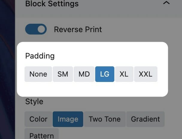
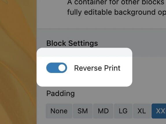
You’ll find the reverse print toggle in the block sidebar. Enabling reverse print will affect the block its enabled on as well as everything inside of it. If the block contains Inner Blocks, reverse print will cascade to all descendants.

We recommend using reverse print whenever a block has a dark background and using white text would increase its contrast. While you can set text color on core blocks like Headings and Paragraphs, we strongly recommend using the block-level reverse print instead. This way, you’ll be able to quickly toggle all the content if you change the background color in the future. All Inner Blocks will respect the reverse print setting, even those without color settings themselves.

To read more about contrast requirements on the web, visit here.

Show More Show Less

Text Style

The Text Style (sometimes called Headline Style) option controls the display of your text.

The Text Style (or Headline Style) will default to a different value depending on the block, but can be changed to any of the other available options. These styles are defined in your Customizer under Styles. For more information on changing your styles visit Customizing Styles.

One important thing to note is that this only changes how the headlines appear visually. The underlying html will be determined by the block that uses this features.

Show More Show Less

Background Image

Use a photo from your media library or upload a new one to use as a background.

Choose a Background Image

You can choose a background image in the block sidebar by clicking on the ‘Choose Photo’ button. You’ll be prompted to select a photo from your media library or upload a new one.

Once you’ve selected a photo to use as your background, new options will take the place of the one you used to select the photo. The first is a simple button to remove the image that you’ve selected, allowing you to start this over.

The second is the Focal Point selector. This tool allows you to select the most important point of your photo that your website will try to always keep visible. Because of the responsive nature of the web, images used as a background must stretch and cover the area when viewed on different device sizes, but this focal point allows you to keep what’s important in frame.

Set an Overlay

Whether you need to darken or tint an image to maintain the legibility of text on top of it or as a stylistic choice, there are many situations where you’ll want to add an overlay to your background image. The overlay tool in your block sidebar lets you choose a color from your palette (with the addition of pure black or pure white). The overlay opacity slider will determines how much overlay to apply to the background image, with 100% being solid color.

Select X as the overlay color to disable the overlay completely, or set its opacity to 0%.

Background Attachment

Some blocks allow you to set the background attachment. A background with Fixed attachment will remain anchored to the browser window as the user scrolls, creating a parallax effect.

Show More Show Less

Gradient Background

A smooth transition between two colors from your palette.

Choosing the Colors

Gradient backgrounds consist of two colors which you can choose from the block sidebar. The color options presented here will be colors from your site’s color palette, which you can edit in the Customizer. The end color has an additional X option for no color. This is useful for nested backgrounds, where you’d like the parent background to bleed through.

Make sure to toggle the Reverse Print switch if you are using dark background colors.

Gradient Direction

Controls the direction you’d like the gradient to go, from Start color to End Color. For example, with the lower right arrow selected, the End color will be predominantly in the lower right corner of the background.

Background Attachment

Some blocks allow you to set the background attachment. A background with Fixed attachment will remain anchored to the browser window as the user scrolls, creating a parallax effect.

In this way, nested backgrounds with one layer being a fixed background can yield interested results. Try it out!

Show More Show Less

Background Pattern

Use a repeatable pattern as a background.

Choose a Background Pattern

You can choose a background pattern in the block sidebar by clicking on the ‘Choose Pattern’ button. You’ll be prompted to select an image from your media library or upload a new one. This can be any image, but we recommend SVG (or PNG if SVG isn’t available) and we suggest using a pattern that repeats seamlessly.

Select a Background Size

The Background Size range field will scale the background pattern. Choose a size that looks good on both desktop and mobile.

The Background Size control in action. Be sure to select one that not only looks good, but also doesn’t get in the way of your content.

Set an Overlay

The overlay tool in your block sidebar lets you choose a color from your palette (with the addition of pure black or pure white). The overlay opacity slider determines how much overlay to apply to the background image, with 100% being solid color. With most patterns, you’ll be able to completely tint your pattern with an overlay color, so if you upload one pattern SVG file in black or white you’ll be able to use it in any of your site’s palette colors simply by using the overlay tool.

Select X as the overlay color to disable the overlay completely, or set its opacity to 0%.

Background Attachment

Some blocks allow you to set the background attachment. A background with Fixed attachment will remain anchored to the browser window as the user scrolls, creating a parallax effect.

Show More Show Less

Gradient Background

A smooth transition between two colors from your palette.

Choosing the Colors

Gradient backgrounds consist of two colors which you can choose from the block sidebar. The color options presented here will be colors from your site’s color palette, which you can edit in the Customizer. The end color has an additional X option for no color. This is useful for nested backgrounds, where you’d like the parent background to bleed through.

Make sure to toggle the Reverse Print switch if you are using dark background colors.

Gradient Direction

Controls the direction you’d like the gradient to go, from Start color to End Color. For example, with the lower right arrow selected, the End color will be predominantly in the lower right corner of the background.

Background Attachment

Some blocks allow you to set the background attachment. A background with Fixed attachment will remain anchored to the browser window as the user scrolls, creating a parallax effect.

In this way, nested backgrounds with one layer being a fixed background can yield interested results. Try it out!

Show More Show Less

Child Settings

The Child Settings for a Landing Page content block are your Links, and can be customized as follows:

Padding

The padding control changes the amount of space that’s given to the content contained within the block, adjusting how much the content is allowed to breathe within its container.

The padding control normally comes in predetermined step sizes, anywhere from None to XXL. The reason we use these predetermined step sizes is so your page can adapt intelligently depending upon which screen size your user is viewing your website on. For example, a LG padding setting will be smaller on mobile than it is on desktop.

There are occasions that this padding setting will appear as a range slider that allows your to choose a precise number for this setting. In these circumstances, your website will display the precise size you choose in this setting regardless of screen size.

Show More Show Less

Text Style

The Text Style (sometimes called Headline Style) option controls the display of your text.

The Text Style (or Headline Style) will default to a different value depending on the block, but can be changed to any of the other available options. These styles are defined in your Customizer under Styles. For more information on changing your styles visit Customizing Styles.

One important thing to note is that this only changes how the headlines appear visually. The underlying html will be determined by the block that uses this features.

Show More Show Less

Landing Page