

Blocks
Two blocks, side by side, each with alignment and background settings.
Usage
Blocks (listed as "Blocks" in the inserter) is a split-screen layout: two panels side by side on desktop, stacked on mobile. Each panel has its own background and text settings and can hold most Dirigible and core blocks.
Use Blocks when you want a two-column layout with different styling on each side — photo beside copy, color beside pattern, or two contrasting content areas — without building it from Columns yourself.
Most blocks are allowed inside each panel; only very complex blocks are left out. Drag blocks in from elsewhere on the page, or use the + inside the panel.
Parent and child blocks
The Blocks parent always contains exactly two Block children. You can't add, remove, or reorder the two panels.
Select the Blocks parent for column sizing, swap order, and split scroll. Select an individual Block child for background style, text alignment, reverse print, and inner content.
Use the parent button in the toolbar, breadcrumb path, or List View to jump between parent and child blocks.
Parent settings
- Block Sizes — five column width presets from larger-left through even to larger-right (toolbar icons or sidebar). Column proportions apply on desktop; sizing is independent of swap order.
- Swap Blocks — swaps the two panels on desktop (toolbar or sidebar). On mobile, the first panel always stacks on top.
- Scrolling — Default or Split Scroll. Split scroll pins content to the top or bottom of the screen as visitors scroll — desktop only.
Child settings
Select a Block child to style that panel:
- Text Color (reverse print) — light text on dark backgrounds, applied to everything in the panel. Also on the toolbar as White Text.
- Text Alignment — nine-position grid (upper-left through lower-right) that positions content within the panel and sets alignment on inner blocks. Right-aligned compositions revert to left alignment on mobile.
- Style — background type:
- Color — solid palette fill
- Image — photo with focal point and overlay color/opacity
- Pattern — repeating texture with overlay and Background Size scale
Inner content
Each panel accepts headings, paragraphs, buttons, images, galleries, grids, FAQs, counters, timelines, forms, and many other blocks. Edit content inline or add blocks with the + inside the panel.
Block width
Blocks supports Wide and Full alignment from the block toolbar and defaults to Full width. Full runs edge to edge across the screen; Wide uses your site's wide content width.
Deleting the block
Each parent has a fixed pair of child blocks — the editor will not let you delete a child on its own. Select the Blocks parent, then press Delete or choose Delete block from the ⋮ menu.
Tips
- Turn on Text Color (reverse print) on any panel with a dark background or heavy image overlay.
- Split Scroll works best when one side is short and the other is tall.
- Adjust Overlay Opacity on image backgrounds so headlines stay readable without hiding the photo.
Screenshots
Front-end
-
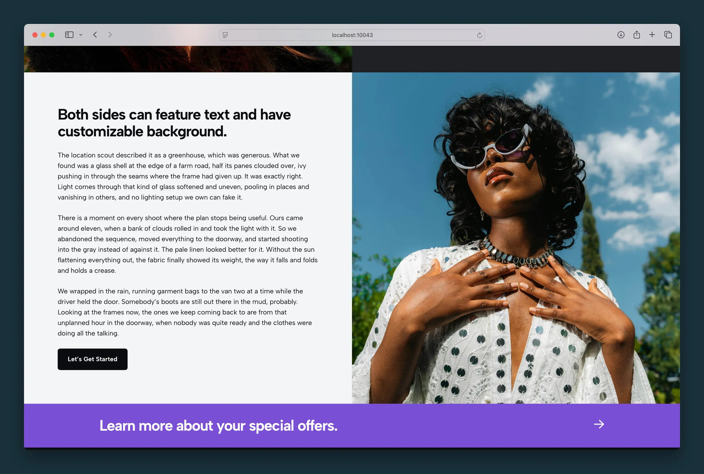
Text-and-CTA panel beside a full-bleed photo panel. -
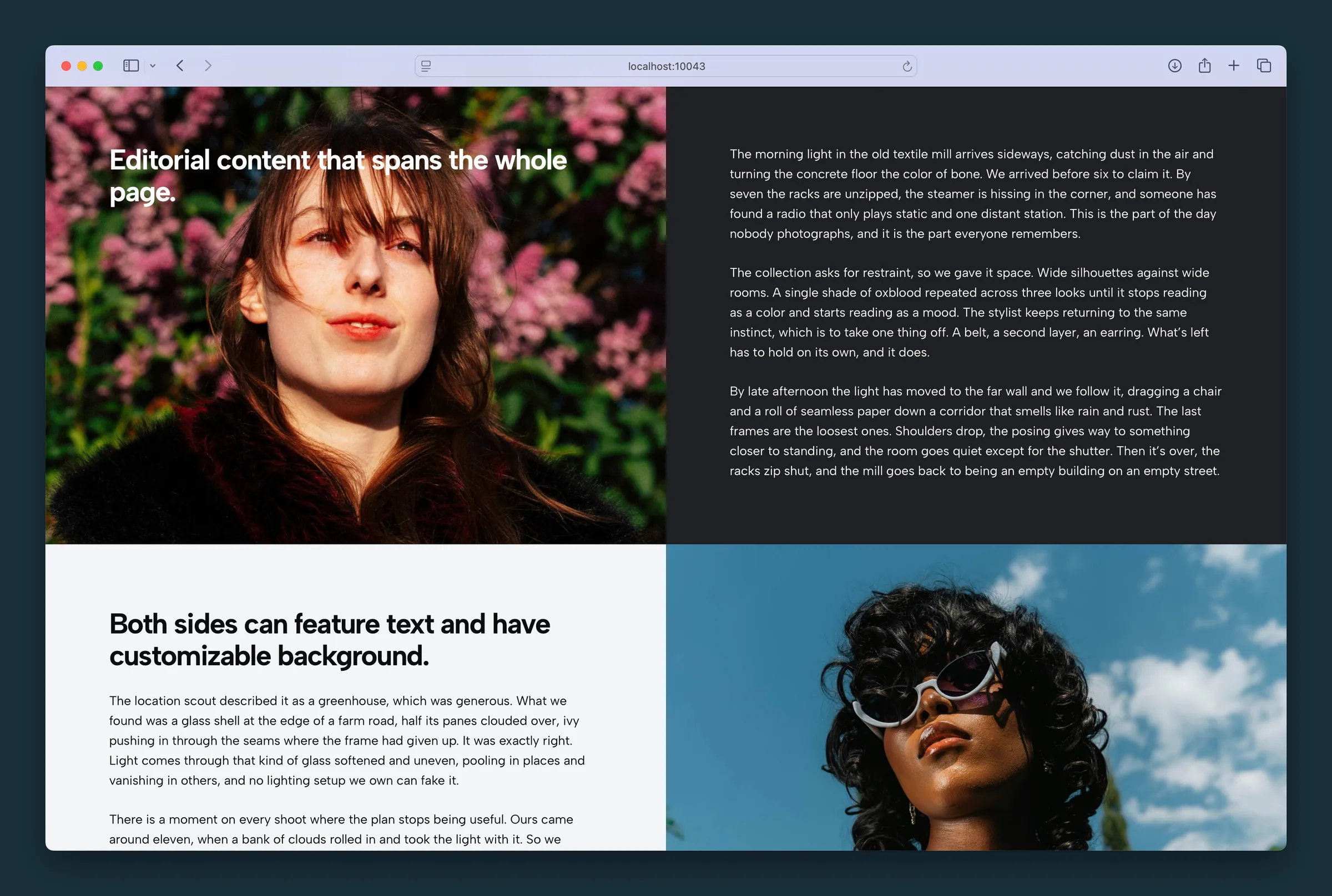
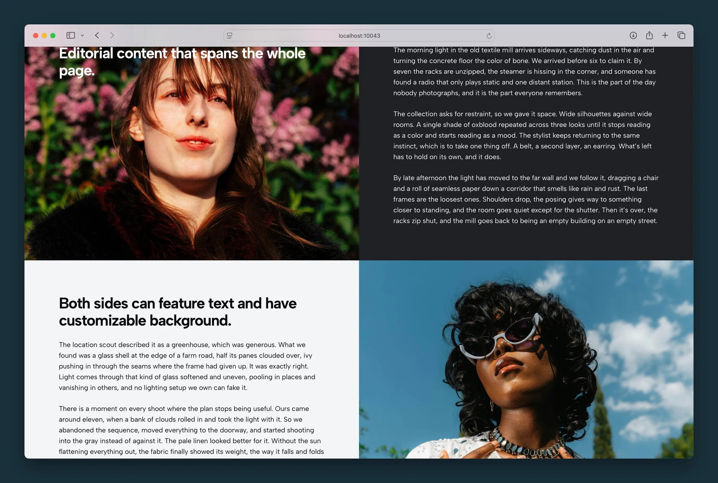
Two Blocks rows stacked — editorial image with overlay copy, then reversed text and photo.
Editor
-
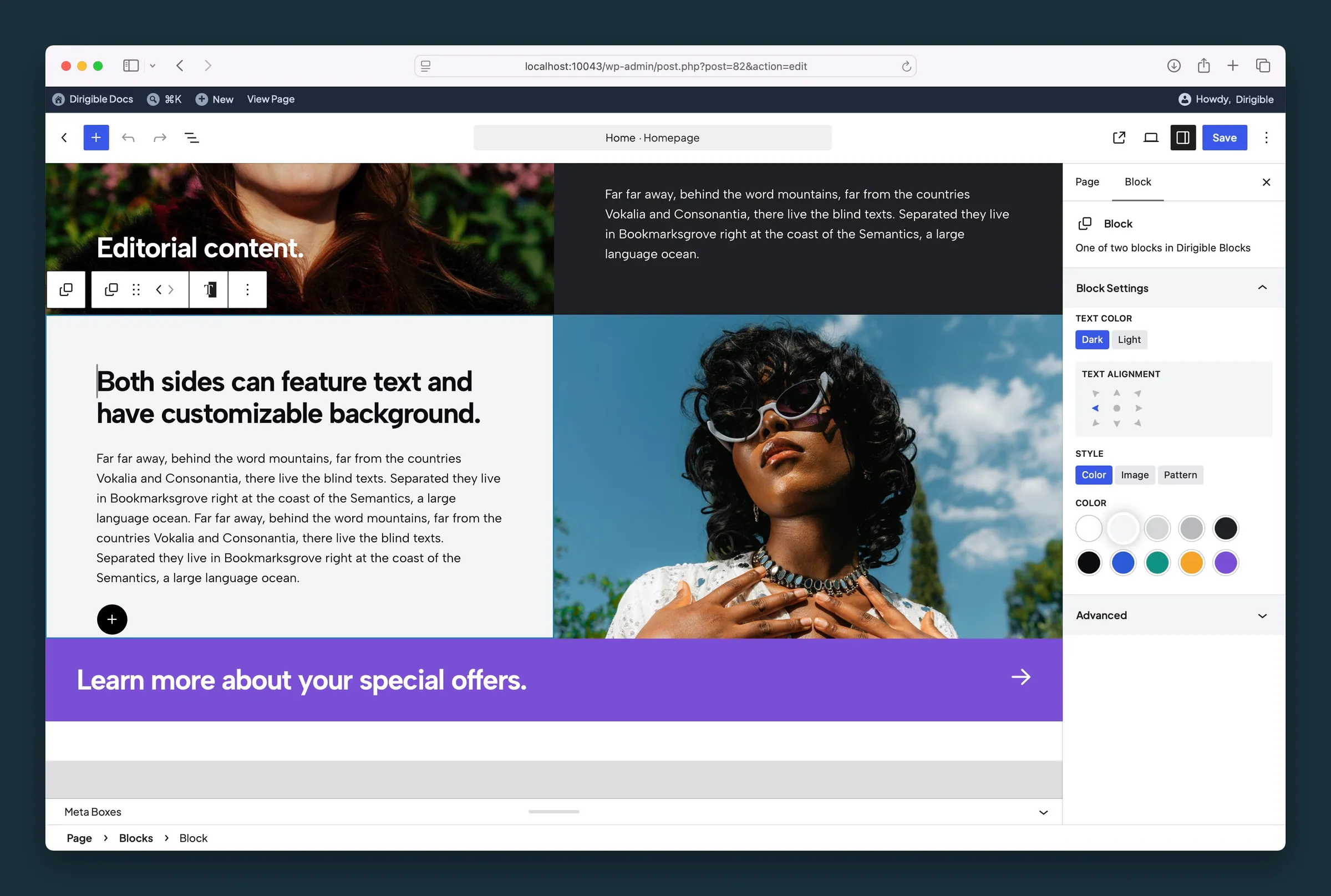
Child Block settings — text color, text alignment, and color background. -
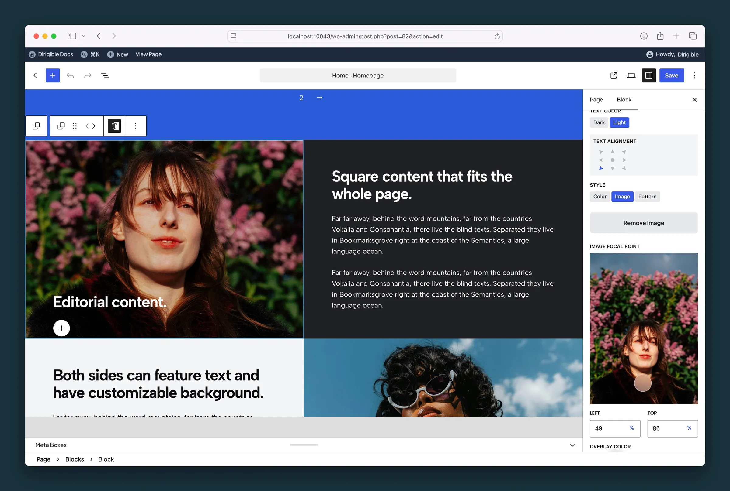
Image style on a child Block — light text, alignment, and focal point.
Settings
Layout
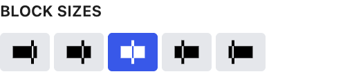
Column width ratio between the two panels — larger left, slightly larger left, even, slightly larger right, or larger right. Proportions apply on desktop and are independent of Swap Blocks.

Default scrolling or Split Scroll. Split scroll pins panel content to the top or bottom of the viewport while scrolling — desktop only.

Flips the two child panels on desktop. Column size presets refer to left/right proportions, not visual order after swapping.
Block Settings

Light text for dark backgrounds. Applies to everything in the panel, so you don't need to color each block.
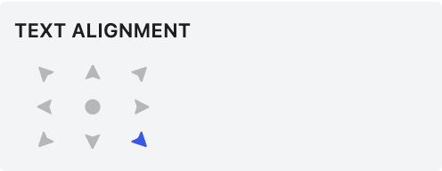
Positions content within the panel and aligns the blocks inside it. Right-aligned layouts switch to left on mobile.

Background type for this panel: solid color, image, or repeating pattern.

Background color for this panel, from your site palette.

Keeps the important part of the background photo in view when it's cropped. It follows the image's focal point from the Media Library until you move it here; after that it's this block's own.
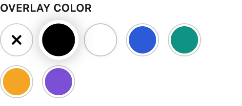
Tints an image or pattern background so text stays readable.
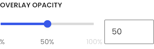
Strength of the overlay from transparent to solid.
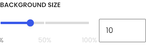
Scale of the repeating pattern background.