

Slider
A carousel of Hero and Section slides for banners, quotes, or features.
Usage
Slider is a carousel that holds Hero and Section slides. Because a Section can hold any other block, you can build a hero banner slider, a testimonial carousel, or a rotating set of features.
The block starts with two Hero slides. In the editor, the Slider moves between slides the same way it does on the site: use the arrows or dots, or swipe sideways on a trackpad, and edit the slide you're looking at. Autoplay never runs in the editor.
Don't put essential content on later slides. Most visitors never move past the first one.
Adding, removing, and reordering slides
- Add a slide: click + after the dots to add one at the end, or select a slide and click Add slide after this one (+) in its toolbar. The new slide is the same kind as its neighbour (a new Hero copies its neighbour's height), and the Slider moves to it.
- Add the other kind of slide: select a slide, then use the block inserter to add a Hero or Section after it.
- Remove a slide: select it and click Remove slide (trash can) in its toolbar, or choose Remove slide in the slide's ⋮ menu. A slide with content asks you to confirm first. Undo brings it back.
- From the Slider's own toolbar: Add slide after the one shown and Remove the slide shown act on the slide on screen.
- Reorder: select a slide and use Move left or Move right in its toolbar, or drag it in List View.
Selecting a block in List View, or undoing a change, brings its slide into view. If the editor shows the slides stacked one under another instead of sliding, update the Dirigible theme; the add and remove buttons work either way. On the site, an older theme shows only the first slide, without arrows or dots, until you update it.
Slides
Each slide is a full Hero or Section block with its own settings:
- Hero slides — headline, subheadline, button, background, height, text color, and so on
- Section slides — any blocks you like, with the Section's background and layout options
Every slide is as tall as the tallest one, so the page below never jumps as slides change. Shorter slides stretch to that height, so keep Section slides about the same height to avoid a lot of empty space on the short ones.
Slider settings
In Slider Settings:
- Autoplay — advances slides automatically
- Autoplay interval (seconds) — time between slides (1–10 seconds)
- Pause on hover — pauses autoplay while the cursor is over the slider
- Bottom Navigation — places the arrows and dots under the slides
Visitors can swipe, scroll sideways on a trackpad, click the arrows or dots, or use the arrow keys once the slider has keyboard focus. Dragging with a mouse doesn't move the slides. After the last slide, the slider loops back to the first.
When a visitor moves the slides (a swipe, the arrows, the dots or the keyboard), autoplay waits a full interval before the next slide. It pauses while keyboard focus is inside the slider or the browser tab is in the background, and it doesn't run at all for visitors who've turned on reduced motion in their device settings. Visitors can stop it with a small pause button at the bottom right, which appears when they hover over the slider or reach it with the keyboard (on phones and tablets it's always shown).
At the top of a page
A Slider of Hero slides at the top of a page works with seamless navigation the same way a single Hero does.
When navigation is set to Seamless in the Customizer, the header's text color follows the current slide. A Hero with boxed content on a background color switches the header to light text. As slides change, the header updates to match.
Block width
Slider defaults to Full width and also supports Wide from the block toolbar.
Tips
- Use the same text color on every Hero slide at the top of the page so the header stays consistent.
- Use Section slides for a testimonial carousel or content that isn't a classic hero banner.
- Turn on Pause on hover with autoplay so visitors can finish reading a slide.
- With autoplay on, slides don't replay their scroll-in animation each time they come back around.
Screenshots
Front-end
-

A slide change in progress — North Point giving way to the next hero, with arrows and dots. -

The North Point slide settled — headline, description, button, and dot navigation.
Editor
-

Slider sidebar with Autoplay on — interval and Pause on hover. -

Autoplay off, with Add Slide on the selected slide.
Settings
Slider Settings

Advances slides automatically on the live site. When a visitor moves the slides, it waits a full interval before the next one. It doesn't run for visitors who've turned on reduced motion in their device settings.

Places the arrows and dots under the slides instead of over them.
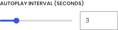
Seconds between slides when Autoplay is on (1–10).

Pauses autoplay while the cursor is over the slider.