Jump Nav
- Blocks
- Section
- Buttons
- Counters
- Blocks
- Comparison Table
- Columns
- Breadcrumbs
- Call To Action
- Landing Page
- Tabs
- YouTube
- FAQ
- Grid
- Hero
- Media Callout
- Site Preview
- Jump Nav
- Jump Link
- Link-in-Bio
- Logos
- Marquee
- Map
- Media and Text
- Photo Feature
- Posts
- Price List
- Quote Blocks
- Quotes
- Slider
- Structured List
- Socials
- Timeline
- Yearbook
- Vignette
- Video Gallery
Jump Nav
Allow users to quickly navigate between anchor points on a single page.
Usage
The Jump Nav works differently than other blocks. While you can still choose appearance options like Sticky and Color, the menu items are automatically generated from Jump Link blocks placed on your page.
The Jump Nav block will appear blank when inserted on a page that doesn’t have any Jump Links. In order to populate this navigation menu, you’ll have to insert a Jump Link at every point in the page you’d like your users to be able to navigate to. The text entered into each Jump Link will be inserted into the Jump Nav. The order of links in the Jump Nav is determined by the order it appears on the page.
These page navigation systems are really useful in a lot of situations, including:
- Pages that are very long with lots of content.
- Pages that you suspect your users might be looking for a specific, relevant section.
- Pages that you suspect users might want to quickly navigate between two sections, maybe for comparison or reference.
Of course, your use case may be any combination of these or a unique situation altogether.
Styles
While there are minimal styles for the Jump Nav block, you can edit the appearance of each link in the navigation in your customizer. The links are styled as <tag> elements, and so any changes you make to your <tag> style will cascade to any Jump Nav blocks used on your website.
Sticky
The Sticky toggle determines whether the Jump Nav will remain pinned to the top of your site beneath your main page navigation as the user scrolls between Jump Link anchor points.
Sticky enabled.
Sticky disabled.
Color
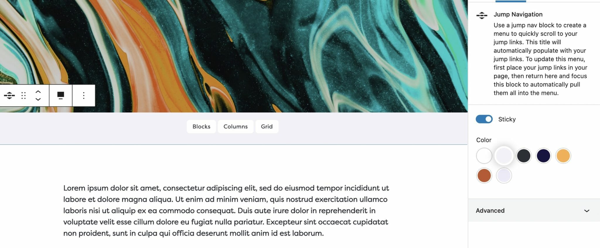
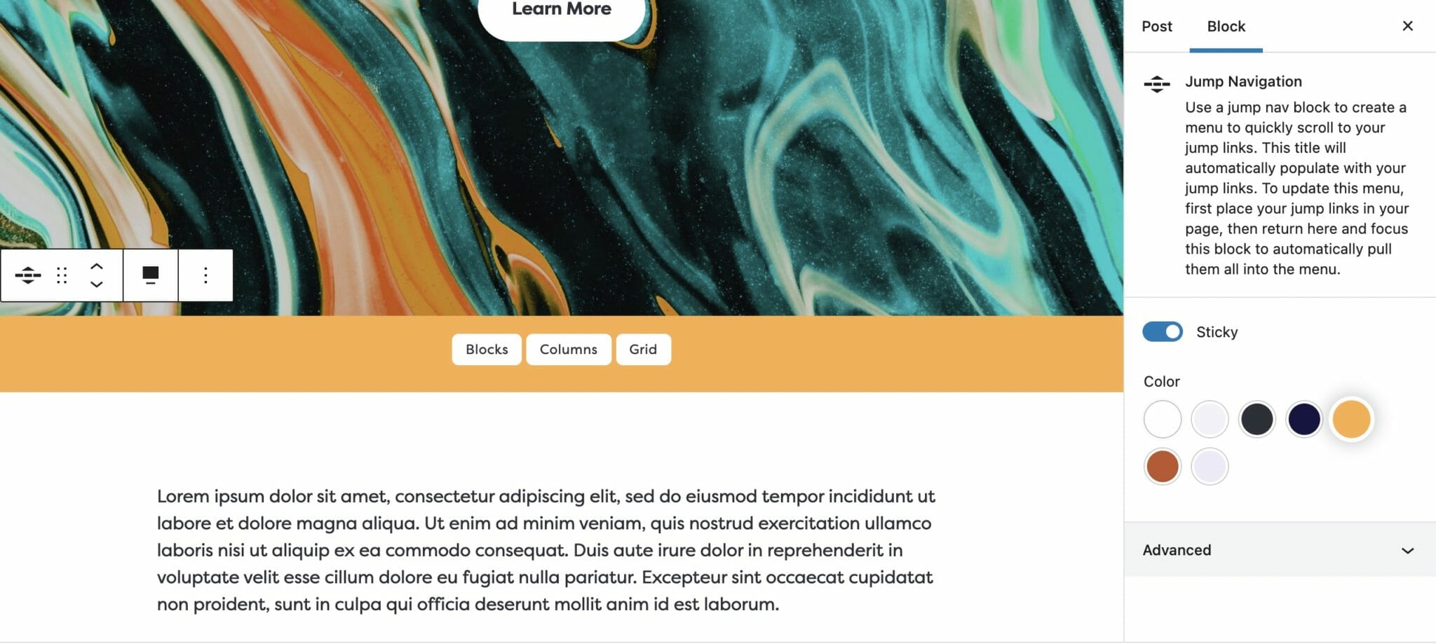
You can choose any color from your palette (set up in your customizer) for the Jump Nav background.
Note: There is no Reverse Print option provided for the Jump Nav because it takes its appearance from your <tag> styles, including the text and background color.

Gray background.

Yellow background.
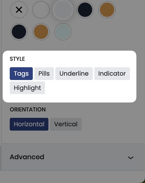
Style

Select a style for the Jump Links in your Jump Nav, there are five to choose from: Tags, Pills, Underline, Indicator, and Highlight.
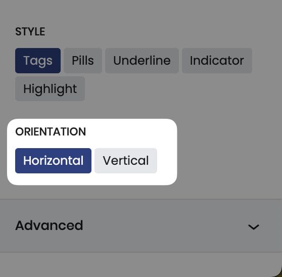
Style

Select whether you want you navigation menu to appear horizontally or vertically.
Tip: Vertical orientation pairs well when placing your content in columns (as can be seen in the demo here)