

Comparison Table
- Blocks
- Section
- Buttons
- Counters
- Blocks
- Comparison Table
- Columns
- Breadcrumbs
- Call To Action
- Landing Page
- Tabs
- YouTube
- FAQ
- Grid
- Hero
- Media Callout
- Site Preview
- Jump Nav
- Jump Link
- Link-in-Bio
- Logos
- Marquee
- Map
- Media and Text
- Photo Feature
- Posts
- Price List
- Quote Blocks
- Quotes
- Slider
- Structured List
- Socials
- Timeline
- Yearbook
- Vignette
- Video Gallery
Comparison Table
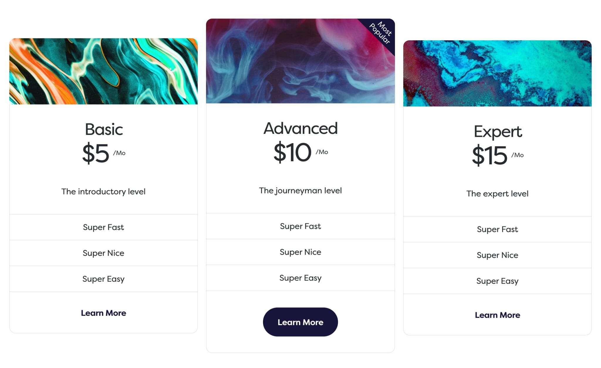
Show pricing tiers in an attractive, easy-to-use way.
Usage
Comparison Table is a container block that holds pricing tier children cards. These are displayed in a line on desktop and stacked on mobile. You can add as many cards as you’d like, but we’d recommend sticking to three or four.
The cards will expand to fit their content, so we recommend entering your content in a way that guides your users to your desired pricing tier, which is commonly put it in the middle. You can also use card styles to guide your users to the best choice.
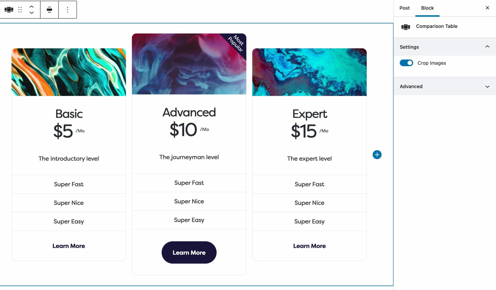
Parent Settings
The parent block (named Comparison Table in the editor) has the following setting. To access these settings, you must have the parent block selected.
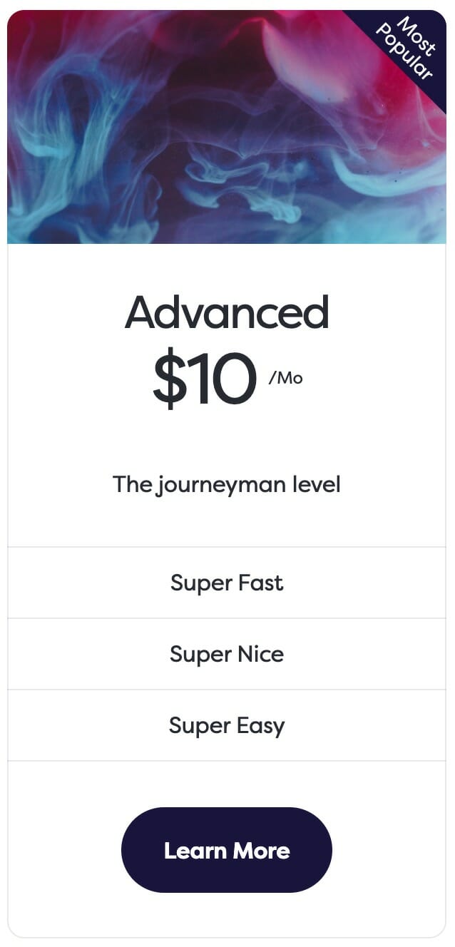
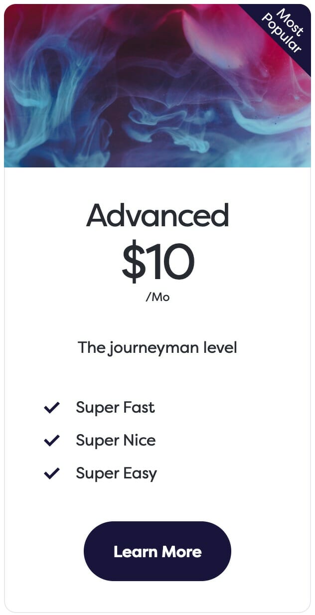
Crop Images
This setting defaults to enabled, and switches whether the background image in each tier card should cover the entire width of the card. As a general guideline, you would normally want to crop images when using photos and leave this disabled when using icons.
Crop Images enabled.

Crop Images disabled.
Child Settings
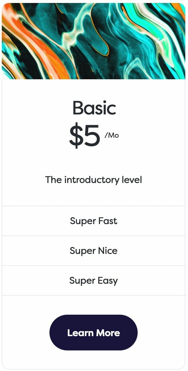
Each Comparison Table card can be styled independently from the others, but we recommend keeping them more-or-less the same. In this way, you will keep your cards easily comparable between each other, and any differentiators will provide cues to your users rather than distraction.
Style
There are three styles for tier cards, available in the block editor sidebar.

Default
Compact
Simple
Prominent
Enabling the Prominent toggle will change the subtle border around the card to your site’s primary color that you’ve selected in your palette.
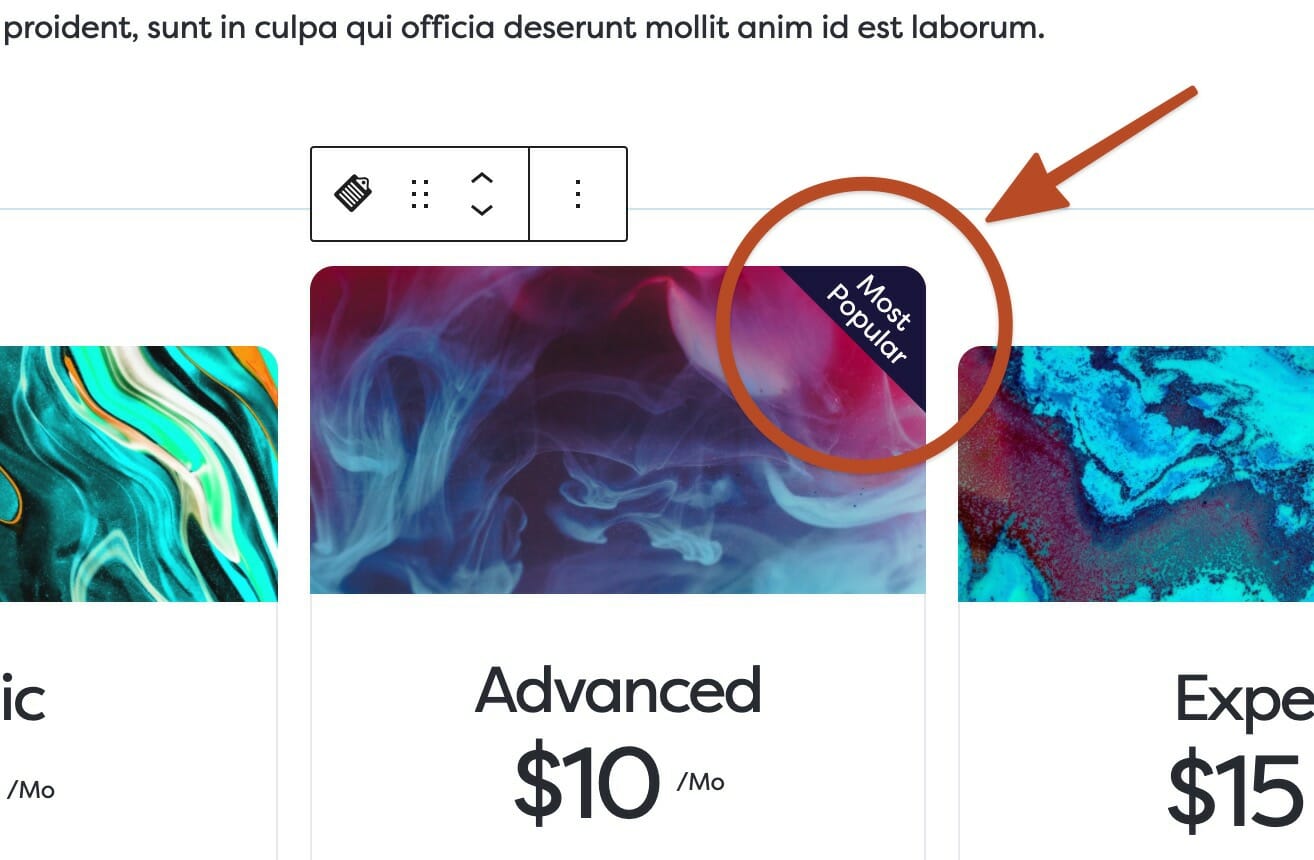
Flag
Flag is a text field that will add a banner to the upper righthand side of the tier card. This is designed to hold a brief prompt for users to guide them to a desired card.
Links
By entering a URL or choosing a page from your site in the Link field, a button will appear at the bottom of the tier card as well as a toggle in the sidebar for link Style. The two options are Button or Understated.
You can edit the text of the button by clicking into it and typing, just like how you edit the text of the Buttons block.
The Button link style.

The Understated link style.
Background Image
Choosing a Background Image will insert it at the top of the tier card. If a background image is selected, a new Size control will appear underneath, which will allow you to adjust the height of the image in pixels.
Note: The parent block’s Image Crop toggle will change how this is displayed.
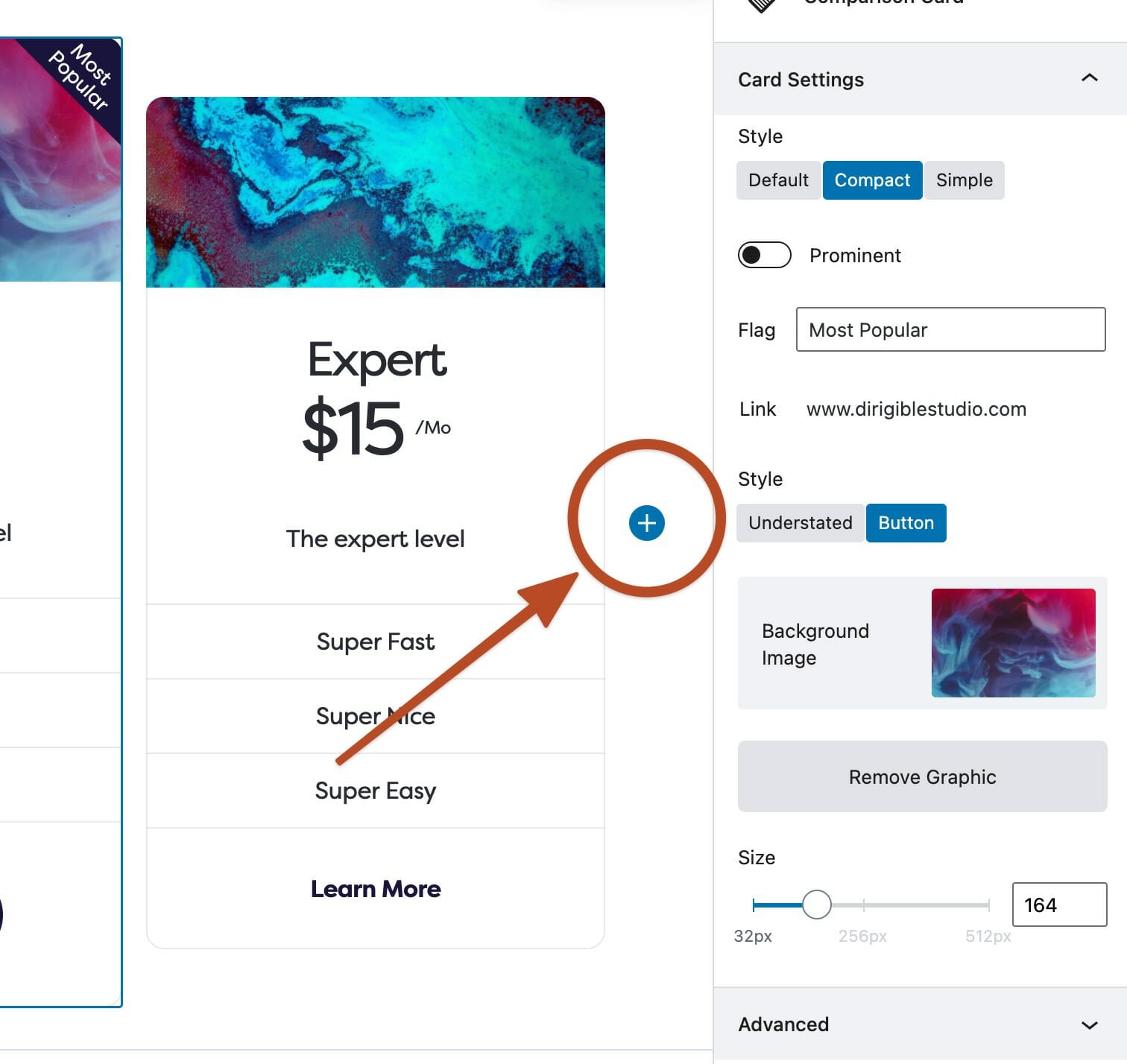
Inserting Tier Cards
While the Comparison Card block is focused, the block inserter + icon will appear at the right of the last card. This allows you to add more cards into this block.