Close Menu
  1. Media Callout

Media Callout

Showcase your media in a side-by-side layout.

Usage

The Media Callout is a simple, but effective web design element where organizing information and media collide. It allows for a seamless integration of media – such as images, videos, and recordings – while also presenting written content that is easy for users to engage with. 

Why it Stands Out 

The Media Callout block draws attention to a specific part of your page with its unique and flexible visual presentation of text and media. You can swap your blocks, manage the column sizes, and style the headline and paragraphs to appeal to your users. 

Utilizing media callout in your website will drive more engagement and create a user-friendly experience by keeping your users well informed. Additionally, the media callout block is a visually appealing and interactive design element that can take your website to the next level and keep users coming back for more. 

Content & Appearance Fields

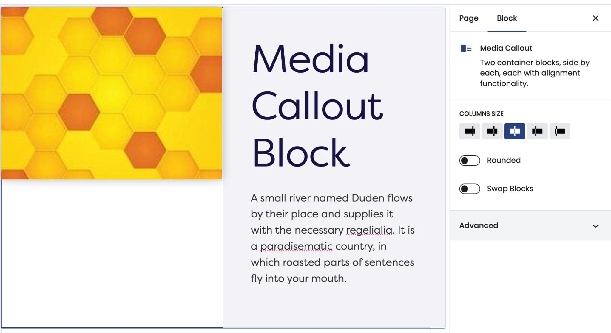
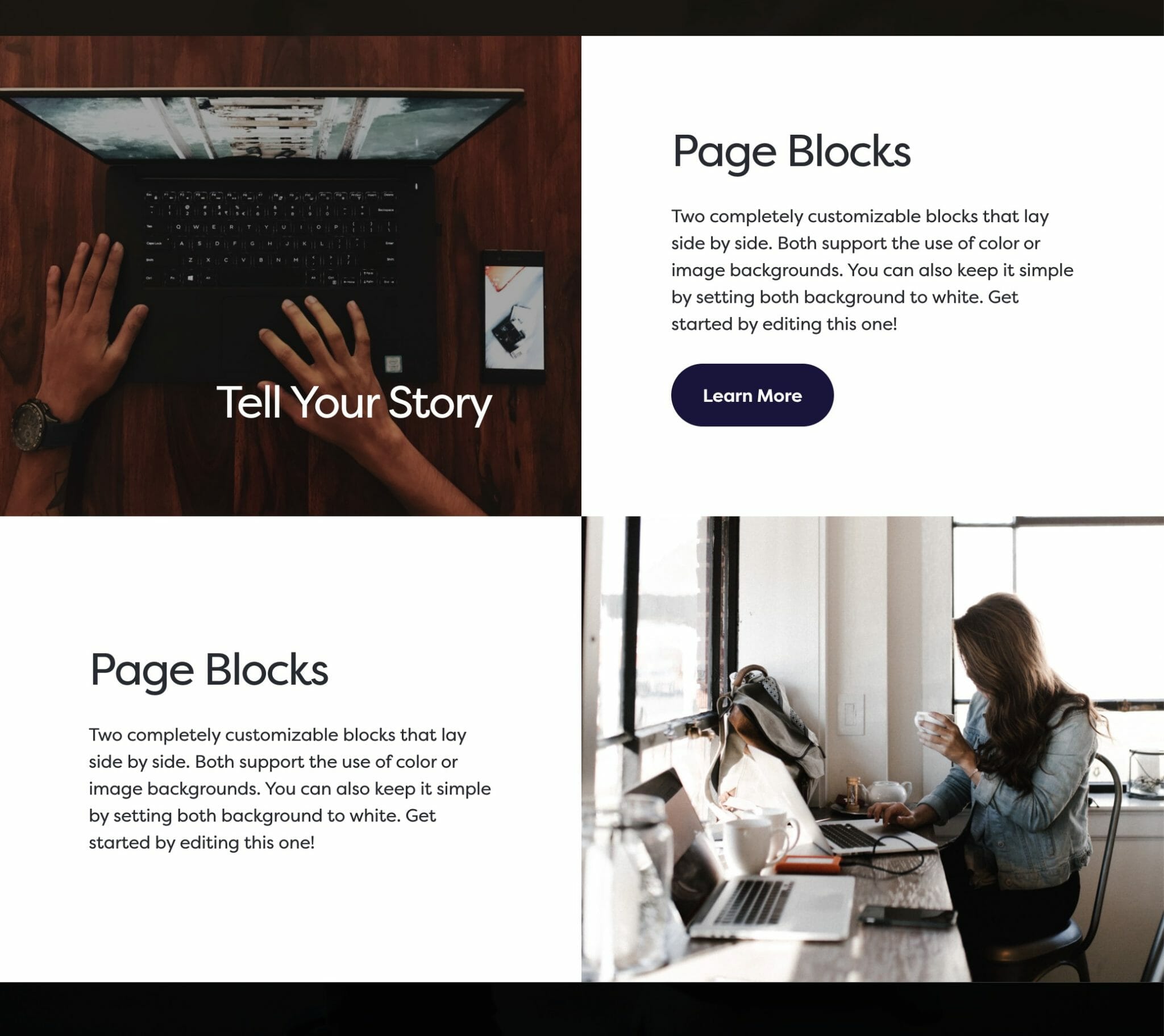
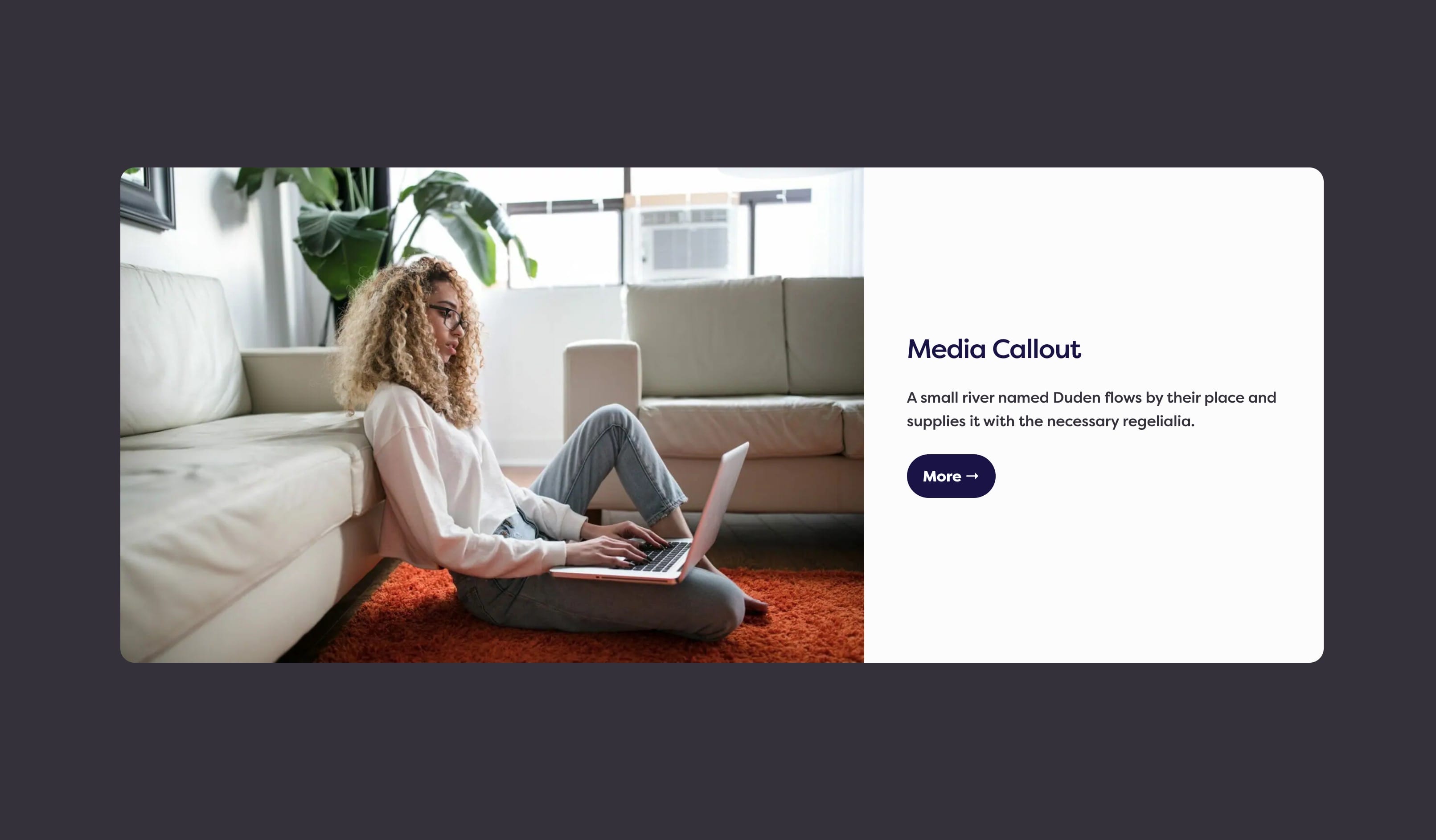
The Media Callout block consists of two container blocks (two columns), one with an Image and the other container block with a Heading and a Paragraph.

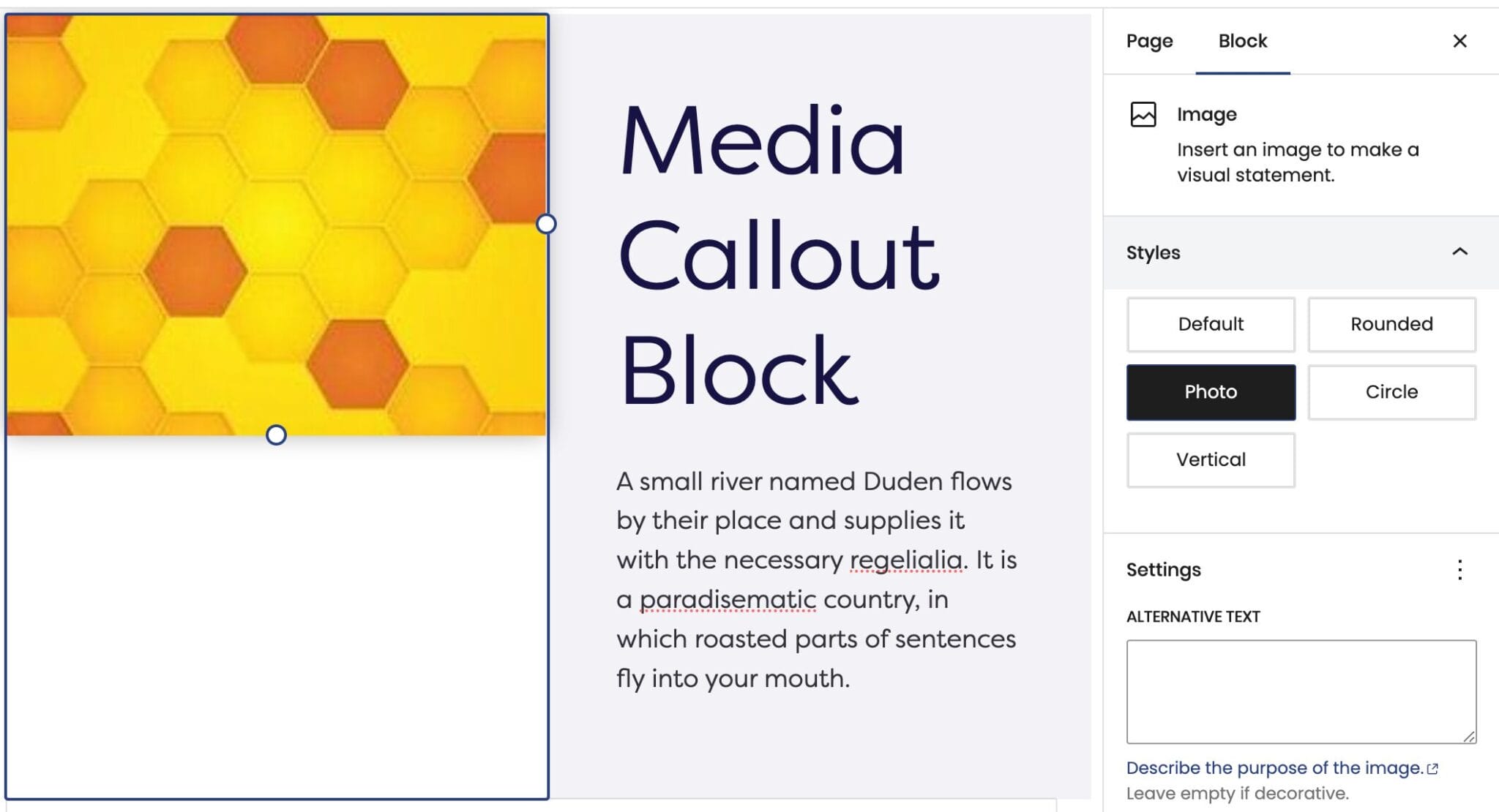
If you include an Image, a secondary Style field will appear. This will give you several options to choose from to find the layout that best fits your website’s design.

The second container block holds the copy that gives users context of the media that is presented. The Heading and Paragraph can be adjusted in various positions for a better information experience that will keep users engaged.

Explore the Reverse Print and Color fields to customize the media callout block and capture your audience at the first glance.

Block Width

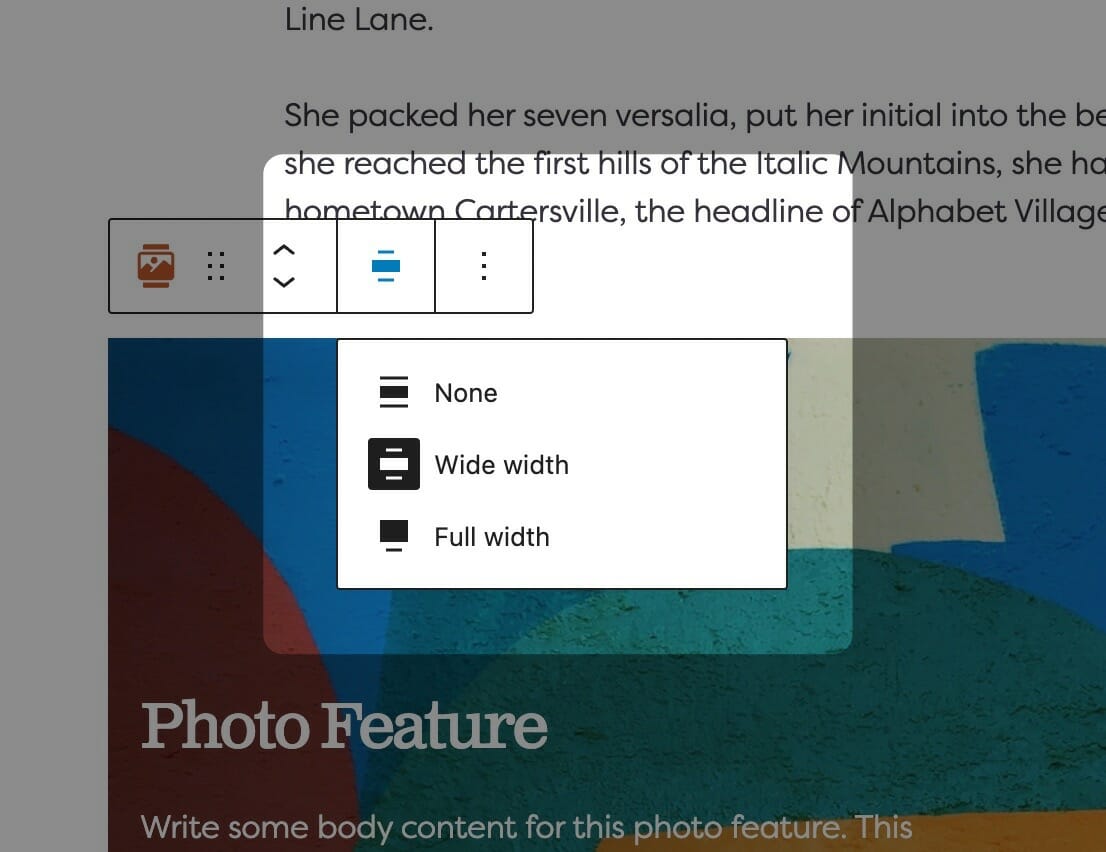
Blocks can be set to one of three widths in the editor: Default, Wide, or Full. Blocks will interact with adjacent blocks differently depending on their width.

Adjusting Block Width

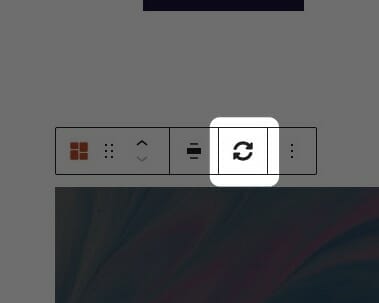
The block width setting is found in your block context bar, which will show up above the current block that you have selected. A block that supports the block widths will show its current width icon in the context bar, and clicking it will allow you to change the width.

If you have the Top Toolbar setting selected, the block context bar will always show at the top of your page, not at the top of your block.

Default Width

The default width of your content is determined by the value set in your Customizer. You can find this setting under Styles » Widths » Content Width. This is the default width of most text-based content and most blog pages. We recommend keeping this set so that your content retains maximum readability, which most studies agree is around 50-60 characters per line.

Wide Width

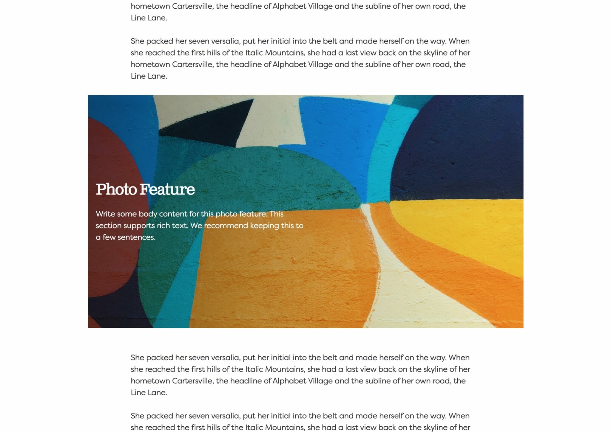
Wide width content will take up 75% of the available width on the page or the default content width set on your site—whichever is larger. In effect, this makes content take up more of the available screen real estate. When used in conjunction with other wide width blocks, you can shape your webpages in many different ways.

Full Width

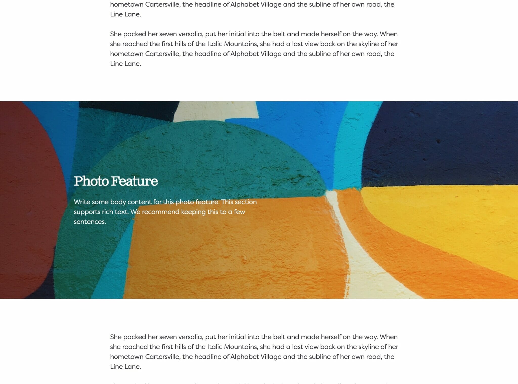
Full width content will always take up 100% of the available width on the page. When placed next to default or wide width content, margin will be applied to the full width block to give it some room to breath. When two full width blocks are placed next to each other, however, they will suction together and form a cohesive unit with no margin in between them.

Show More Show Less

Swap Blocks

Change the order of the blocks on desktop.

The Swap Blocks setting is used to change the order of the blocks on desktop and not on mobile.

This is an important distinction and can be used to control the flow of your website on mobile, giving your users the best mobile experience possible.

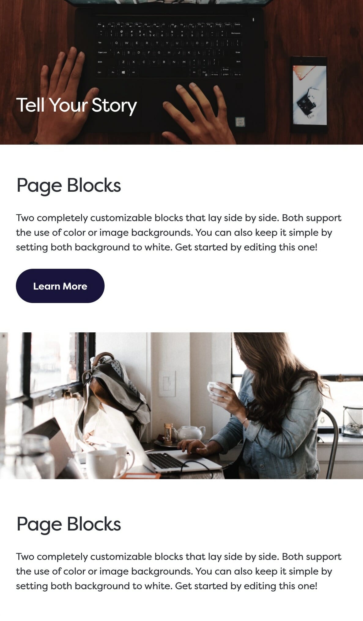
Even if Swap Blocks is enabled, displaying your media on the righthand side on desktop, the media block will still appear above your content on mobile.

Mobile swap blocks example.

Example mobile stacking.

The same blocks viewed on desktop. In this example, the second Blocks group has Swap Blocks enabled.

Show More Show Less

Reverse Print

Toggling reverse print will flip the colors from your standard palette to white, which increases contrast and readability when text is placed on dark backgrounds.

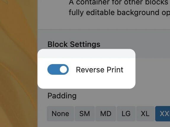
You’ll find the reverse print toggle in the block sidebar. Enabling reverse print will affect the block its enabled on as well as everything inside of it. If the block contains Inner Blocks, reverse print will cascade to all descendants.

We recommend using reverse print whenever a block has a dark background and using white text would increase its contrast. While you can set text color on core blocks like Headings and Paragraphs, we strongly recommend using the block-level reverse print instead. This way, you’ll be able to quickly toggle all the content if you change the background color in the future. All Inner Blocks will respect the reverse print setting, even those without color settings themselves.

To read more about contrast requirements on the web, visit here.
Show More Show Less

Block Text Alignment

Choose the text alignment of the selected block.

Choosing a Block Text Alignment

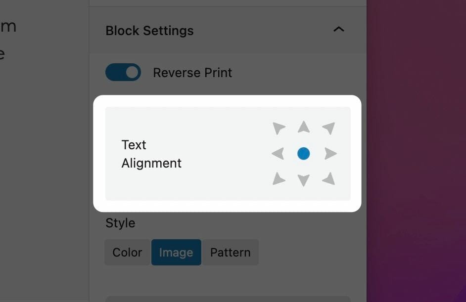
The text alignment option allows you to place your text anywhere inside of the child block. This is more useful than trying to control the alignment of each inner child block element, and is a combination of text position and text alignment. For example, setting the text to the lower right hand corner will not only position the text in the lower righthand corner, but also set right text alignment on all children.

Note: Because right text alignment is generally used compositionally on desktop, text set to be right aligned will automatically revert to left alignment on mobile to give your users the best experience.

Show More Show Less

Media Callout