Take your website to the next dimension with the Voronoi, a powerful design element that can be found almost anywhere in nature, art, and space.
Try out the Voronoi in your next web development project and embrace its captivating ability to distribute your content in an efficient and aesthetically pleasing design.
Usage
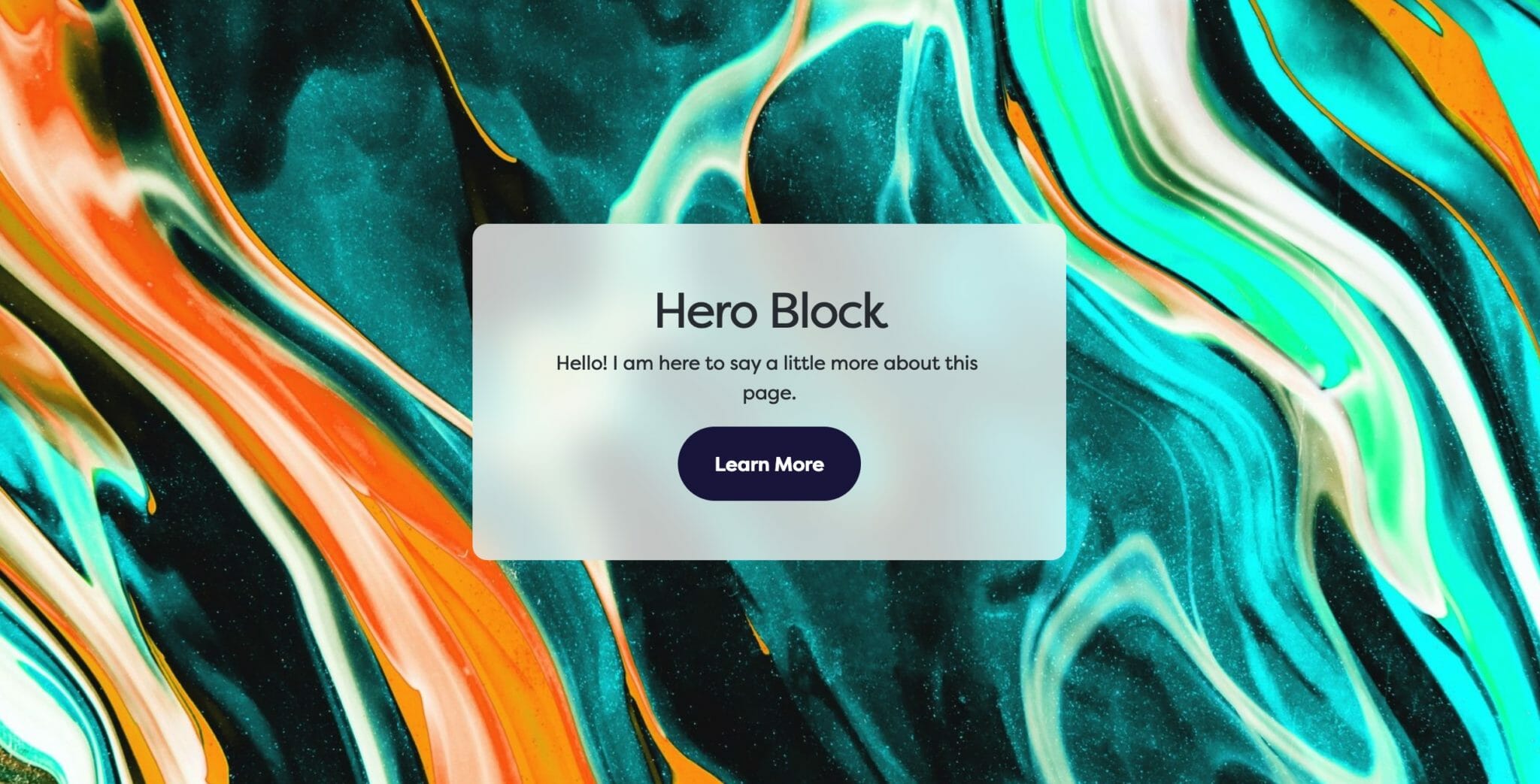
The latest addition to our Dirigible Blocks: the Voronoi block. We are leveraging the power of innovative design elements that enhance website designs by creating visually appealing layouts that are bound to capture the eyes of your users.
The Voronoi block adds a modern and elegant twist to your website design, bringing it to life by enhancing the versatility of your website’s layout.
Content Fields
The Voronoi block can have four different content fields, Regenerate BG, Headline, Subheadline, and Button Link. You can edit these inline or in the sidebar. If you delete a field (such as the headline field), it will remove it from the inline editor. You can always get it back by typing in the sidebar.
For these content fields, you can either edit them inline or in the sidebar. If a field is empty, it will be removed from block editor.
To regenerate a background’s design, simply click on the Regenerate BG field to refresh your background or layout with ease.
The Headline field is set in the page as an <h1> tag, and the Subheadline field is set as an <h2> to ensure semantic HTML structure.
If a Button Link exists, you can edit the Button Text by clicking into the default ‘Learn More’ text and typing. The button link field allows you to place a website link for a seamless user experience with the Voronoi block.
Appearance Fields
The Voronoi is an effective design element to layout your page and help give your users a lasting impression on what your website will consist of. We include a lot of appearance options for you to sculpt the Voronoi to fit your page, including Text Alignment, Style, Size, Reverse Print, Text Box, and Type.
The Type field allows you to toggle the background type for the block and works in the same way as the Background Block. The options include Color, Image, Pattern, or Video.
Block Text Alignment
Choose the text alignment of the selected block.
Choosing a Block Text Alignment
The text alignment option allows you to place your text anywhere inside of the child block. This is more useful than trying to control the alignment of each inner child block element, and is a combination of text position and text alignment. For example, setting the text to the lower right hand corner will not only position the text in the lower righthand corner, but also set right text alignment on all children.
Note: Because right text alignment is generally used compositionally on desktop, text set to be right aligned will automatically revert to left alignment on mobile to give your users the best experience.
Show MoreShow Less
Style
The Style option defaults to the Default headline style, where the <h2> subheadline field is displayed with the <p> style set in the customizer. If you choose the Large Headlines option, the <h2> subheadline field will display with the <h2> style set in the customizer.
Default
Large Headlines
Size
The Size switch sets the height of your Voronoi block. The height you choose determines the height on both mobile and desktop. When set to Auto, the voronoi will be the same as a Small voronoi on desktop but will expand to fit its content on mobile. When the Full Page Voronoi toggle is selected, the size is ignored and the Voronoi will automatically fill the entire screen.
Small
Medium
Large
Full Page Voronoi
Text Box
Improve the contrast of text on an image background.
Make your text readable.
The Text Box field wraps the block content in a container with a background applied. This will respect the setting of the Reverse Print field, swapping palettes depending on its setting. The colored text background will immediately produce contrast ratios that render the text legible against any type of background, often negating the need for use of the Overlay field.
Text box with reverse print enabled.
Text box with reverse print disabled.
Show MoreShow Less
Background Color
Choose any color from your palette to create a background.
Background Image
Use a photo from your media library or upload a new one to use as a background.
Background Pattern
Use a repeatable pattern as a background.
Choosing a Background Color
You can choose a color from the block sidebar that will fill your block with a background color. The color options presented here will be colors from your site’s color palette, which you can edit in the Customizer. When using a dark background color, be sure to toggle the Reverse Print option to make sure your text remains legible.
Choose a Background Image
You can choose a background image in the block sidebar by clicking on the ‘Choose Photo’ button. You’ll be prompted to select a photo from your media library or upload a new one.
Once you’ve selected a photo to use as your background, new options will take the place of the one you used to select the photo. The first is a simple button to remove the image that you’ve selected, allowing you to start this over.
The second is the Focal Point selector. This tool allows you to select the most important point of your photo that your website will try to always keep visible. Because of the responsive nature of the web, images used as a background must stretch and cover the area when viewed on different device sizes, but this focal point allows you to keep what’s important in frame.
Set an Overlay
Whether you need to darken or tint an image to maintain the legibility of text on top of it or as a stylistic choice, there are many situations where you’ll want to add an overlay to your background image. The overlay tool in your block sidebar lets you choose a color from your palette (with the addition of pure black or pure white). The overlay opacity slider will determines how much overlay to apply to the background image, with 100% being solid color.
Select X as the overlay color to disable the overlay completely, or set its opacity to 0%.
Background Attachment
Some blocks allow you to set the background attachment. A background with Fixed attachment will remain anchored to the browser window as the user scrolls, creating a parallax effect.
Choose a Background Pattern
You can choose a background pattern in the block sidebar by clicking on the ‘Choose Pattern’ button. You’ll be prompted to select an image from your media library or upload a new one. This can be any image, but we recommend SVG (or PNG if SVG isn’t available) and we suggest using a pattern that repeats seamlessly.
Select a Background Size
The Background Size range field will scale the background pattern. Choose a size that looks good on both desktop and mobile.
The Background Size control in action. Be sure to select one that not only looks good, but also doesn’t get in the way of your content.
Set an Overlay
The overlay tool in your block sidebar lets you choose a color from your palette (with the addition of pure black or pure white). The overlay opacity slider determines how much overlay to apply to the background image, with 100% being solid color. With most patterns, you’ll be able to completely tint your pattern with an overlay color, so if you upload one pattern SVG file in black or white you’ll be able to use it in any of your site’s palette colors simply by using the overlay tool.
Select X as the overlay color to disable the overlay completely, or set its opacity to 0%.
Background Attachment
Some blocks allow you to set the background attachment. A background with Fixed attachment will remain anchored to the browser window as the user scrolls, creating a parallax effect.