

Events
Usage
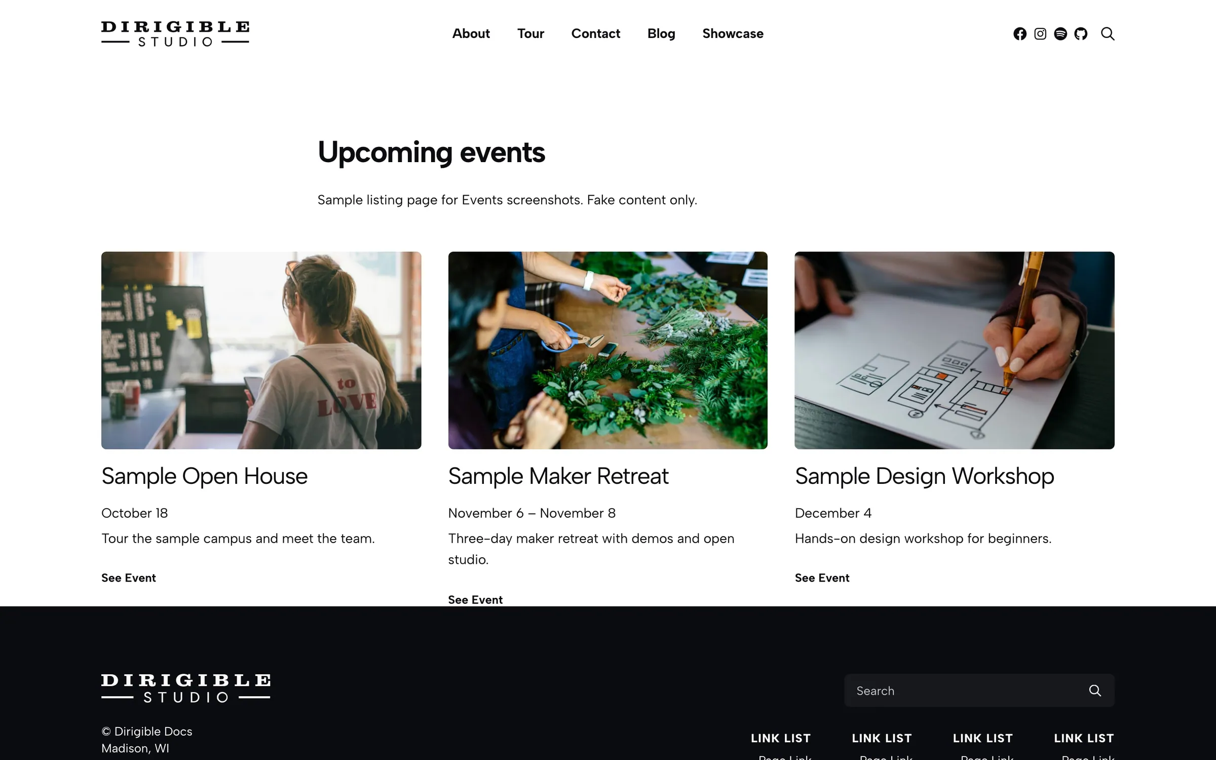
The Events block shows an upcoming-events list or card grid anywhere on your site. Pick List, Cards, or Mini, choose upcoming, past, ongoing, future, or all events, and optionally narrow it to certain Event Categories.
Use it for tour dates, class schedules, fundraisers, or conference agendas.
Real-world example
hangtenband.com/shows uses two Events blocks on one page:
- Upcoming Shows — Display set to Default (Ongoing & Future). When nothing is scheduled, the block says "There are no upcoming events at this time."
- Past Shows — Display set to Past, Display As set to Cards, Columns set to 4, Image hidden, Title Style at h4, Show Address on with City and State, and each event's Excerpt used for door times and lineups.
Each card links to a single event page with the full show detail.
Content
- Display — Default (Ongoing & Future) (default), Ongoing, Past, Future, or All. Past events sort newest-first; upcoming sorts soonest-first.
- Preferred Image — Featured Image (default) or the thumbnail from the event's Video URL
- Category — show only certain Event Categories; leave empty for all
- Limit Events — when on, show up to Events To Show (1–50, default 3). Leave off for a full tour history.
Appearance
- Display As — List (image + copy side by side), Cards (default, responsive grid), or Mini (compact grid)
- Columns — 1–5 per row for Cards and Mini (default 3)
- Title Style — text style for event titles
- Image — Default, Show, or Hide
- Image Aspect Ratio — golden rectangle, 1:1, 16:9, and more
- Excerpt — Default, Normal, Small, or Hide
- Link / Link Text — link style and label (default See Event). Set Link to Hide when the whole card is clickable.
- Spacing — vertical gap between items (XS through XL)
- Show Address — when enabled, choose Show Street, Show City (default on), Show State (default on), Show Zip
Front-end behavior
Each event's Starts and Ends dates decide which Display mode it falls under.
When nothing matches, upcoming blocks say "There are no upcoming events at this time" and past blocks say "There have been no past events."
Block width
Events supports Wide (default), Full, Center, and None alignment.
Tips
- For a tour page, stack an upcoming block above a past-shows card grid.
- Hide Image on dense grids and let the title, date, and city do the work.
- For a month grid, use Events Calendar. To promote one date, use Event Countdown.
Settings
Content
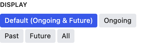
Default shows ongoing and upcoming events. For separate upcoming and past sections, use two Events blocks.
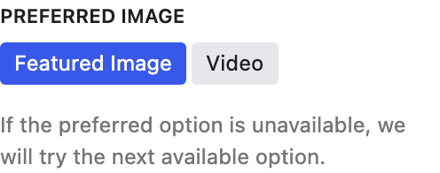
Choose whether each card uses the featured image or the video thumbnail first. If an event is missing one, the block uses the other.

Leave off to show every matching event.
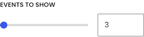
Appears when Limit Events is on.
Appearance
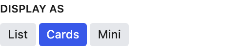
List puts the image beside the text. Cards is a grid. Mini is a compact grid for tight spaces.
Cards or Mini items per row.
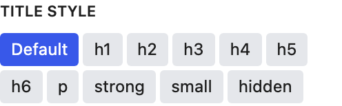
Mini lists often use Small or Hidden so the dates stand out.
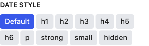
Mini uses Small by default. Pick a heading size when the date matters most.

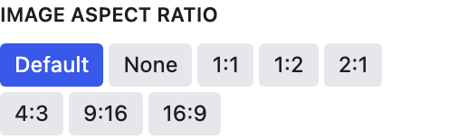
Crops event photos to one shape so cards line up. None keeps each photo's original shape.
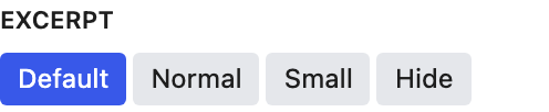
The excerpt is a good place for door times, lineups, or ticket notes.
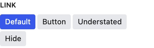
Hide the link when the whole card is already clickable.
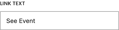
Default "See Event."

Makes the whole card clickable. The link text still shows unless Link is hidden.
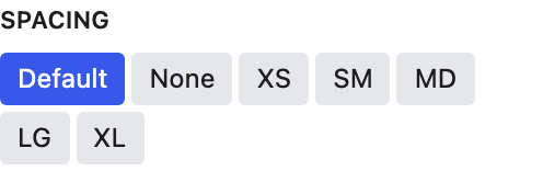
Space between events.

Shows the venue location under each date. City and state are often enough for tour dates.

Appears when Show Address is on.

Appears when Show Address is on.

Appears when Show Address is on.

Appears when Show Address is on.