

Knowledgebase: Editing
Best Practices for Website Headlines
Your headlines guide your visitors and search engines
Your headlines not only structure your content and guide your visitors, but also help search engines understand exactly what your site and its pages are about. Let’s walk through how to use headings properly on your Dirigible site so your content stays SEO-friendly.
Use Headings to Organize Your Content
Headings (H1 through H6) create a clear hierarchy that breaks your page into digestible sections. That helps both your readers and search engines scan your content quickly.
Here’s how to structure them:
H1: The Page Title
- Every page should have exactly one H1, and it should describe what the page is about.
- Example: If the page is about your photography services, a good H1 might be:
“Professional Wedding Photography in Madison”
H2: Main Content Section
- Use one H2 to introduce the main content area of your page.
- This creates a clean break between your title (H1) and the rest of the content.
H3–H6: Subsections
- Use H3s for key points under your H2.
- H4s go under H3s, and so on. However, most pages only need H1–H3.
- Don’t skip heading levels (e.g., avoid jumping from H2 straight to H4).
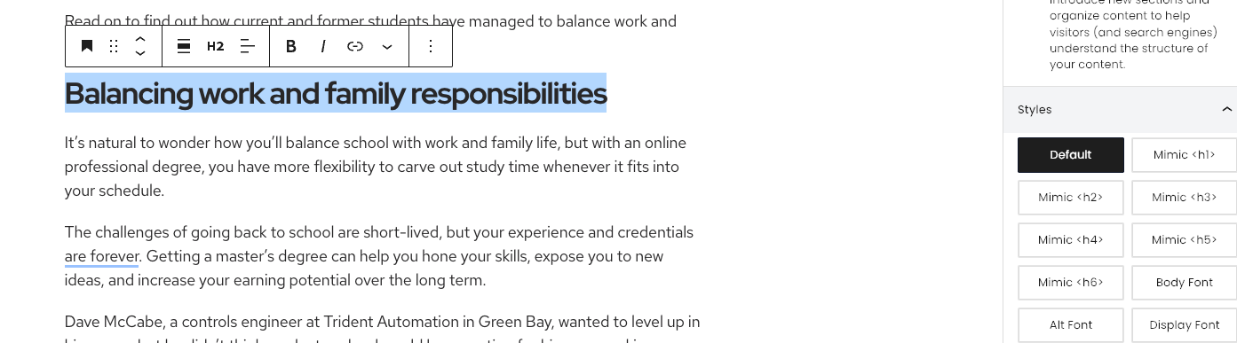
If you want a heading to look different but stay in the correct hierarchy, just use the “Mimic” style in the editor. This way, search engines still read the structure correctly.
Why Headings Matter for SEO and Readability
Proper heading hierarchy helps:
- Search engines to index your pages accurately
- Visitors skim your content more easily
A Quick Checklist Before You Publish
Before hitting “Publish,” run through this quick check:
- One H1 per page
- One H2 to introduce the main section
- H3–H6 are used in correct order (no skipping levels)
- If applicable, the Editor’s “Mimic” style is used appropriately to maintain the hierarchy
Getting this right improves user experience and gives your pages a solid SEO foundation.
Block Recovery
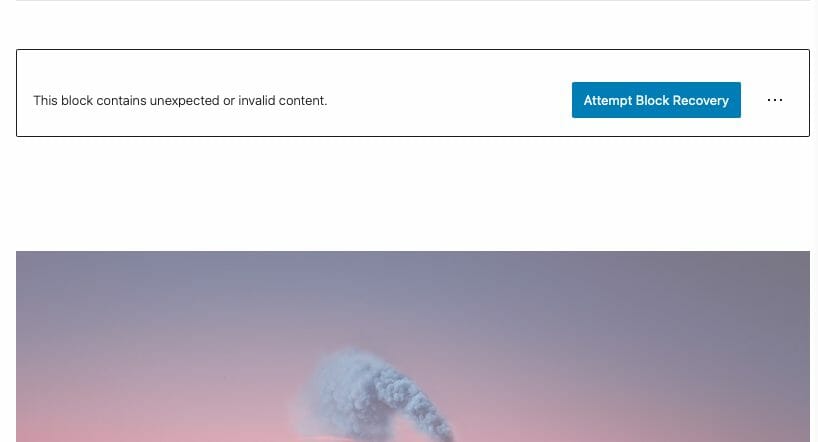
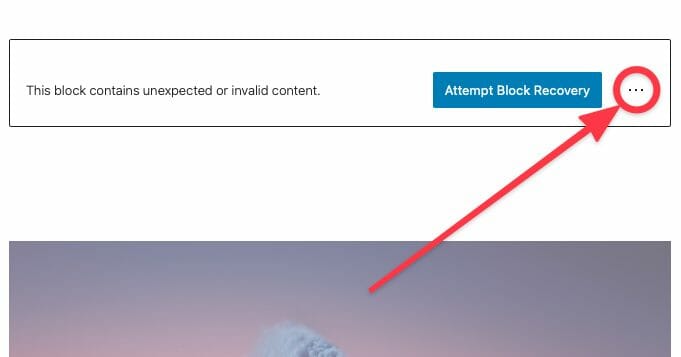
“This block contains unexpected or invalid content.”
Don’t panic! This is just a misbehaving block.
You’ve opened your editor, and a scary error message has popped up on your previously pristine page! “This block contains unexpected or invalid content.” can occur during content updates when custom HTML has been added to a block, either via block update or the Code Editor.
Another common cause of block validation errors is non-standard/poorly formatted ASCII content. We recommend not copy & pasting from editors like Microsoft Word. These editors often add sneaky characters that WordPress’ Gutenberg editor hates. If you absolutely must copy and paste– we recommend to do that from things like notepad, and other simple text editors.

Recovering a Block
Have no fear, recovering from most block errors is easy! In most cases, a block error is nothing to worry about and you’ll be able to solve it in a click.
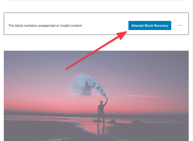
Attempt Block Recovery
In the right hand corner of the affected block, you’ll find a block recovery button. Click it and WordPress will take care of the rest!
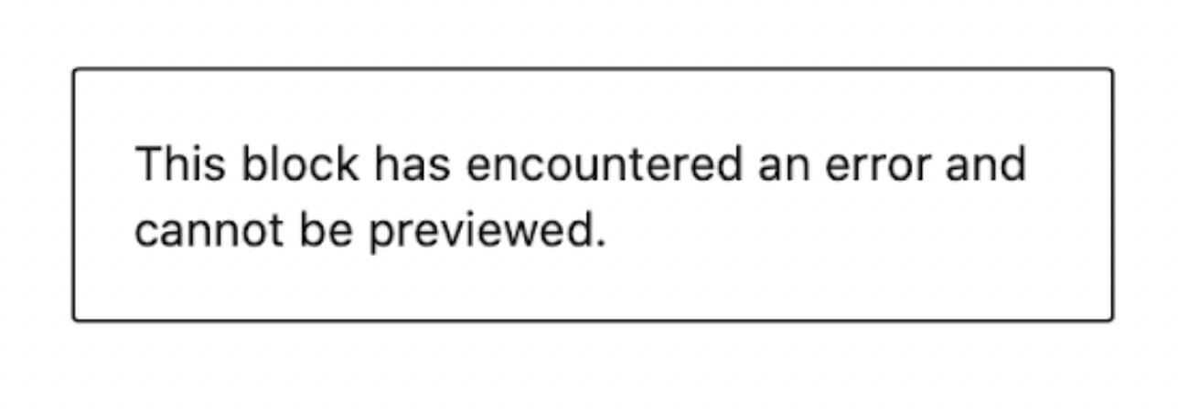
Really broken blocks.
In rare instances, a block might be so broken that WordPress doesn’t even give you an option to attempt block recovery. While this is worst-case scenario, remember that as long as you don’t delete this block, WordPress will never remove it from the front end of your site.
So what should I do?
Our recommendation is to use the frontend block as a reference to recreate the block in the backend. Make sure to do this before you delete the block so that you can continue to use it as a guide.
Advanced Recovery Options
There are a couple other options available when you run into a block error. However, these options are only recommended if you’re an advanced HTML and CSS user. With these options you lose much of what makes the Gutenberg editor so great!
Proceed with caution.
Convert to HTML
Block errors occur when Gutenberg is unable to make sense of the HTML that’s in your block. If you’re absolutely sure that what’s in there is supposed to be there, you can try converting the block to HTML. Once you’ve converted a block to HTML you cannot convert it back to it’s previous block type. If things don’t work out you’ll have to recreate the block from scratch!
In the right hand corner of the block, you’ll find the editor options menu hidden behind a ⋮ button.
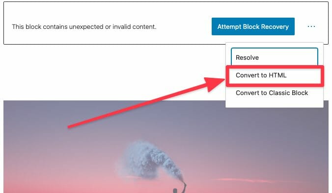
In the dropdown you’ll find the option to convert your block to HTML.
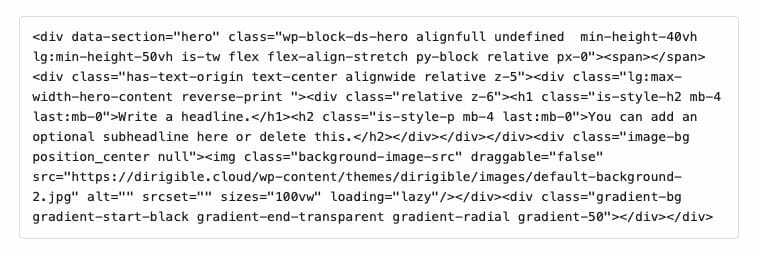
After conversion you’ll see the raw block HTML.
Creating a Mobile Menu
Dirigible has four menu locations:
- Main menu
- Footer menu
- Utility menu
- Mobile menu
If you are using the Dirigible Mega Menu plugin, or if you have a complex menu on your website, a simplified mobile menu can make your website more user-friendly on phones and tablets.
In the video below, Kindra takes you through creating a mobile menu for your website.
Hello! I’m Kindra from Dirigible, and today I’ll guide you through using and customizing the mobile menus on your website. Let’s get started:
- In the WordPress dashboard, you can access the menu editing options in two ways:
- Click on the ribbon menu under your website name and select “Menus.”
- Alternatively, go to the left-hand sidebar, open the “Appearance” menu, and choose “Menus.”
- In the “Manage Locations” section, you’ll see four available Theme Locations for your Dirigible site: Main, Mobile, Footer, and Utility.
- To customize the mobile menu, click on “Create New Menu” and give it a name, such as “Mobile.”
- Set the location of the newly created menu to “Mobile” and click “Create.”
- Now that you have the mobile menu created, you can add pages to it that will appear in the mobile version of your site. For example, you can choose “About,” “Contact Us,” and “Blog” pages.
- Once you’ve added the desired pages, click “Save” to update the mobile menu.
- If you go to your mobile window and refresh the page, you’ll see that the mobile menu has been updated with the selected pages.
- Remember that maintaining the mobile menu requires manual updates when you make changes to your main menu. If the main menu and mobile menu have similarities, you must update both menus accordingly. This means adding, deleting, or modifying menu items in both menus.
That’s it! You’ve learned how to create and customize the mobile menu for your Dirigible site. If you have any further questions, feel free to get in touch with us or visit support.mydirigible.com for more information.
I hope this tutorial was helpful to you. Have a great day!
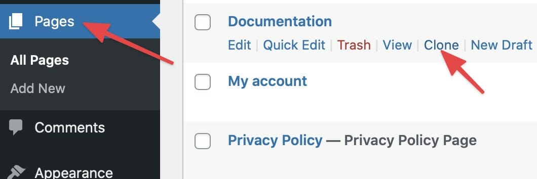
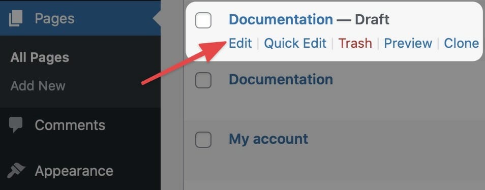
Duplicate Page to Publish Later
Need to make edits to a page but publish them at a later date? Easy, clone it.
To create a duplicate page to publish later, from your dashboard, navigate to Pages and select Clone under the page you wish to copy. Your cloned page will appear as a draft.
Until you are ready to publish your new page, make your changes and continue to save the cloned page as a draft.
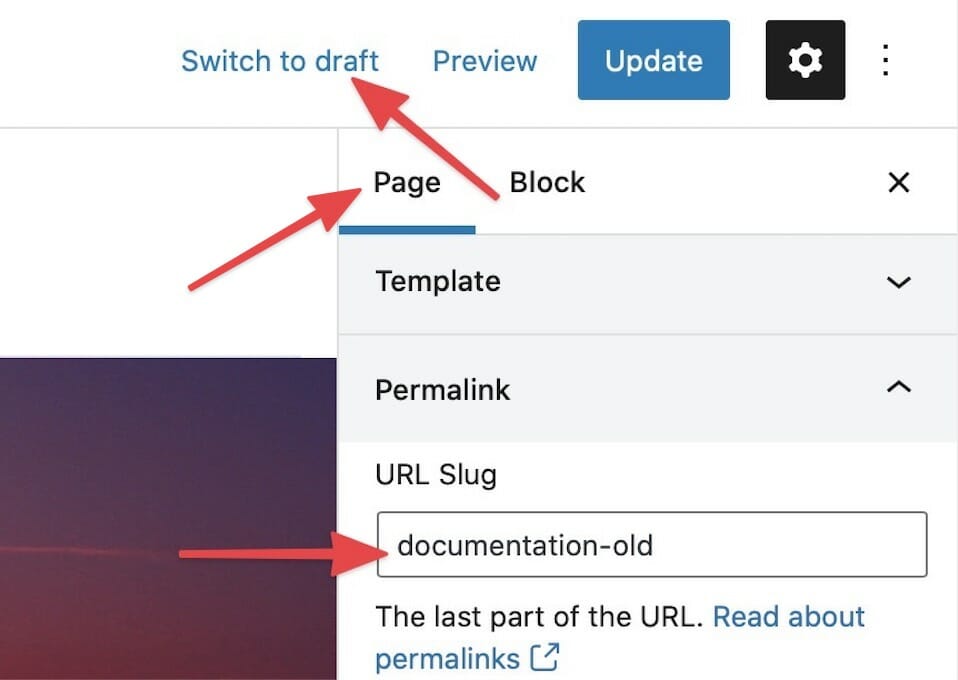
When you are ready to publish…
When you are ready to launch your new page, you’ll want to make some changes to the original page first.
From the settings menu in the page editor, change the original page’s permalink by adding -old to the end of the URL slug. Then, save the change and switch the page to a draft by clicking Switch to draft.
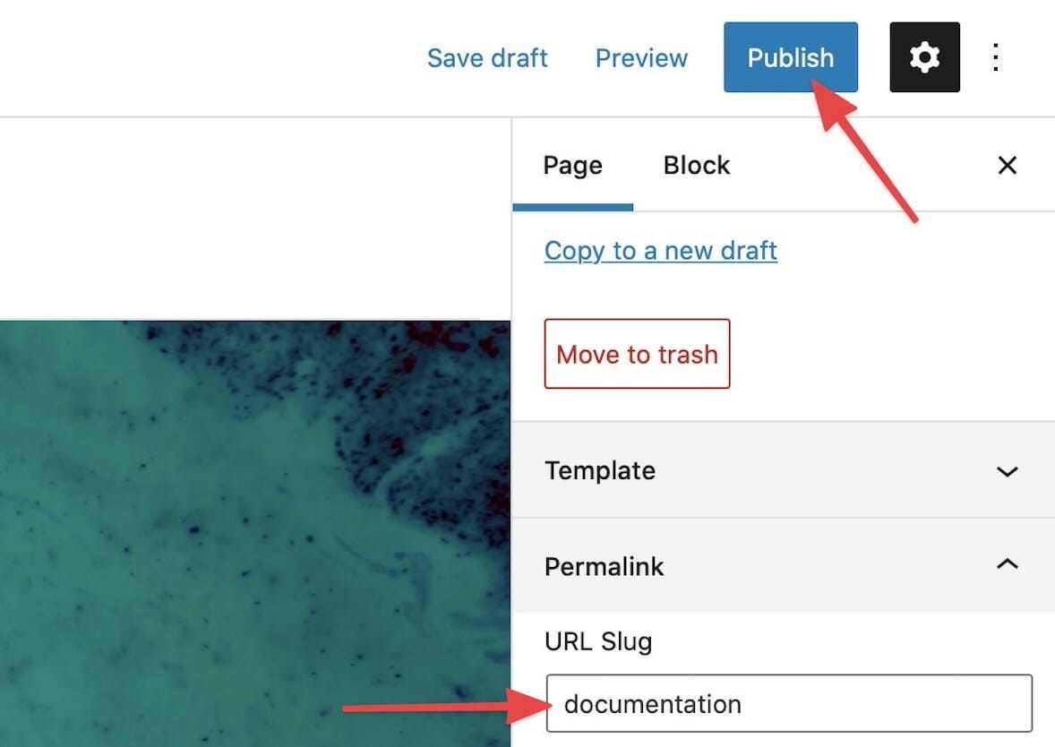
After updating the original page, you’ll want to change the URL slug of your new page to match the old page’s original permalink. Then, save your change and launch the new page by clicking the Publish button.
Gravity Forms Looks Weird
The forms on Dirigible are created using Gravity Forms, a powerful WordPress plugin.
A major update in 2021 can cause a conflict with the way the forms appear. If your forms look a bit off, just navigate to the form settings and make sure that “Enable Legacy Markup” is unchecked. Please note, this setting is a form setting. This means that you’ll have to change this for each form that looks off.
For more information on Gravity Forms, check out their site.
How do I change my colors?
Need to change your color palette? Look no further! For more details on the customizer visit Customizing Styles.
Hello everyone! My name is Jake, and I’m a partner and developer at Dirigible Studio. Today, I’ll show you how to make simple color changes using the Customizer in Dirigible. Let’s get started:
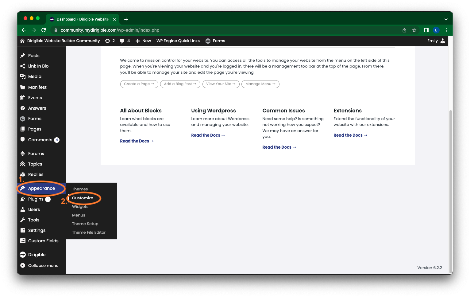
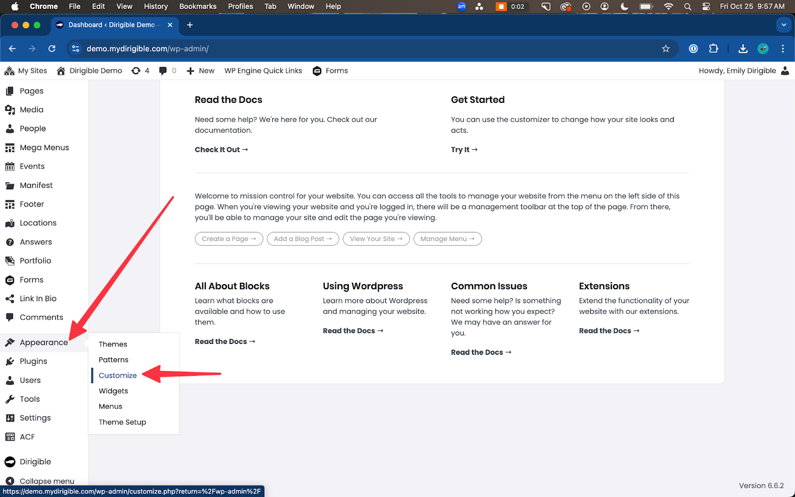
- Go to the Customizer by clicking on “Customize” in the WordPress admin bar or by navigating to “Appearance” and selecting “Customize.”
- In the Customizer, find the “Styles” section and click on it.
- Within the “Styles” section, locate and click on “Palette.” This is where you can change various colors on your site.
- Scroll down to view the different color options available in the palette.
- For example, let’s change the “Secondary” color, which is often used for buttons on your site.
- Adjust the sliders or color pickers to select a different shade or hue for the secondary color. You can make it more vibrant or less pastel, depending on your preference.
- As you make changes, you’ll notice that the colors on your site update in real-time, allowing you to preview the changes.
- Continue making adjustments until you’re satisfied with the new color.
- Next, you can modify the “Accent” color, which is used in various elements throughout your site.
- Similarly, use the color picker or sliders to select a different shade or hue for the accent color.
- Preview the changes on your site to see how they look.
- Once you’re happy with the new colors, click on the “Publish” button to make the changes live on your site.
- Until you publish the changes, they will only be visible to you, allowing you to experiment and make adjustments without affecting the live site.
- That’s it! You’ve successfully changed the colors on your site using the Customizer’s palette menu.
- Remember, you can modify other colors as well to ensure a consistent and cohesive look throughout your site.
I hope this guide helps you customize your site’s colors easily. If you have any further questions, feel free to ask. Thank you!
How Do I Change My Font Sizes in WordPress?
3 Ways to Change Your Text Size
On your Dirigible site, you are able to control every aspect of your design and layout – so your site can truly reflect your brand identity. You can customize your website by adding photos, arranging the layout, and setting your colors, to name a few. One of the simplest and most powerful changes you can make is setting the size of your text. Making sure that your site’s type is legible is important for accessibility and usability.
There are three main ways to adjust your text size.
- In the customizer – this will make global changes to your text sizes
- In the block settings – this will change your text size in that particular block
- Using paragraph and headers in the block editor – this will change your text size for a specific piece of text
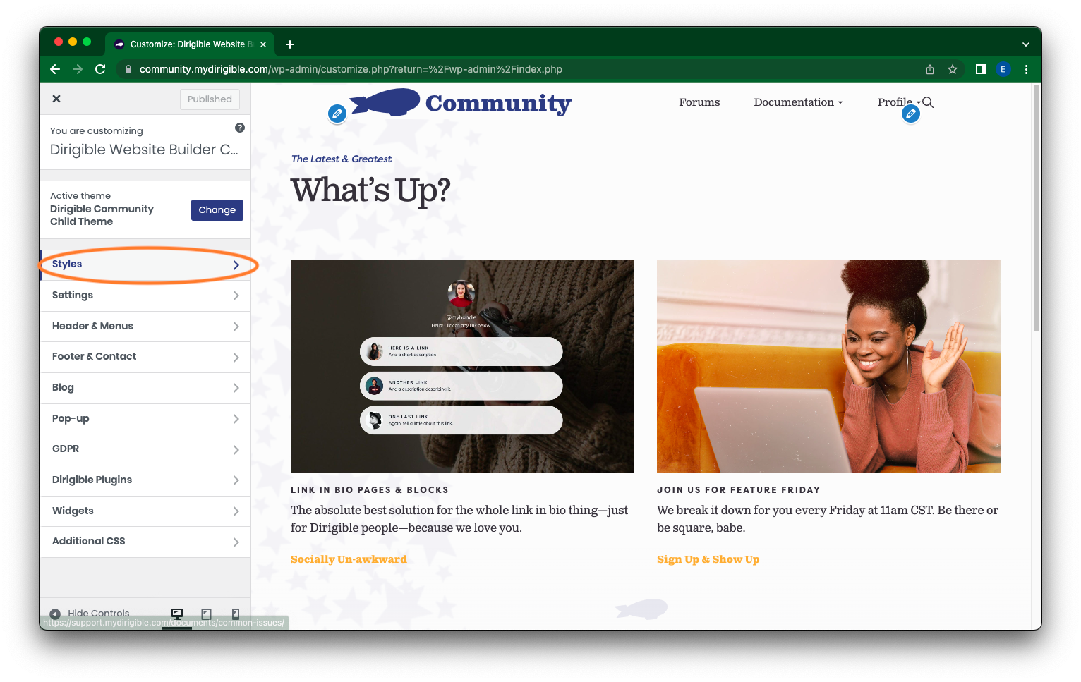
How to Change Font Sizes in the Customizer:
- In your Dashboard, on the left hand-side, scroll down and click on Appearances. Then select Customize.
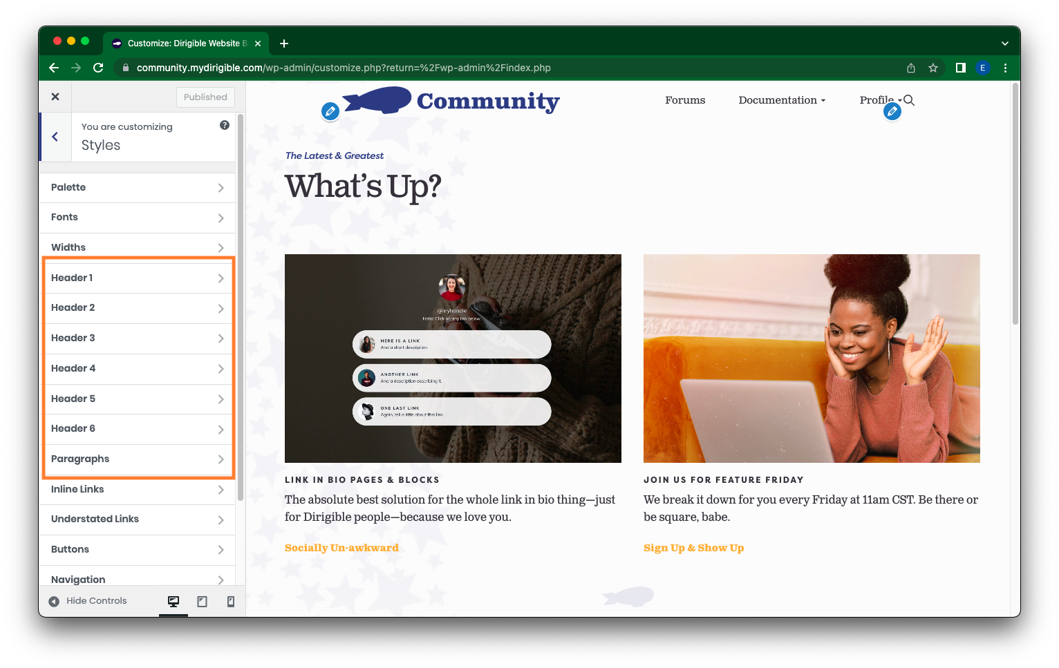
- In the side menu, select Styles.
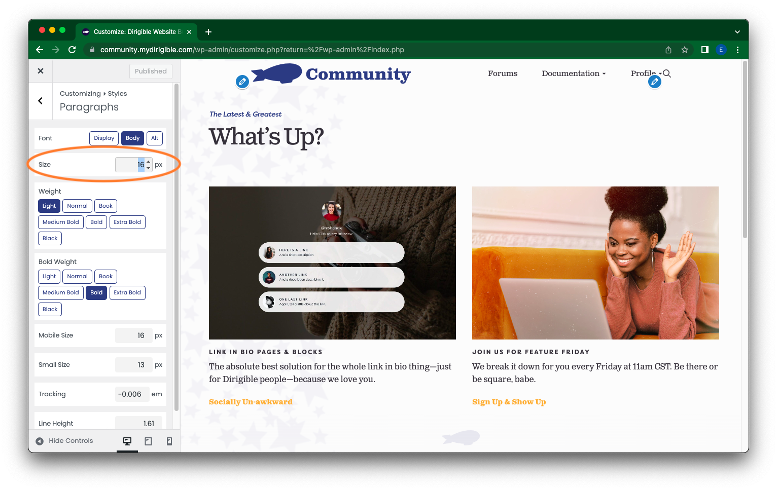
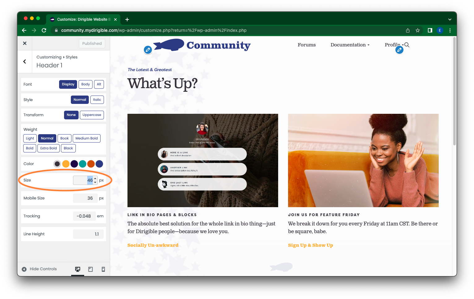
- From here you can now edit your Headers and Paragraphs by clicking on which you want to adjust or change in the left menu. This is effectively setting presets for your website’s text.
- Once you have made your selection, on the left-hand side navigate to the Size category to make your adjustments either by typing in a value or using the up and down arrows on the side. You can also customize your Paragraphs and Headers presets here in other ways like Color and Weight if you so wish.
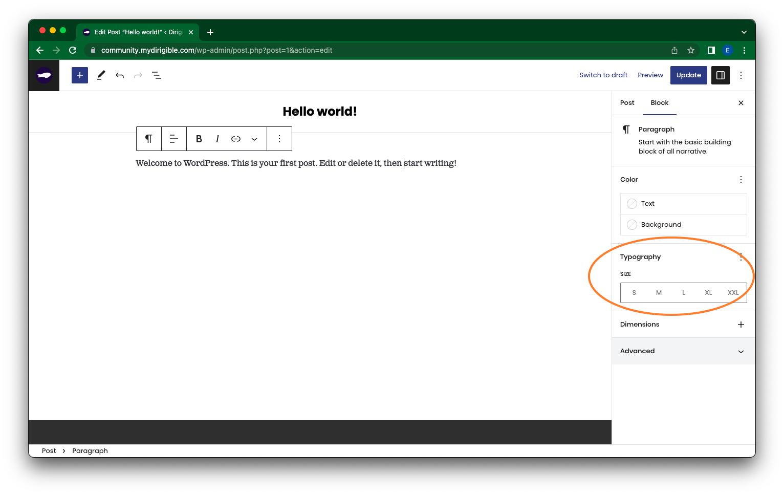
How to Change Font Size in Block Settings:
- Select the paragraph block where you want to adjust the font size.
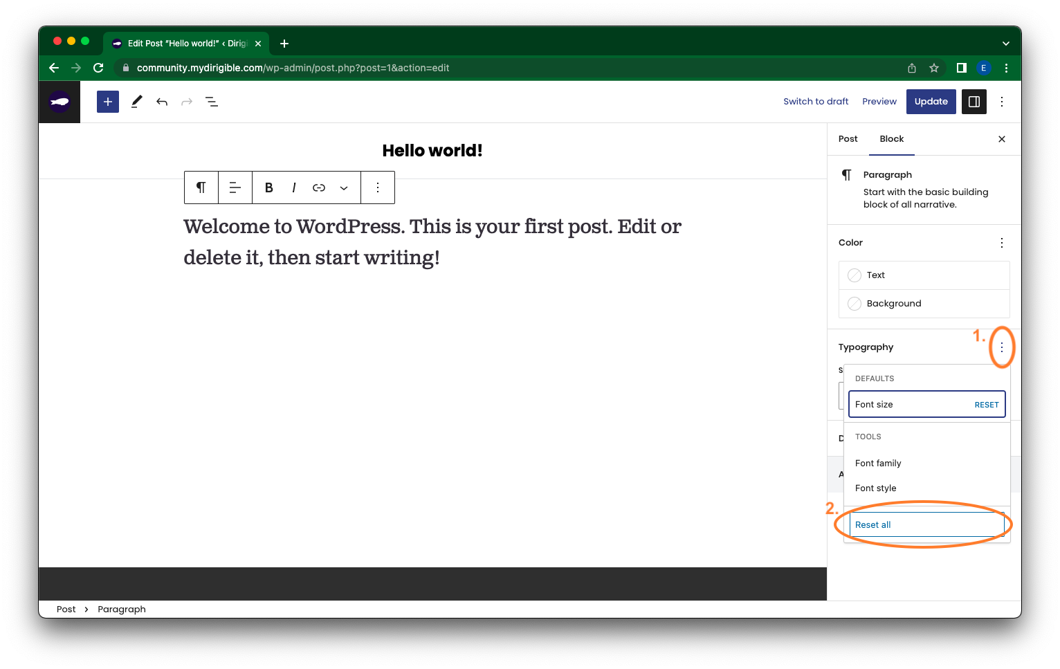
- Then on the right-hand side under Block, there is a category labeled Typography with a size selection bar underneath. The options are Small, Medium, Large, Extra Large, and Extra Extra Large. Select your preferred font size.
- If for whatever reason you change your mind, just select a different size or you can rest by clicking on the three vertically arranged dots next to Typography and select Reset all at the bottom of the drop down menu.
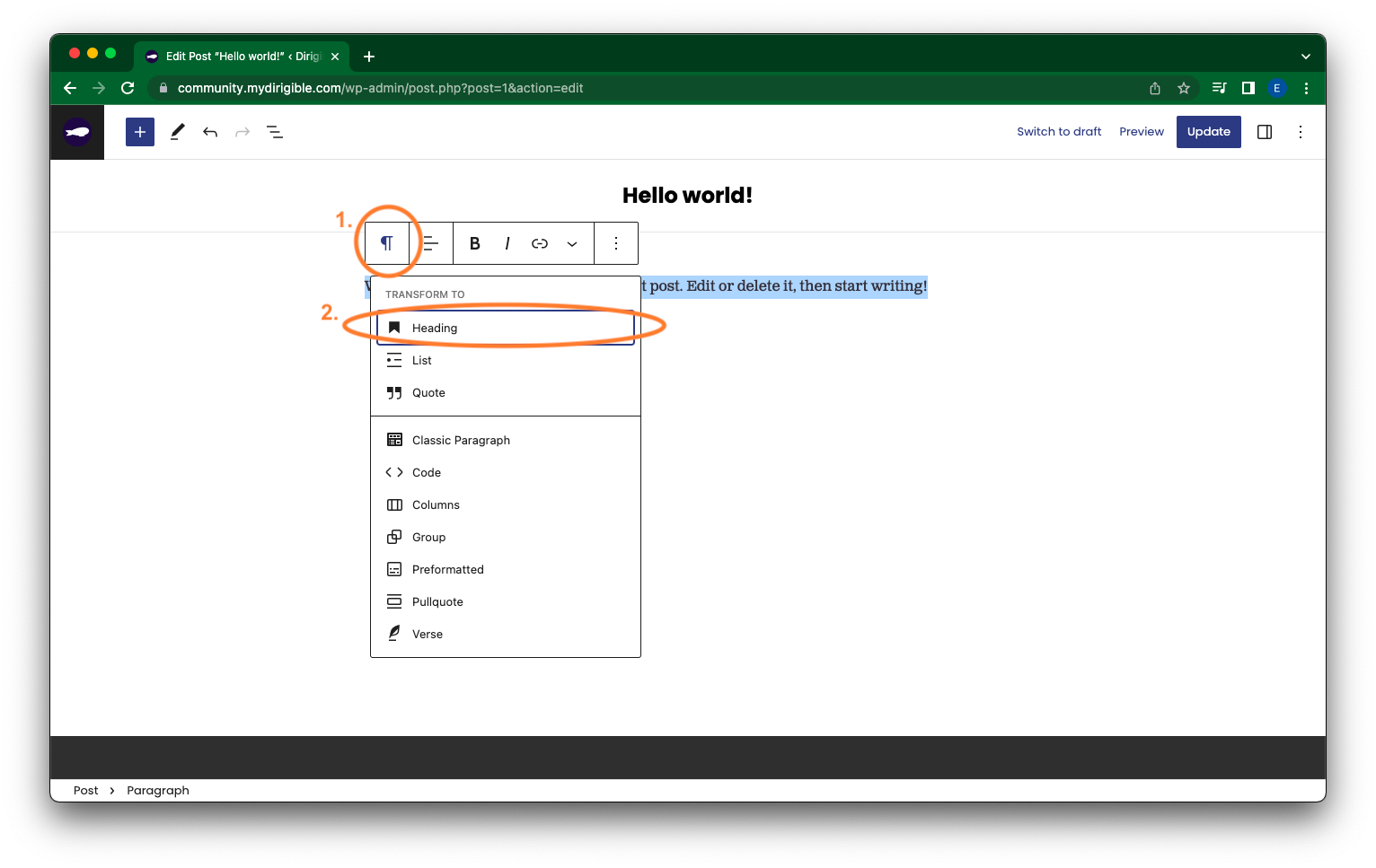
How to Change Font Size Using Paragraph Headings:
- Highlight the section of text and/or select the block you want to adjust. In the Customizer click on the paragraph icon on the right of the menu.
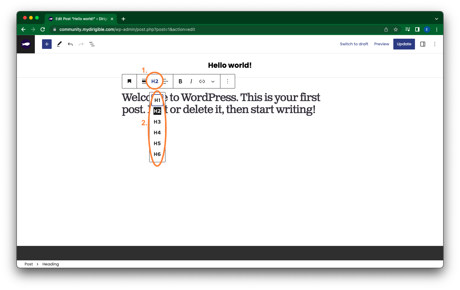
- Select Header in the drop down menu.
- Now, in the customizer you can adjust the preset heading by selecting H1, H2, H3, H4, H5, or H6.
Hopefully these methods help and get you one step closer to getting your site looking the way you want it to!
If you found this helpful and want to learn more about using your website and how to market your brand – sign up for our Website Building 101 course with Dirigible!
How to add a clickable telephone number to your website
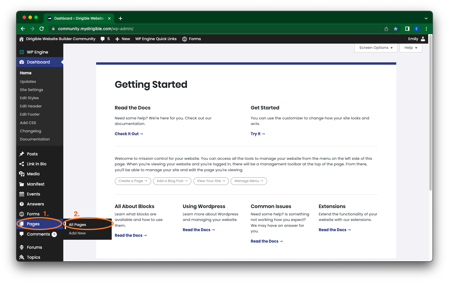
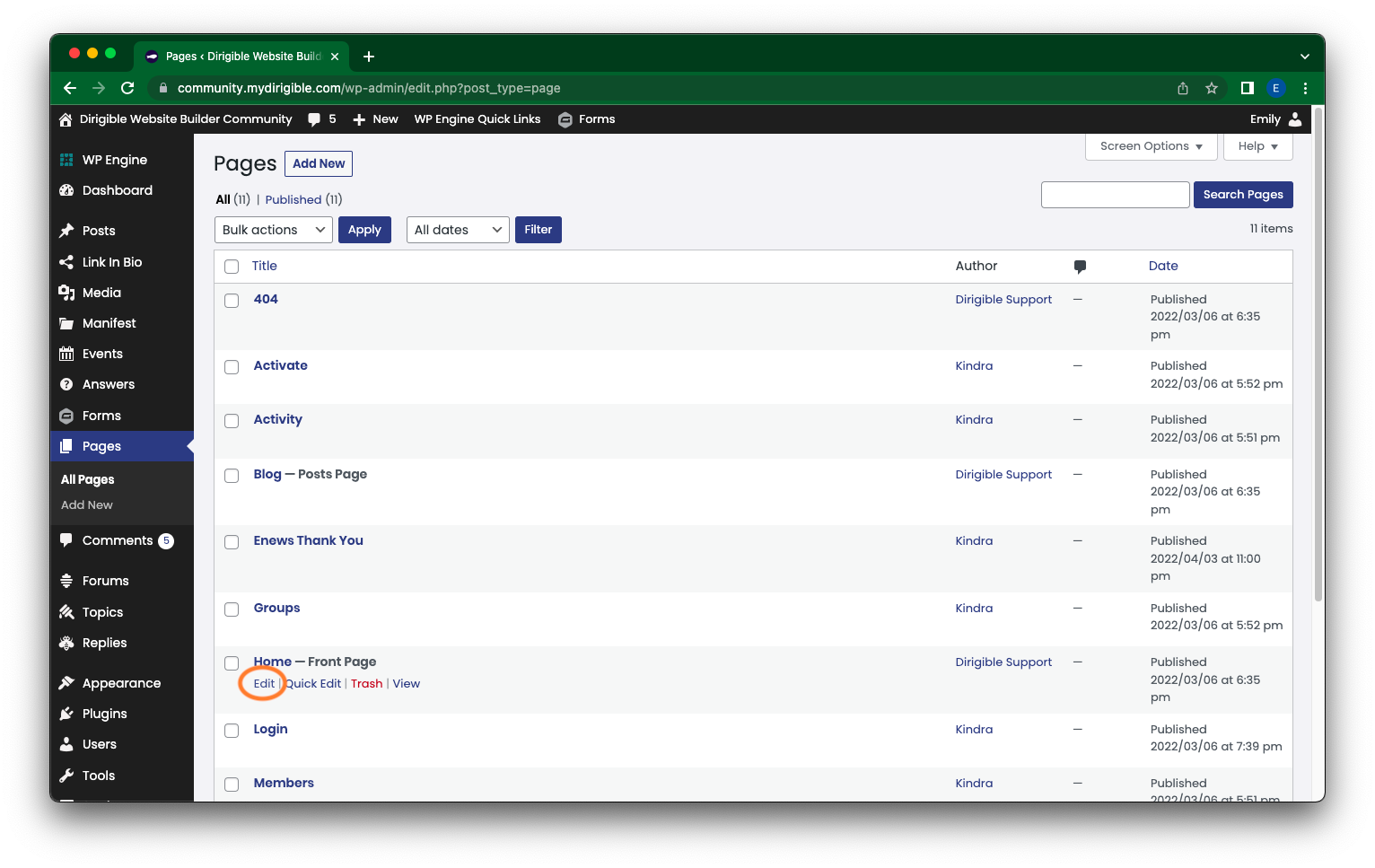
Begin by navigating to the relevant page on your website, such as a contact page where you intend to insert your phone number.
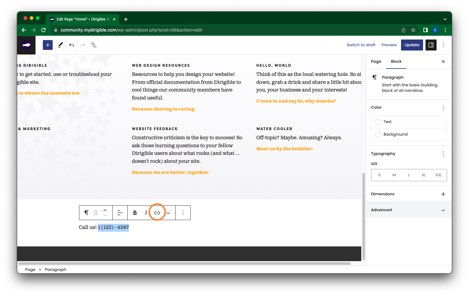
Once there, select Edit and input your phone number in the appropriate section. Feel free to personalize its display with emojis or abbreviations like “tel:” or “t:” to signify its function!
Next, highlight the phone number and click on the Link option from the popup menu. You can also utilize the shortcut ⌘K on a Mac or Ctrl+K on a Windows machine to achieve the same result.
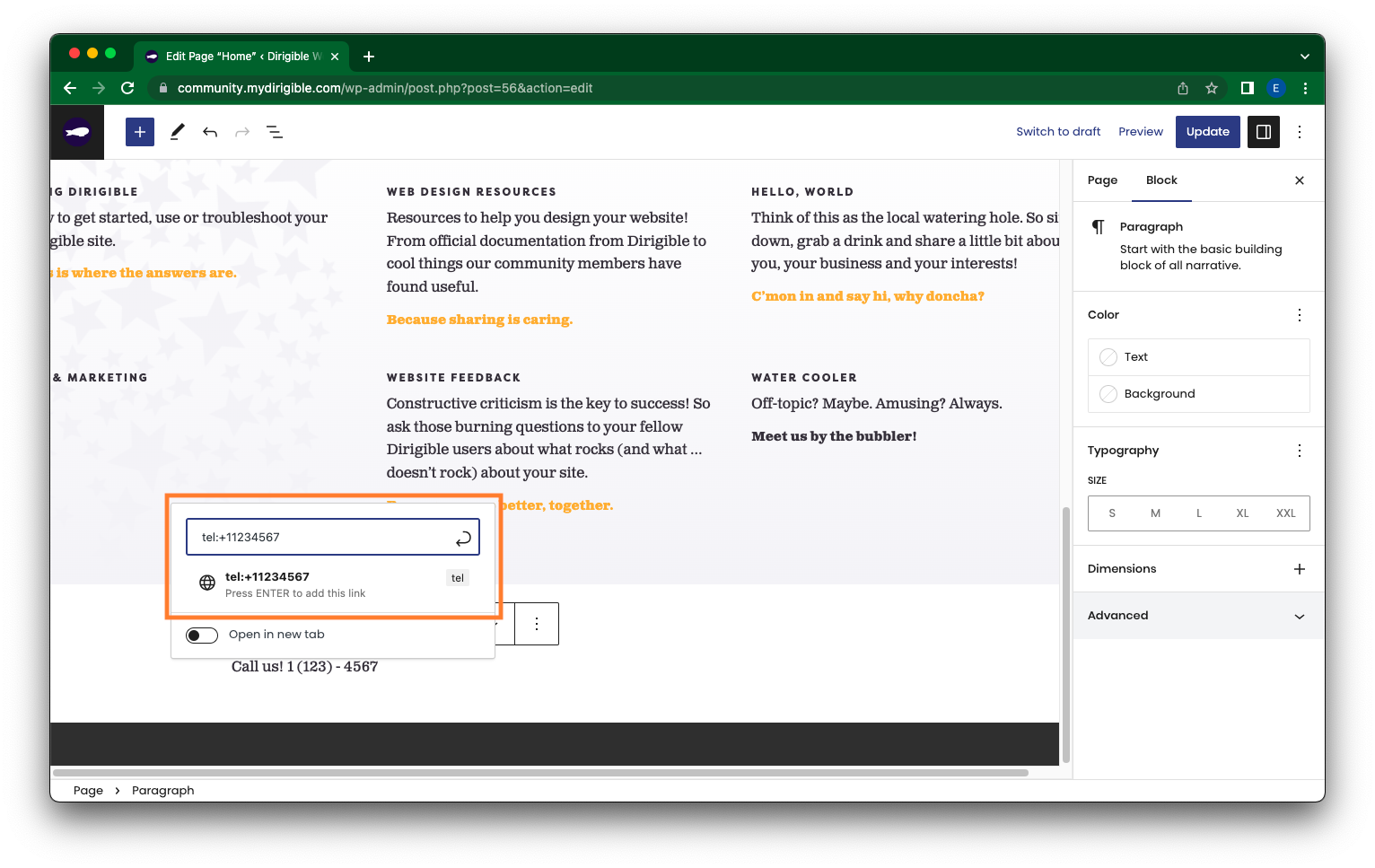
In the field to insert a link, enter “tel:+” followed by your phone number’s country code and the number itself. For instance, a phone number from the United States should appear as “tel:+11234567890,” where ‘1’ is the US country code and ‘1234567890’ is a placeholder for your number.
After inserting the number, press the Update (or Publish) button. The linked phone number becomes operational once you publish or update your page!
How To Add/Update a Button on Your Site’s Main Menu
Adding a custom button to the top of your site is a great way to drive attention and encourage your users to take a specific action, such as contacting support, signing up, or navigating to a key page. Follow the steps below to add (or edit) a button to your site’s main menu from the Customizer.
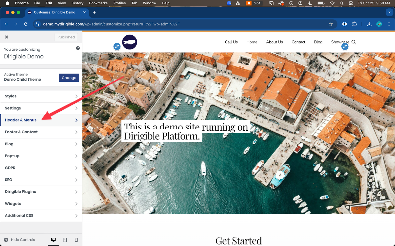
- From your website’s dashboard, navigate to Appearance > Customize. This will open the Customizer panel.
- Click on Header & Menus. This section allows you to adjust your website’s header and menu settings for both desktop and mobile views.
- Click on Button to open the button-specific customization options.
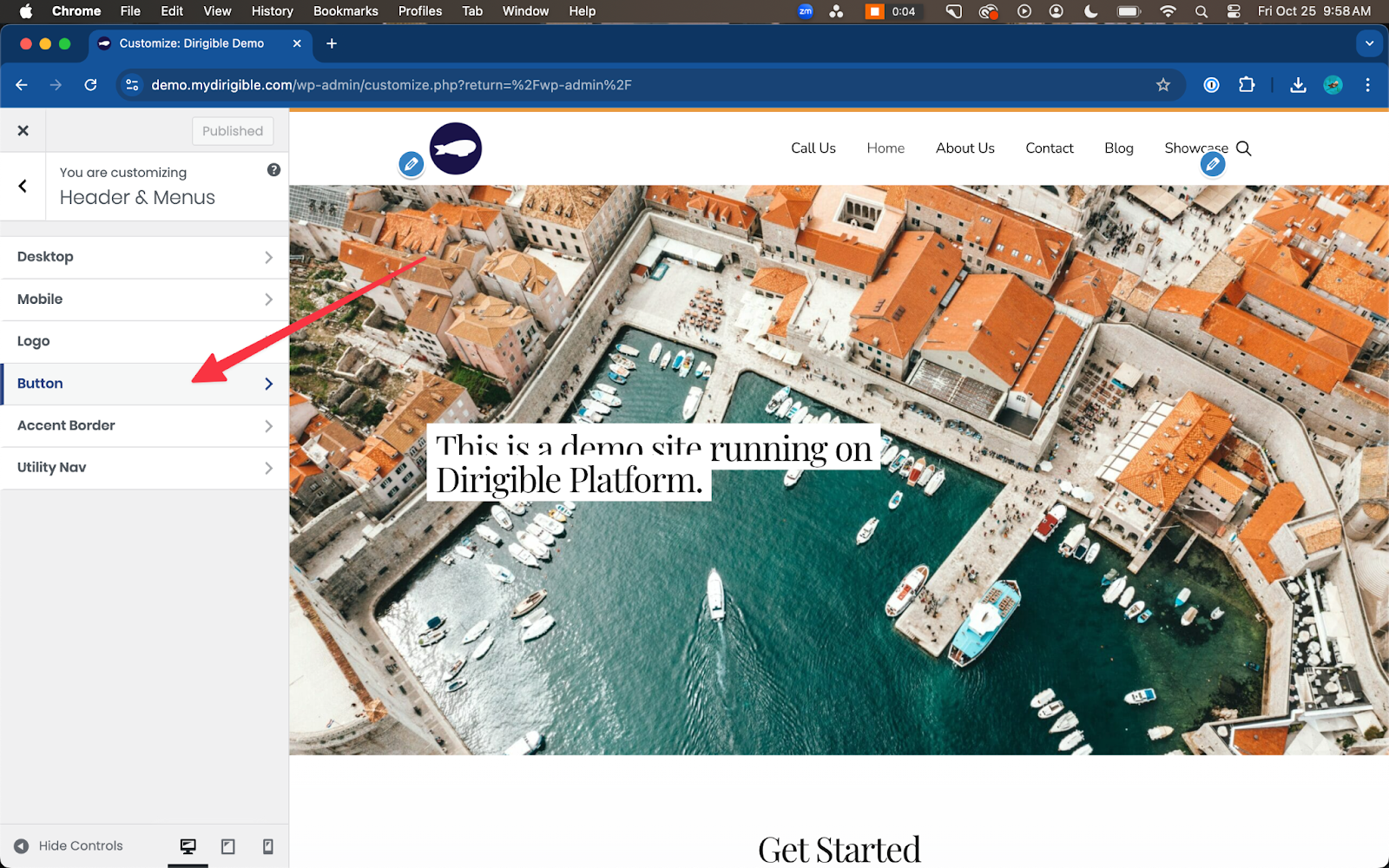
- Here is where you will find the various setting fields to customize your Main Menu’s button—adding Text and a URL as well as selecting Style. Be sure to toggle on Enable.
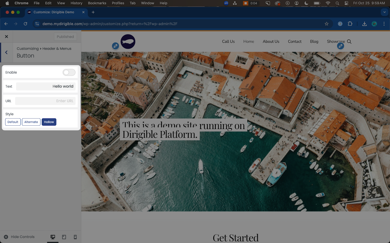
- After making selections and hitting Publish/Update, be sure to visit your site on mobile and desktop to confirm the button works and looks how you want it to.
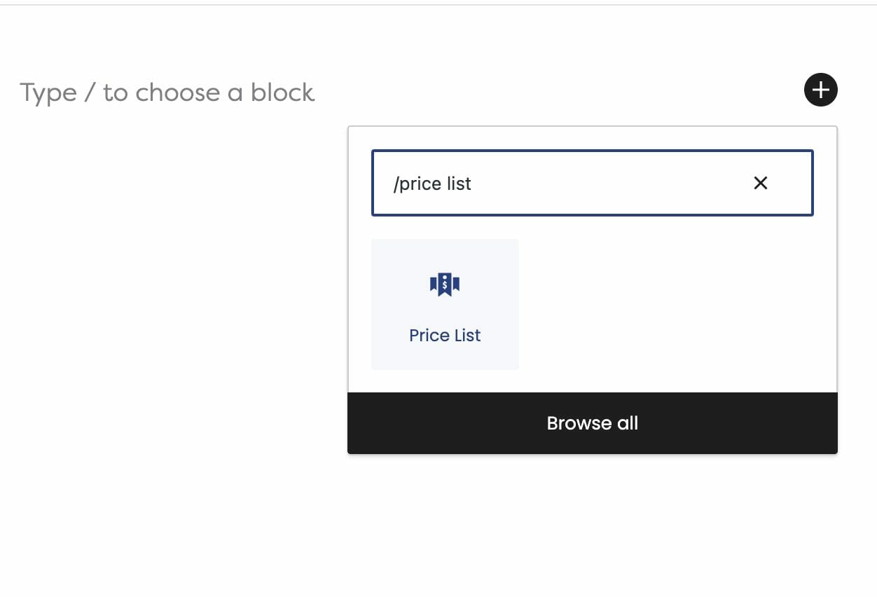
How to Use Price Lists
Learn how to present your products and services with their respective prices to keep your customers coming back for more! Our Price List Block is an essential design tool created to help you communicate your business information to your customers in a clear, concise way.
Steps to Adding a Price List Block:
- Click on the + icon to add a new block to your page
- Type in “Price List” to find the Price List Block
- Select Price List
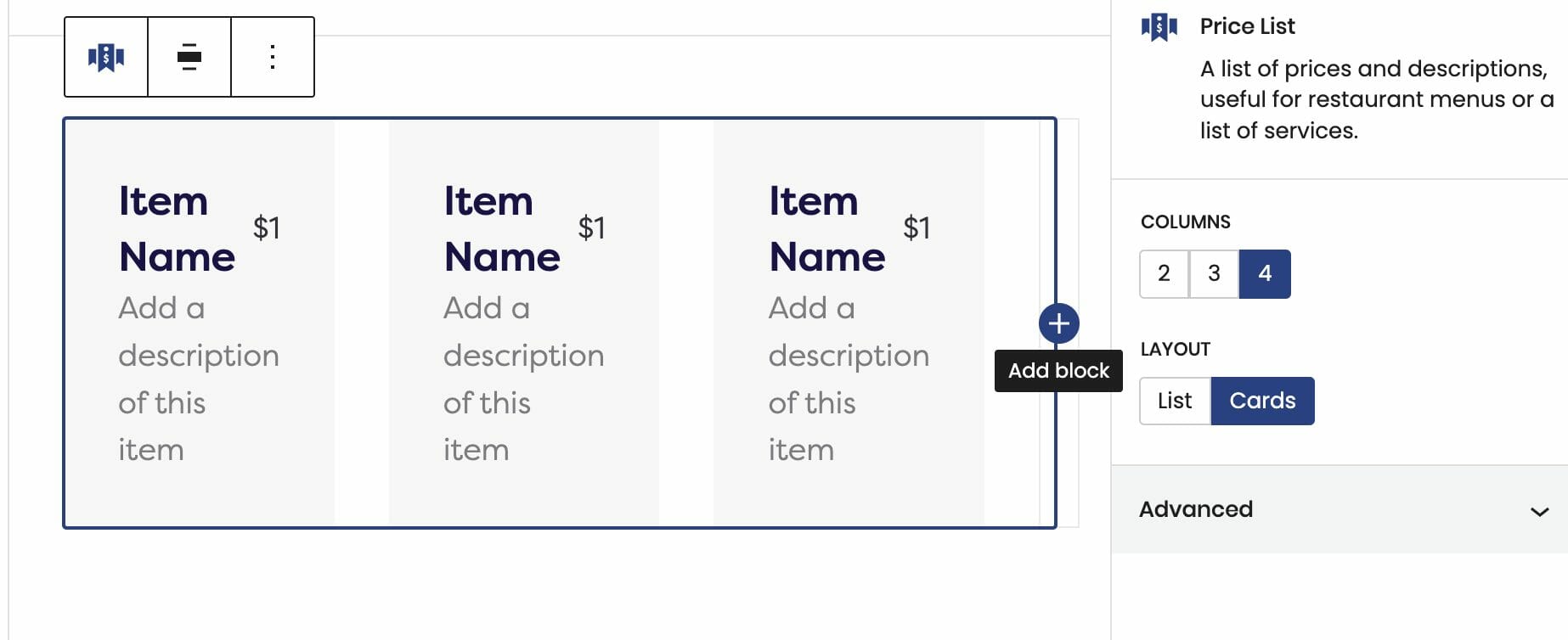
Need to add more services to your list? Just click on the + icon for more!
You’re in Control
Use the block editor on the right side to customize your list of offerings – you can format your services with a Card format or keep it as a List!
In addition, the price field is completely flexible to your design goals. When adding a new Price List, the cards will showcase prices that have the USD ($) currency symbol. This doesn’t have to stay there. Feel free to format your prices however you’d like!
Visit our Support Site to learn more about editing your Price List.
It’s important to be transparent about your business information. Users are more inclined to trust you and continue to engage with your products if your information is well presented and organized. We hope that this tutorial will make a difference in enhancing your website’s accessibility, design, and gain more traffic!
How to Use the Hero Block
introducing your website pages just got easier! The Hero is the first element that users set their eyes on once they land on your page. Think of this special block as the “first impression” section of your website!
Dirigible’s Hero Block is a versatile and seamless addition to your website building goals. It allows you to display eye-catching imagery with text. There’s also plenty of options to display the Hero Block vertically and horizontally – you can edit these features any way you want!
Learn how to build a captivating website using our Hero Block.
Steps to Adding a Hero Block:
- Click on the + icon to add a new block to your page
- Type in “Hero” to find the Hero
- Select Hero
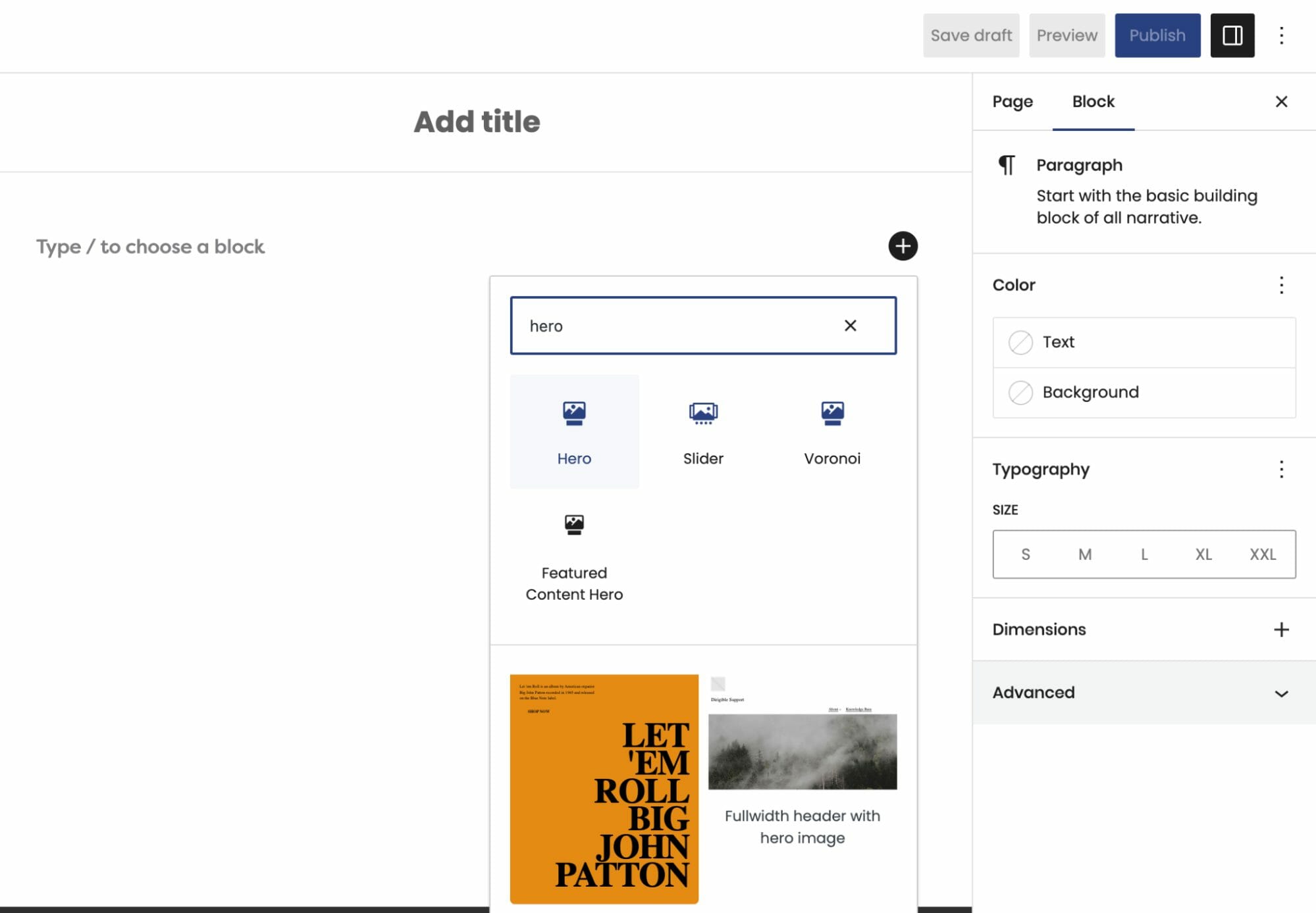
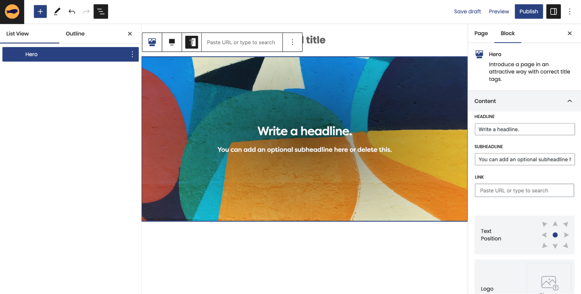
Now that you have opened up a Hero Block, you can edit its four different content fields: Headline, Subheadline, Button, and Logo. You can edit these inline or in the block editor on the right.
Click on our knowledge base post to learn more about how to maximize your Hero’s features!
We hope that this tutorial will help you leave a lasting impression on your users when they visit your website!
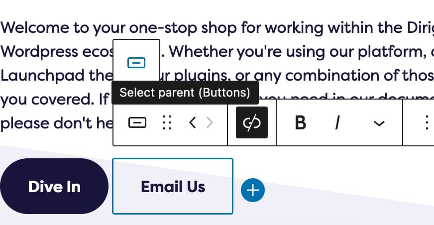
I Can’t Delete Buttons
There is a common issue where removing a button will result in empty buttons on the frontend of your site. No, you’re not crazy. Here’s whats happening.
Gutenberg has replaced its Button block with a Buttons parent block that contains the old Button block as its children. It’s a subtle distinction that has caused quite a bit of confusion. This is great, because it allows you to easily add rows of buttons on your site, and the parent Buttons block includes options for aligning the buttons left, center, or right exactly like you’d expect.
The trouble comes when trying to remove a button. Just because you delete the last button does not mean you have deleted the parent block. To remedy this, you’re going to have to delete the parent block and not just all of its children. To do this, select the parent Buttons block and delete it. If you are having trouble selecting the parent block, we’ve written a guide to easily select the parent block from any child.
Voilà!
To completely remove a buttons block, be sure you’re removing the parent and not just the children!
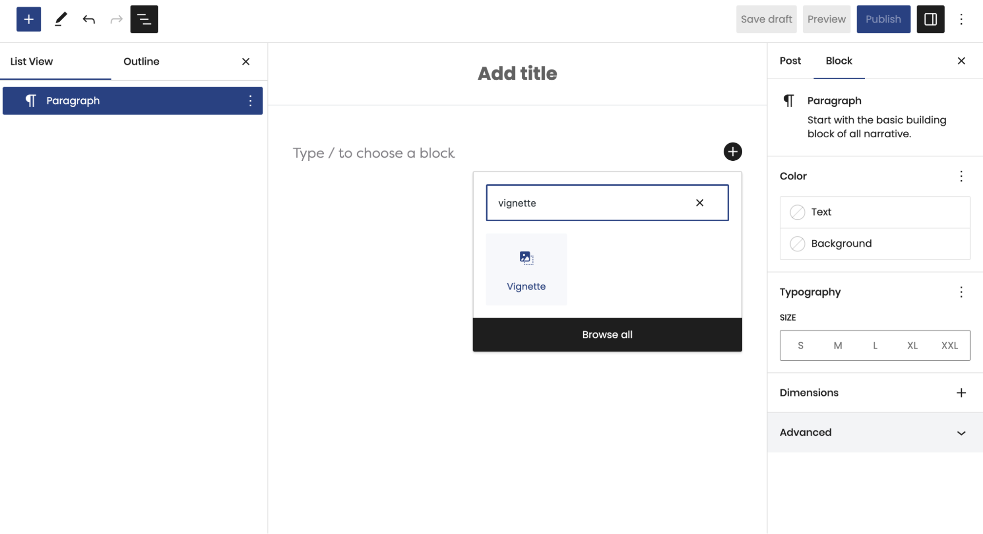
Learn How to Use a Vignette on Your Website
The Vignette Block is an innovative design element that brings your website to life. It consists of the classic Media and Text UX format, but can be customized in unique ways!
Discover new ways to make your content stand out from the rest using our Vignette Block!
Steps to adding a Vignette Block:
- Click on the + icon to add a new block to your page
- Type in “Vignette” to find the Vignette Block
- Select Vignette
What’s Next?
After adding your Vignette to your page, the block editor will appear on the right side of your screen. Now, you can play around with the different block settings to customize your Vignette!
Visit our Knowledge Base post on Vignette to learn more about the different styles and how they work.
Our versatile Vignette Block is designed to captivate your users and highlight content that won’t be overlooked. We hope that this tutorial helps you get started on designing a beautiful, unique website that will stand apart from the rest!
My buttons aren’t centered even when set to be center aligned.
There’s a good chance that your buttons are inside of a columns block. When using blocks that support children alignment, you should be using those settings instead of individual block settings inside of it.
The text alignment option allows you to place your text anywhere inside of the child block. This is more useful than trying to control the alignment of each inner child block element, and is a combination of text position and text alignment. For example, setting the text to the lower right hand corner will not only position the text in the lower righthand corner, but also set right text alignment on all children.
Not only does this let us make sure your site will look good at any size, but this lets us respond to updates holistically.
Note: Because right text alignment is generally used compositionally on desktop, text set to be right aligned will automatically revert to left alignment on mobile to give your users the best experience.
My Circle Images Look Wrong
Circular images are often a popular choice for headshots and other photography on Dirigible sites. However, circular images are one of the instances where the image aspect ratio matters. Crop your image to have a 1:1 aspect ratio, and they’ll behave much more reasonably!
What is aspect ratio?
Aspect ratio refers to the proportional relationship between the height and width of an image, video, or any rectangular shape. It is expressed as a ratio, typically in the form of width:height.
In the case of an image with dimensions 200×200 pixels, the aspect ratio would be 1:1. This means that the width and height are equal, resulting in a square shape.
While we try and take care of most of this for you and this should work without uploading a square image, browsers can be wonky things. If you feed it what it wants directly, there’s much less room for error.
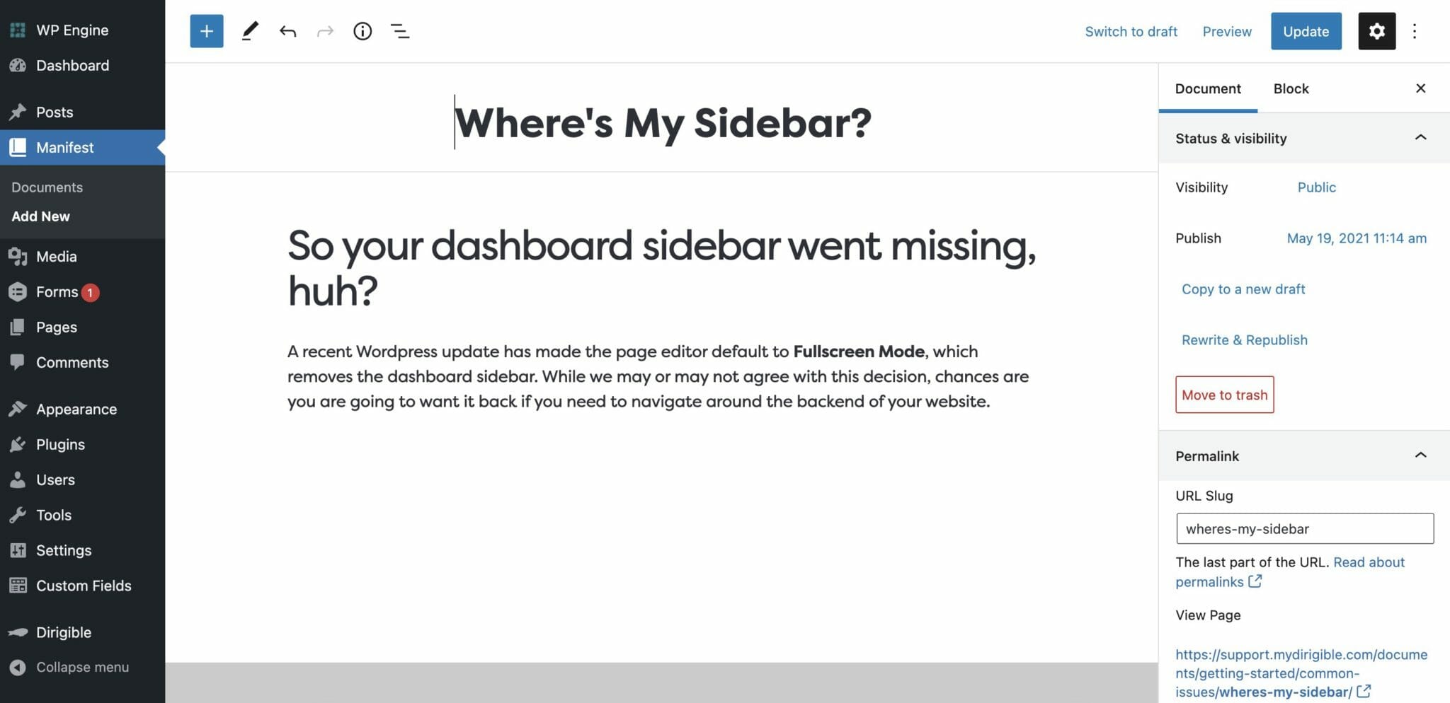
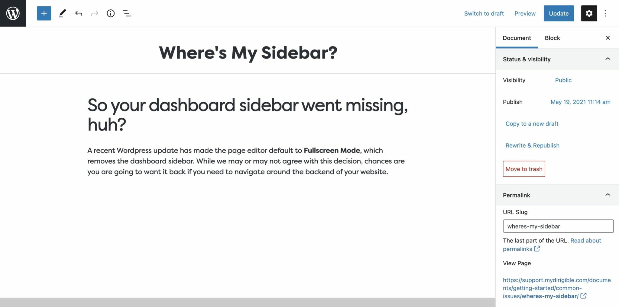
My Sidebar Is Missing in the Editor
So your dashboard sidebar went missing, huh? A recent WordPress update has made the page editor default to Fullscreen Mode, which removes the dashboard sidebar. Chances are, you’re going to want it back if you need to navigate around the backend of your website.
With the steps below, you’ll be toggling Fullscreen Mode like a pro! Alternatively, you can use the Command + Option + Shift + F key combination shortcut.
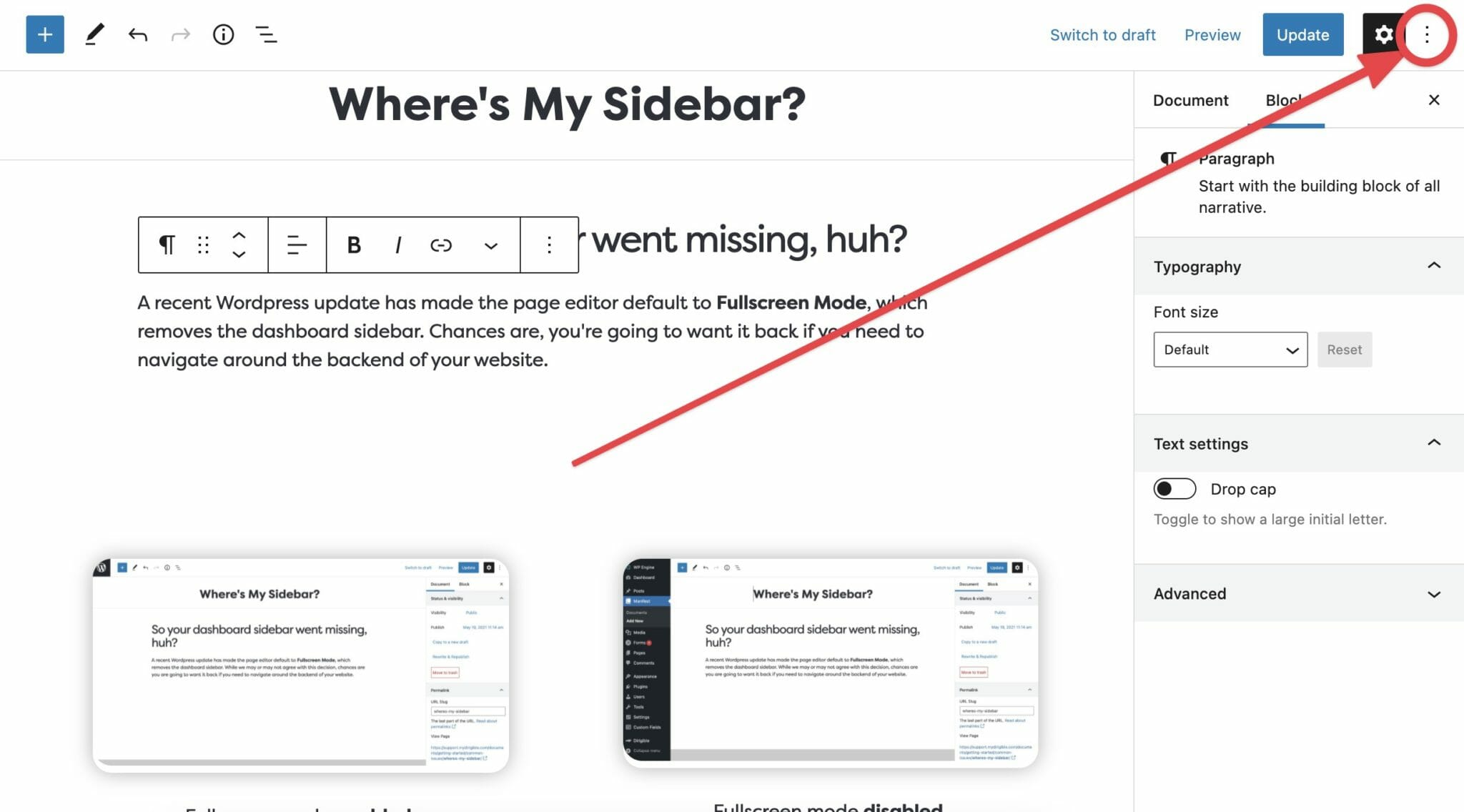
1. Open the Editor Options
In the right hand corner of the page, you’ll find the editor options menu hidden behind a ⋮ button.
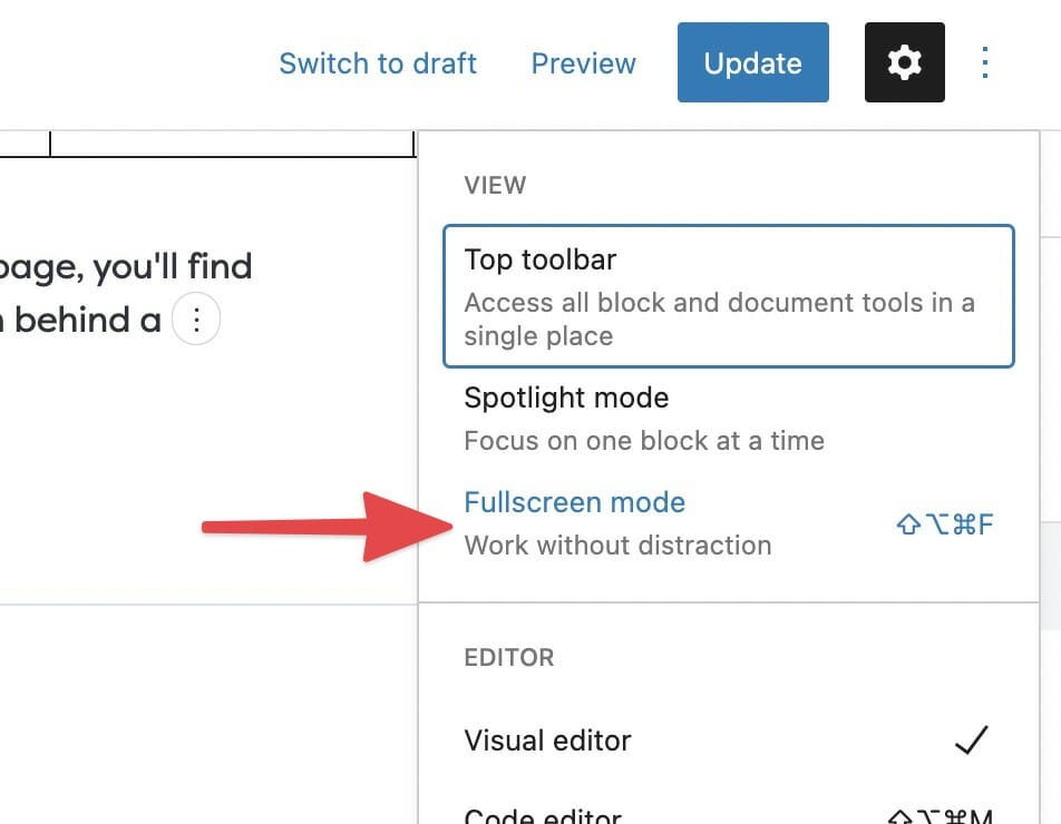
2. Toggle Fullscreen Mode
Toggle Fullscreen mode by clicking on the entry in the editor options menu.
Use the List Block to Make, Well, Lists!
Organize your Blocks into bulleted or numbered lists
Using bullet points or numbering your ideas can give a cleaner look to your website and allow you to more clearly share information with your visitors. If you are looking to create a checklist, an ordered list, or just organize your text, try using a List Block in WordPress.
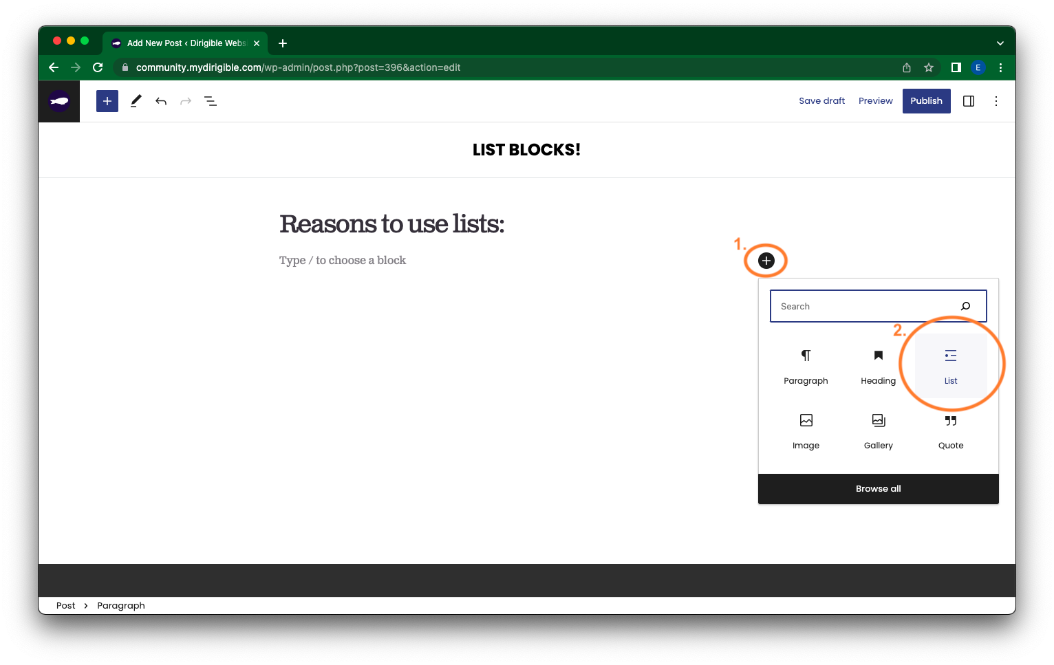
How to add a List Block?
When editing one of your posts, to add a List Block click on the + icon of a new Block and in the drop down menu select List.
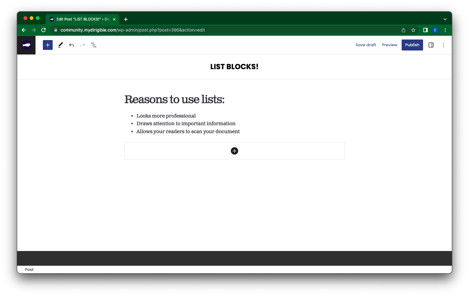
A bullet point will appear in the Block and you can start typing up your list. Your Block will look something like the below image.
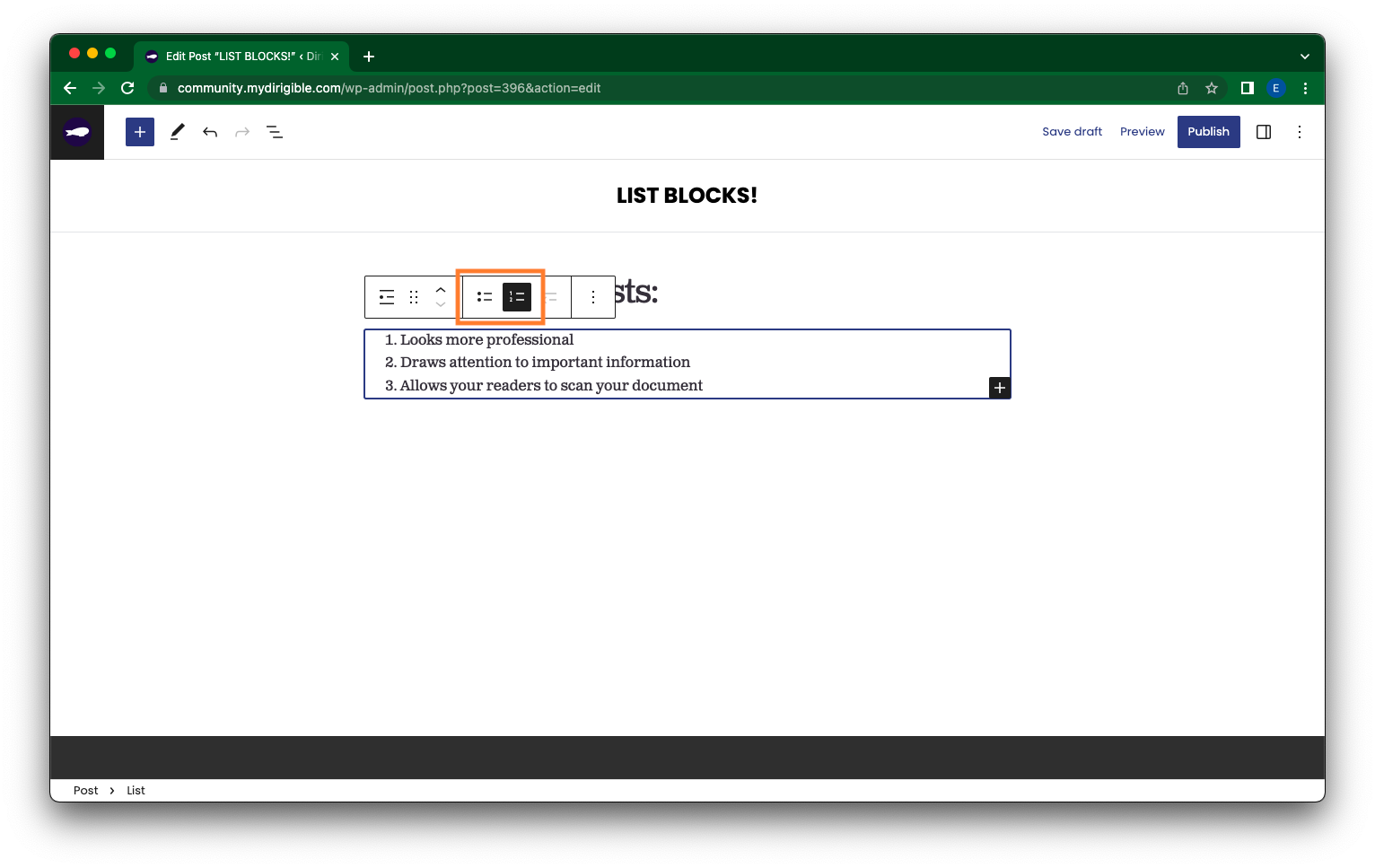
How do I make my bulleted list numbered or vice versa?
Click on the List Block you want to edit. In the top left of the Block Toolbar, click on the Select List icon.
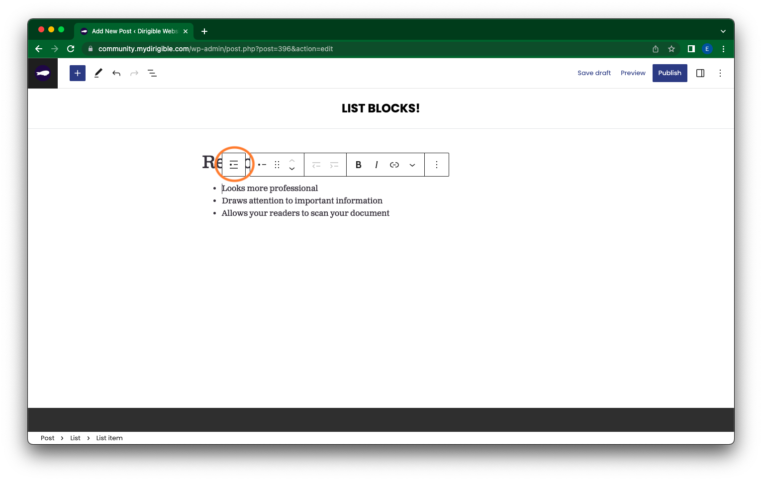
Then in the middle section of the Block Toolbar, there are your list type options. Either bulleted or numbered. Select which one you want.
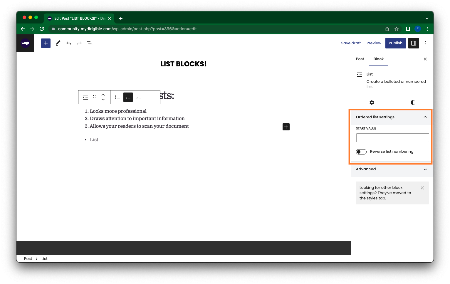
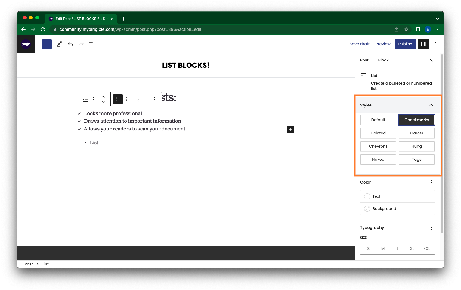
How can I further customize and edit my List Block?
For a numeric list, look at your Block settings sidebar to see additional options like adjusting the Start value of your list or toggle on Reverse list numbering to reverse the numeric order of your list.
For a bulleted list, look at your Block settings sidebar to see additional Styles options like Chevrons, Checkmarks, etc.
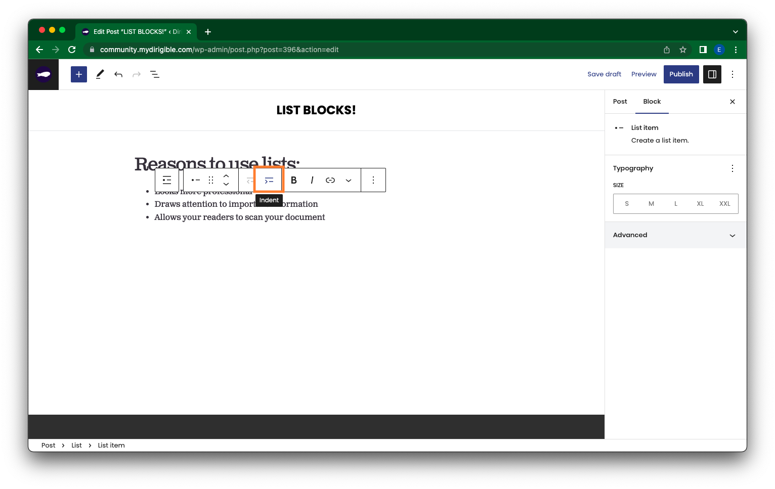
You are also able to indent (first below image) or outdent (second below image) lines of your list in the Block Toolbar.

The List Block is a great way to further customize your site to give it a cleaner, professional look. Go nuts–Combine list types, customize the look of your bullet points, and indent or outdent your lines. Try it out!
If you found this helpful and want to learn more about using your website and how to market your brand – sign up for our Website Building 101 course with Dirigible!
Using Sections and Backgrounds
Transcription:
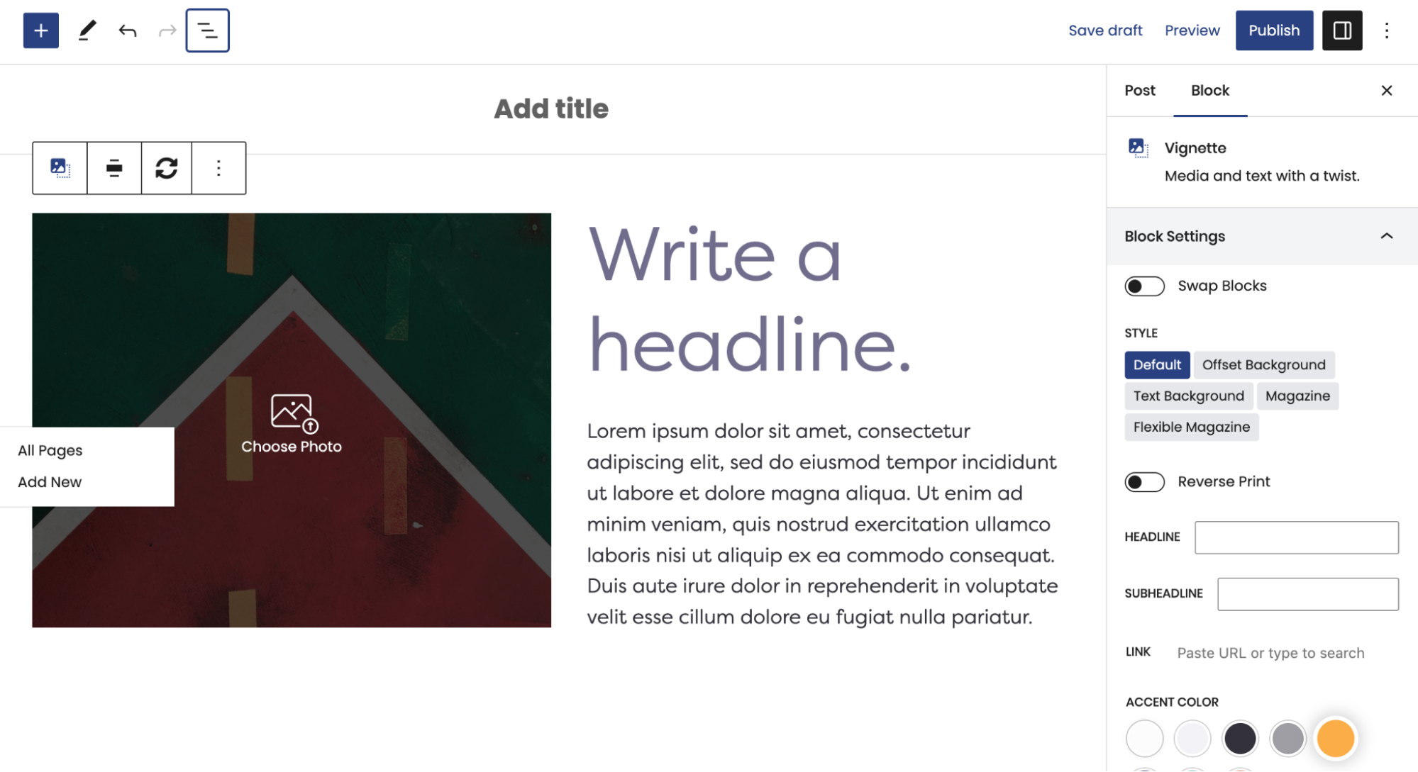
“Hello and welcome! My name is Jake, partner at Dirigible, and today I want to talk to you about one block in particular and then a little bit about how pages are structured and how we use that block to give pages the structure that they need. And that block is the background block. It is by far going to be the most used block on your site and on pretty much every Dirigible site.
The easiest way to get started with it is during page editing. If you pop open the list view, you’ll see that the top-level block on almost every page typically is going to be a background block. Now, the reason behind that is the background block groups other blocks together, and it also provides you with some interesting ways of modifying the background.
First thing I’m going to do is I’m going to run over the structure of this page. And this is a page that I’ve copied from another site and made generic. I’m going to run over the structure of these blocks and why we decided to place them that way. And then we’re going to go back and we’re going to look at some specific features and settings of the background block.
So at the very top of our page, we have a background block, and in that background block is a set of columns. And in those columns is a big logo or in this case, like a featured image that we’re having at the top of our page. And actually, I’ll show you the page rendered as well, not just in the editor.
So, I’ll just scroll through this for you just for a moment so you can get an idea of what’s all on the page. At the top, we have a background with columns in it. Then we have a title, and this title, all the copy that I have on this page right now is just placeholder copy, but they all still have their own purposes. So this top headline here is the H1 of your page, and it’s meant to describe the overarching theme of the page. What is this page talking about? What are we doing on this page?
The next thing we have is a small intro paragraph. Beneath that, we have essentially what amounts to a call to action or another way of routing users around your site. So we have an H2, and in that, we’ve given that as the default H2 style. We have an H2, small intro paragraph, a little list. This is just a list block. And then the actual call to action to make your users go and do something. So in this case, it would be “Go visit this other page that has more information on this specific topic that the H2 references. Go visit that page and learn a little bit more about that.”
And as you can see, we’re still in the background. So we have a background here, background here, and then the next item we have is top-level, and that’s a photo feature. And photo features do this cool thing where they go the full width of the page, really display a nice big, beautiful image. We have another headline here, another small short paragraph, and then another call to action button.
Then we have a post block, also settled once again within a background, with a headline. Here are our posts, and this post block essentially would be relevant to the topic of the page. And then finally, one last background block for a call to action. In this case, it’s a generic call to action, “Follow us on social media” with the social media icons. You can also put something else in this other little column.
Okay, so that’s the overarching piece, and you can see how the background
block categorizes and holds together these separate pieces of your page. Okay, we pop back to the top. So, this one references what the whole page is about or what the whole site is about. In this case, the next one is a separate topic, separate headline, separate paragraph, separate list, small call to action button, all housed within this background.
Photo feature, same thing, headline, small paragraph, small call to action. Background, this one is just housing the post block, but this is all relevant useful information to your users. If it had a category that matched the topic of the page, you would use that category. Background, small call to action for social media.
Now, let’s visit some of the specific settings of the background block. And as you can see, we get this nice little swoop down at the bottom here. That’s an interesting feature of the background block, but I’ll go down the gamut of all of the features here. So we have reverse prints, which is useful if you have a darker color palette on your website. Reverse print, just in this case, it makes it unreadable, but reverse print is typically there to provide the contrast that you need if you have a darker background color.
Padding, you can change the padding. Generally, I would say more space is better than less space, so I would always err on the side of having a little bit more space. You can choose the background style, and the background styles are all really useful. Right now, we have it as a gradient, and this is a subtle gradient. Because you have a stark color of white and an end color of gray, it’s very kind of pleasing to the eye to see it transition here.
But if you did white-blue to white or something, blue to gray, this doesn’t look as nice. Maybe white to red, still, this looks too much like a gradient, right? So you really want to be careful when using gradients in background blocks because it’s really easy to get in trouble. Because this is so subtle, that’s why this works nicely here.
Some of the other styles, you can have it be just a solid color, which is typically a safe thing. And so, if you choose some of these different colors, you can see these are all locked into our color palette, right? You can put an image back there. In this case, we would have to do reverse print to get some of this visible.
Two-tone, which is fun. Two-tone kind of provides this snap gradient effect. It’s not technically a gradient, but it provides this two-tone color effect. You can change the direction. You can change where across it goes. Gradient, which you already know. Then we have a pattern block as well, which you would choose an SVG or something similar, and it tiles the pattern back for you. Leave that as a gradient.
Now we’re going to scroll down here just a little bit, and I’m going to bring this kind of swoop into view here. And you have what’s called the transition. So transitions are very powerful in the backgrounds, and it’s how you get some of your sites to look a little less blocky and just break up the different sections to provide a nice little flow. Not necessary to use at all, not required, but it is nice to have the option.
Currently, we’ve only enabled the bottom transition because this block is touching the top. So we just want to have it be touching the top. We are offsetting transition height. So I’ll show you what that does in just one moment. Right now, we’re using the rounded shape, and that is what causes this little rounded bit right here. And the color, this is where
it becomes that transition between the two blocks. You have the color, and you always, not always, but typically, you’re going to want to choose the color that matches the background of your next block.
So right now, we have this kind of fade-to-gradient gray here, and we’ve chosen the color, which is this kind of the background of the background color. So it could be black, blue, red, and obviously, none of this looks very nice. Yellow-gray kind of breaks over. It doesn’t do anything. It gets rid of our roundedness. But when we choose white because the background, this next background block, its background is white and it’s just a solid color, it provides this nice transition effect where it doesn’t look like there are two background blocks here. It looks like it’s one continuous piece.
I’m going to go ahead and choose my top background again, and you can see that this transition, and you can change the size of this and the bubble as well if you wanted to get greasy with it. I’m going to bring that back down, and we can explore some of these other transitions. So wavy left, wavy right, angle, angle right, curve left, curve rounded. And to give you an example of the offset transition height, let’s pop this angle right down, and then we’re going to turn off the offset transition height. And as you can see, it pulls this back up and makes it if you crank the size up a little bit here, you can get this effect where this transition bridges a lot higher. And if you offset the transition height, you get this big kind of slash.
I’m going to switch back to rounded because I like that. We’re going to turn this back on to five, give it that nice subtle effect. Let’s make sure all our other settings are where they were. Yeah, and so that is the general idea behind the background block. And you can see that you can produce a lot of different effects by combining two background blocks next to each other. And indeed, that is the building blocks of typically many dirigible sites that are built is these background blocks.
So when you’re starting to build a page, I would typically recommend starting with a generic URL block. Then underneath that, you may want to start with a background and then tack another background on underneath that one. That’s how you’re going to be able to really begin to connect these blocks together and build this flow through your entire site.
Thanks for listening. If you have any questions or you want to learn more about your dirigible site, visit support.mydirigible.com. Have a good one.
What is a Quote Block?
A Quote Block is like our other Blocks, but it comes with a special addition – an image field. Displaying a quote next to an image provides users with a holistic view of your website with a captivating visual design.
Our latest adjustment to the styling makes our Quote Blocks more prominent on the page, featuring a simple and elegant quotation mark on top!
Simple Quote Settings:
The quote itself has all the same fields as the Small Quote and Large Quote Blocks—you can adjust the Text Size, Background Color, and Headshot in the Block Editor on the right-hand side.
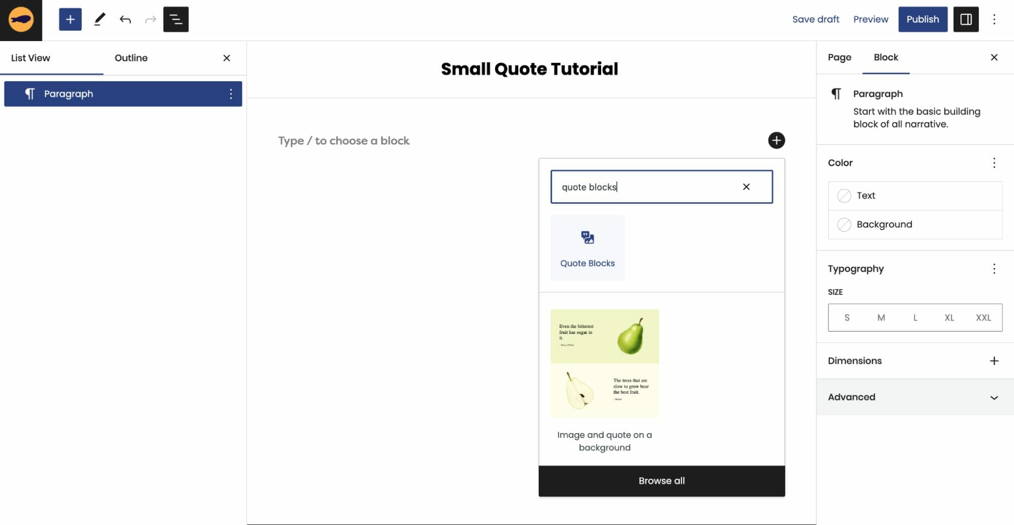
How to add a Quote Block:
- Click on the + icon to add a new block to your page
- Type in “/Quote Blocks” to find the Quote Blocks
- Select Quote Blocks
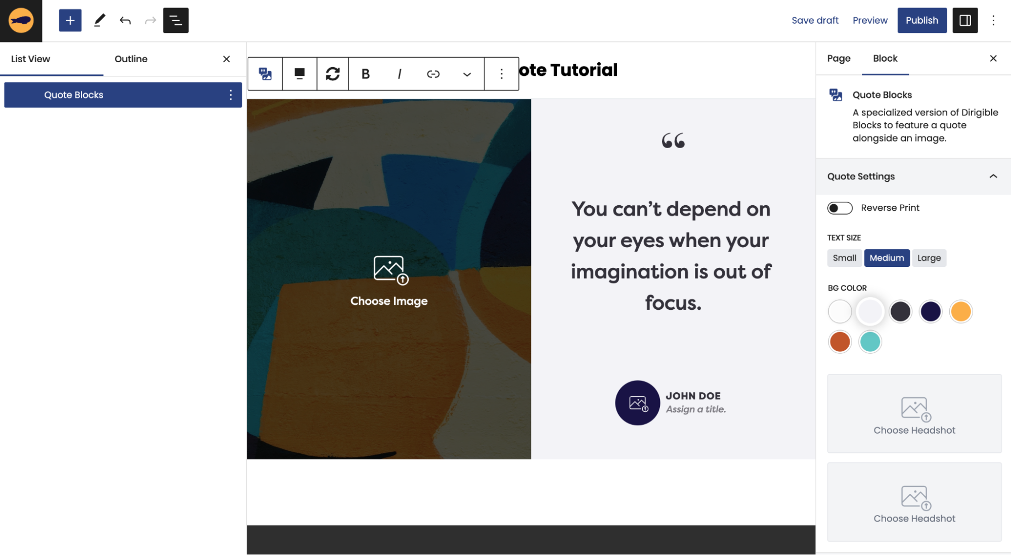
How to add or change the Featured Image?
To set the Featured Image, you can click directly on the image to open up your Media Library and make your selection.
If you want to change the Featured Image you will follow all those same steps, but first have to hit Remove BG Image in the Block Editor when the child block is selected..
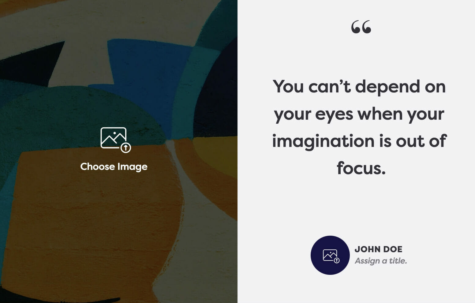
Adding a Headshot:
To add a Headshot, you can click directly on the headshot icon to open your Media Library and make your selection.
If you want to change the Headshot you will follow all those same steps, but first have to hit Remove Headshot in the Block Editor when the child block is selected..
NOTE: If you don’t add a headshot, the Name and Title will appear centered underneath the quote on the frontend. So you don’t have to worry about a blank space showing up in your Quote Block. The headshot field is only there if you want to use it, it is not a requirement.
We hope this tutorial helped you understand how our seamlessly awesome Quote Blocks work! Try it out and discover how the perfect blend of an image and a quote can elevate the design and functionality of your website!
What is a Site Title in WordPress?
Keep it simple! Use your brand name.
Your Site Title is simply how people find your website. It should be your business or brand name–that way when people search your name they are directed to your website.
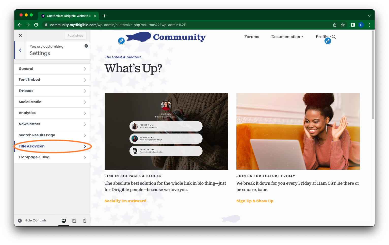
How do I set or change my Site Title?
- In your Dashboard, on the left hand-side, scroll down and click on Appearances > Customize.
- In the side menu, select Settings.

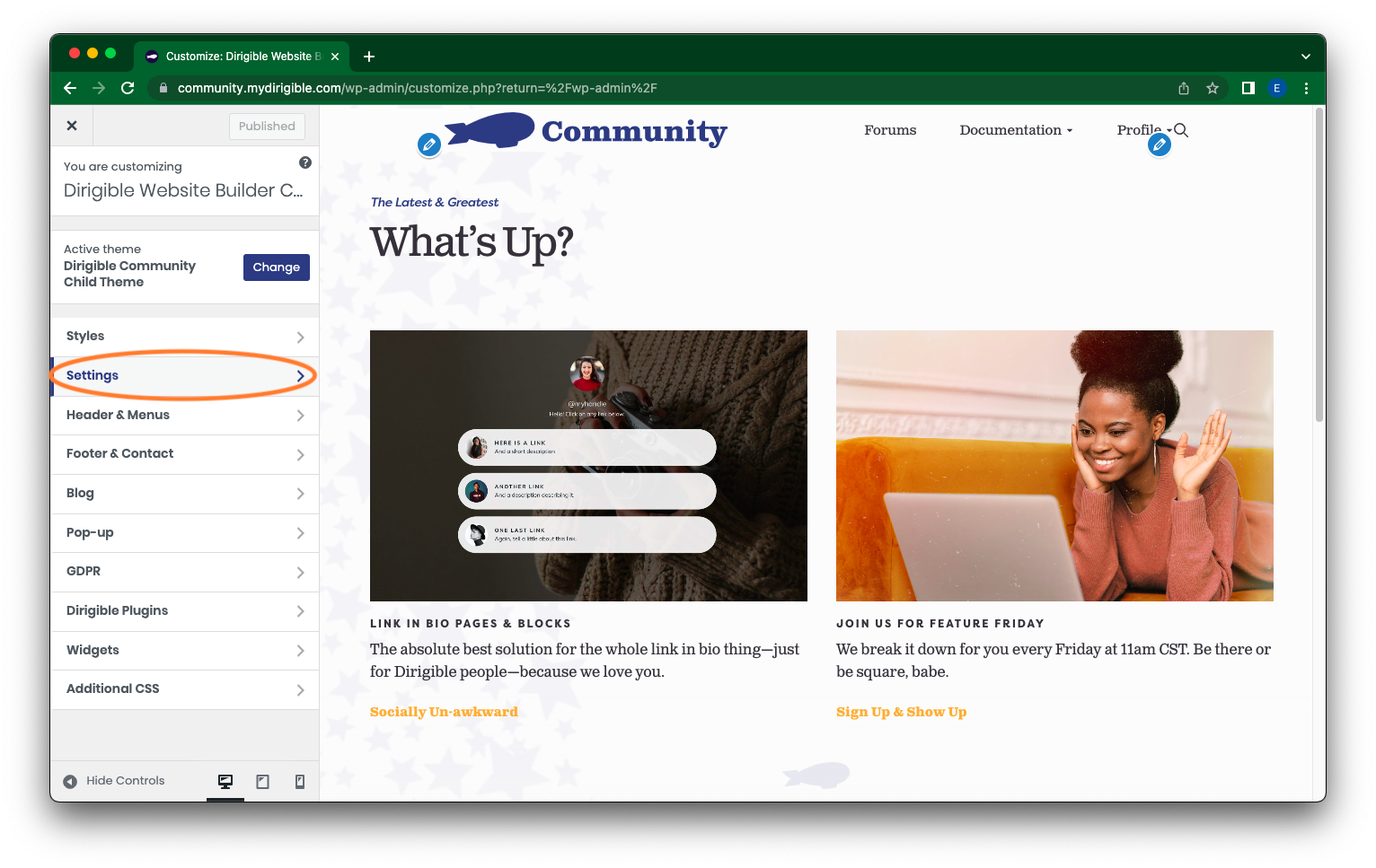
- Then, again in the side menu, click on Title & Favicon.
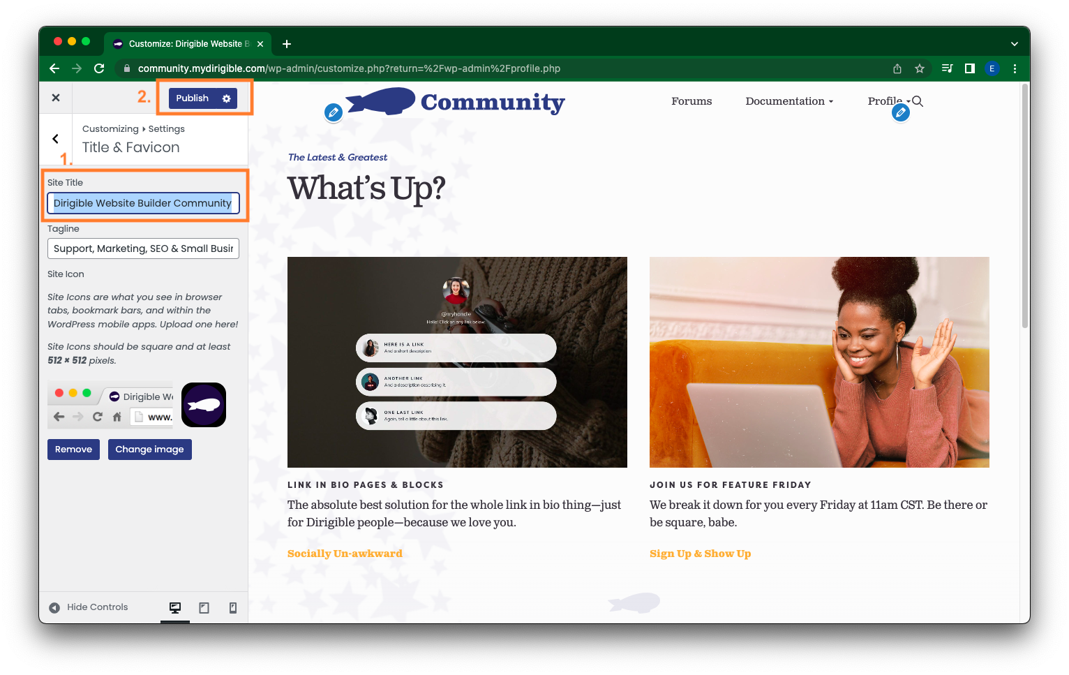
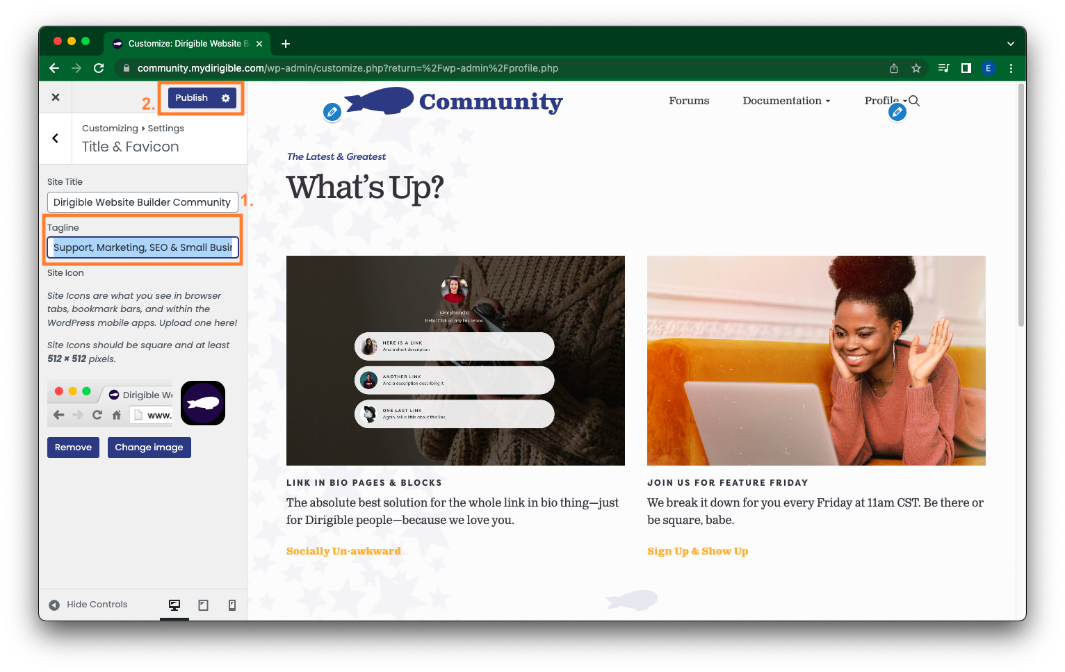
- The section you want to be looking at is Site Title located in your Dashboard column near the top. Here you can add or edit your Site Title. Once you have entered in your Site Title, click Publish in the top right of the Dashboard.
But, what should my Site Title be?
Your Site Title should be your brand name, business name, or something that describes what your website is about. For example, ours is “Dirigible Studio” and you can find our site if you search for it using that site title. You could also add a location or keywords to your Site Title.
And what about my Tagline?
Your Tagline is the box right below your Site Title, which you can also set and edit. Your Tagline should be your brand strap-line or a keyword-rich description of your business. Think of it as a teaser or glimpse for what to expect when visiting your website. Once you have entered in your Tagline, click Publish in the top right of the Dashboard.
Getting something down can seem difficult, but remember you are just entering the basics here. Your site title is as easy as entering in your business or brand name. And if you later find you are unhappy with your site title or tagline, just follow these incredibly easy steps outlined above to update!
Why “Last Updated” Dates Matter for SEO
The value of including publish and “last updated” dates on your website’s content often gets overlooked, yet these seemingly small details provide rich search visibility and content credibility helping boost your content’s performance in search rankings.
If you publish blog posts or pages that get regularly updated over time, including a visible update date can give you an edge in search results and help visitors trust what they’re reading.
Here’s why showing “last updated” dates on your site matters, and how to make the most of them on your Dirigible Site.
Search Engines Use Freshness as a Ranking Signal
Search Engines’ algorithms take “freshness” into account when ranking content, especially for time-sensitive or evolving topics. If a search engine like Google sees that a page was recently updated, it’s more likely to consider that page relevant and reliable.
Dirigible sites have built-in, structured data like datePublished and dateModified to automatically send Search Engines the right signals. Search Engines pay attention to both what is encoded behind the scenes and what users can see on the page itself. Looking at your own site’s content, make sure the information is present both in structured data and visible on the page to ensure appropriate ranking with search engines and credibility with users.
Dates Build Trust & Improve Click-Through Rates
If your listing shows “Updated September 2025” while a competitor’s content appears to be from 2021, users are more likely to trust and click the newer-looking option. Once visitors land on the page, a displayed updated date reinforces credibility, reassuring them they’re not reading outdated information. This signals to readers (and search engines) that your content is being maintained.
When to Show a “Last Updated” Date
Make sure you include a visible update date when:
- You publish content about evolving standards, laws, or regulations
- You’re in a fast-moving industry like tech, healthcare, compliance, etc.
- Your competitors keep their content regularly updated
- You want your blog posts or resources to look current and trustworthy
We get it, it can be tough to update your content regularly, and with those old dates showing up, your content may look outdated even if the information is still valid. In these cases, you may choose to hide the visible date.
How to Show Dates on Your Dirigible Site’s Content
We recommend including both structured data (on the backend) and a visible date (on the frontend) to keep content aligned with SEO best practices. With your Dirigible site, we’ve conveniently built-in date data to always be included in the structured metadata so that you don’t have to worry about backend visibility.
To add or update a visible date:
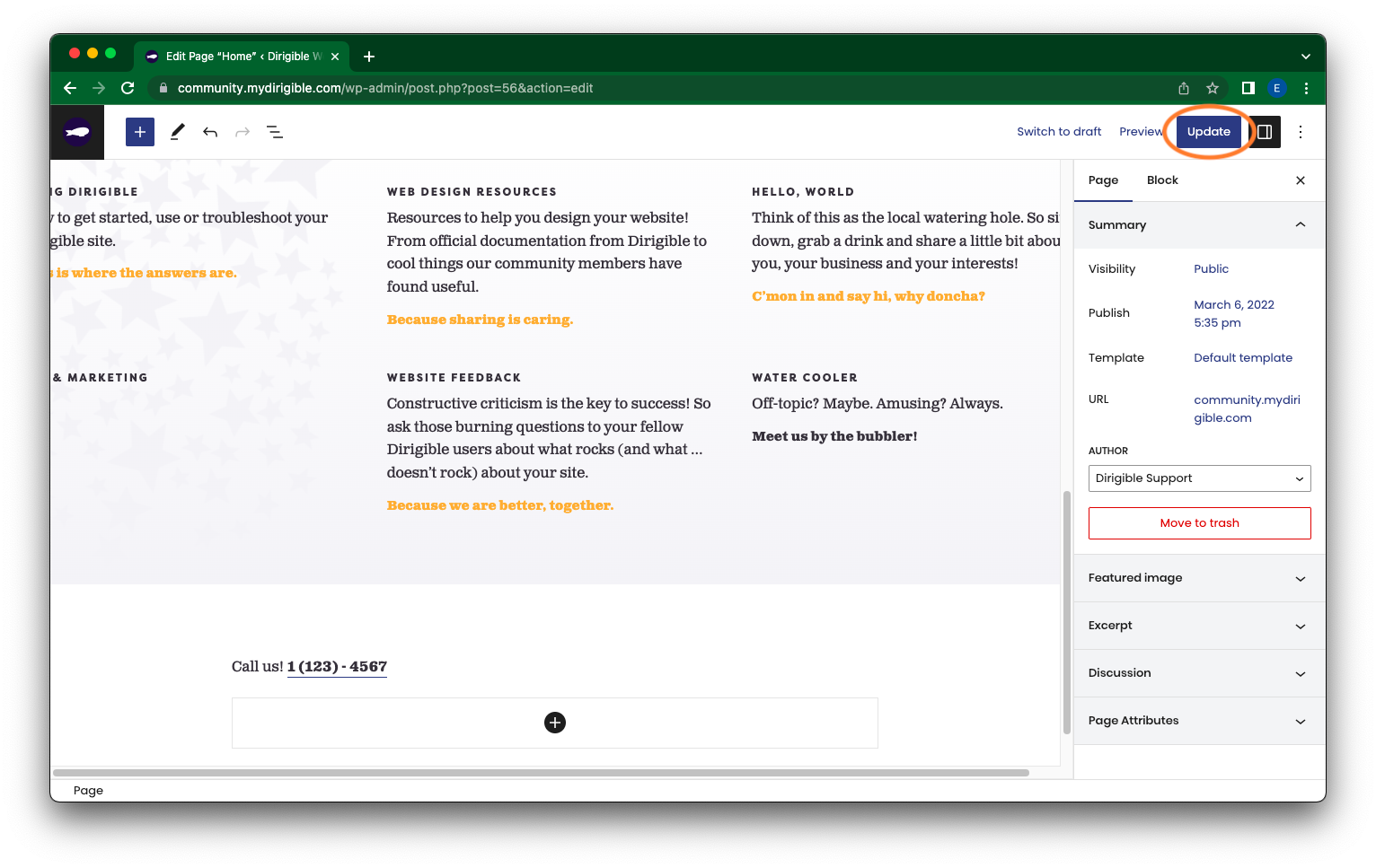
- Open the post or page on your Dirigible site.
- Looking at the right Settings Panel, update the Publish line near the top and update the publish date as needed.
- Scroll down to the Display tab and set Post Meta to “Show” to display the publish and/or last updated date on the frontend.
- If your content is infrequently updated, you can select “Hide” here instead.

- Save and/or publish your changes.
Don’t Let Your Content Go Stale
Adding a visible “last updated” date is one of the simplest ways to signal your content as fresh and credible to both search engines and your readers. It can be the difference between getting the click or getting overlooked in competitive search results.
With Dirigible, you have the tools to keep your content and your site looking sharp, current, and SEO-friendly. If you’re regularly updating blog posts or refreshing key pages, displaying that date shows your audience that you’re paying attention. So add those dates, make those tweaks, and stay ahead of the curve.