

Structured List
- Blocks
- Section
- Buttons
- Counters
- Blocks
- Comparison Table
- Columns
- Breadcrumbs
- Call To Action
- Landing Page
- Tabs
- YouTube
- FAQ
- Grid
- Hero
- Media Callout
- Site Preview
- Jump Nav
- Jump Link
- Link-in-Bio
- Logos
- Marquee
- Map
- Media and Text
- Photo Feature
- Posts
- Price List
- Quote Blocks
- Quotes
- Slider
- Structured List
- Socials
- Timeline
- Yearbook
- Vignette
- Video Gallery
Structured List
Lists with header and body list items, complete with custom numbering or icon options.
Usage
Sometimes you need to create lists with more options than provided by the core List block from WordPress. The Structured List block is our answer. The Structured List is a parent block that can hold either Text (default), Icon, Numbered, or Runner cards.
Each card holds a Headline, rendered as an <h4> tag, and Body, rendered with a <p> tag. Each card (except the Text card and the Numbered card) also has an additional field depending on its type. For example, an Icon child card will have an icon field and the Runner child card has a Runner field.
Layouts
The Structured List parent block provides two different layout options for your content: List or Grid.
List

Grid
Style
The Structured List parent block provides different style presets for your block, including the Outlined, Cards, Compact, Separator, Primary and Naked options. In order to select a style, make sure you are focused on the parent block rather than the child cards.
Outlined
Cards
Compact
Separator

Primary
Naked
Headline Style & Runner Style
The Text Style (sometimes called Headline Style) option controls the display of your text.
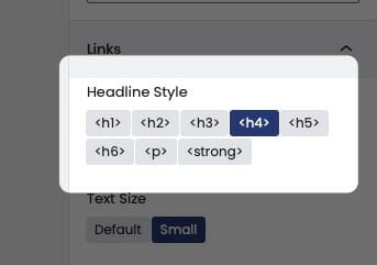
The Text Style (or Headline Style) will default to a different value depending on the block, but can be changed to any of the other available options. These styles are defined in your Customizer under Styles. For more information on changing your styles visit Customizing Styles.
One important thing to note is that this only changes how the headlines appear visually. The underlying html will be determined by the block that uses this features.
Card Types
The Structured List supports different types of child cards: Text (default) cards, Numbered cards, Icon cards, and Runner cards. When you create a new Structured List, it will appear populated with Text cards, but you can delete these and/or change the style to whatever you’d like.

Text Cards
The simplest cards, these contain just a Headline and a Body. Text cards are the default child cards for the Structured List block.

Icon Cards
Icon cards provide an image field for you to choose an image. Clicking on the icon will bring up the media library. We recommend using an SVG.
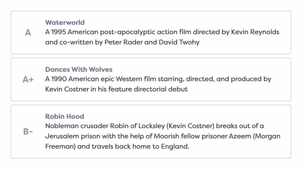
The Structured List pictured has the Cards style applied. Icon and Runner Cards are the only Structured List child cards that have settings in the block editor sidebar, so be careful not to miss it.

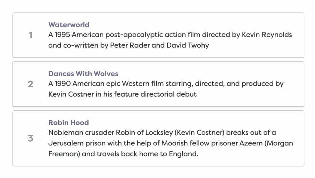
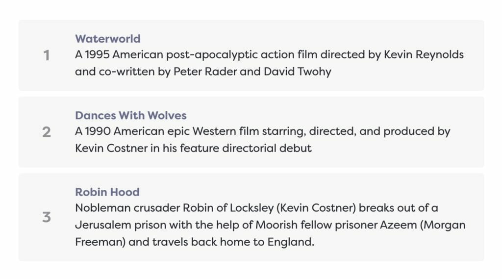
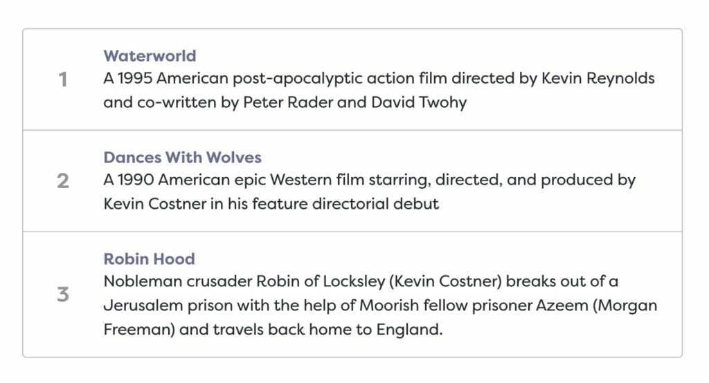
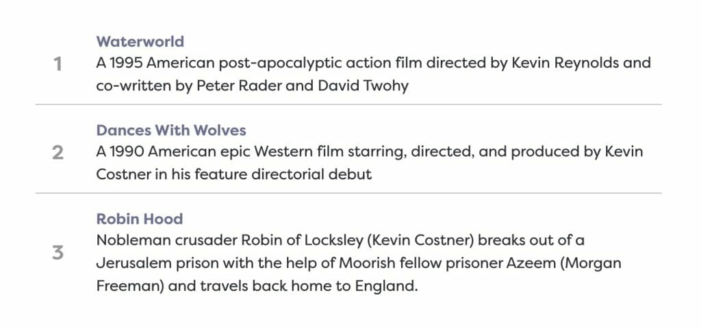
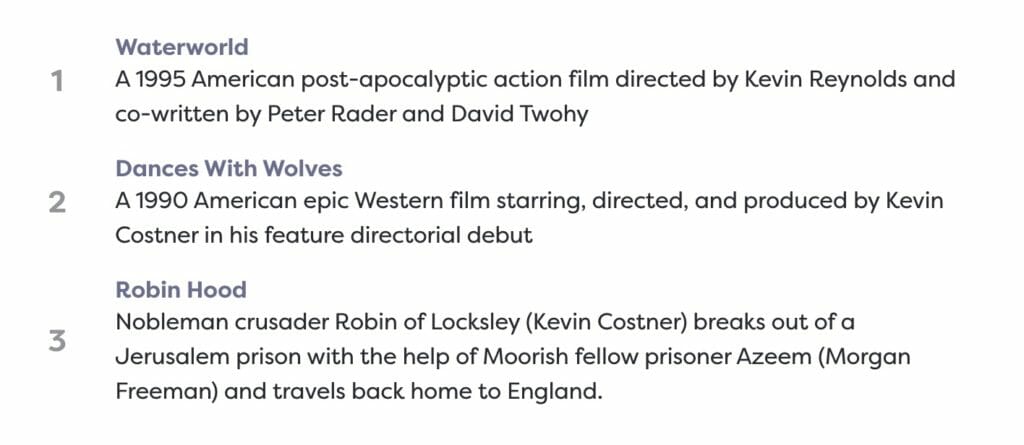
Numbered Cards
The default Numbered card will add a number to the left of the card.
The number is determined by the amount of Numbered cards the Structured List contains, and will ignore other types of cards. For example, if you were to take the example Structured List pictured on the left and inserted an Icon card between the second and last card, the last card would still read 3 as its number.
If you need greater control over this, you can just use the Runner card below.
Runner Cards
Runner cards introduce a free-form text Runner field instead of the number field in the Numbered cards. To change these, simply click into the Runner and type.
The runner will expand to fit its content, so feel free to enter whatever you’d like. The runner is styled like an <h4> tag, but larger.

Adding List Cards
To add a card to your Structured List block, click on the + icon that appears under the block when it is focused.