Breadcrumbs
- Blocks
- Section
- Buttons
- Counters
- Blocks
- Comparison Table
- Columns
- Breadcrumbs
- Call To Action
- Landing Page
- Tabs
- YouTube
- FAQ
- Grid
- Hero
- Media Callout
- Voronoi
- Site Preview
- Jump Nav
- Jump Link
- Link-in-Bio
- Logos
- Marquee
- Map
- Media and Text
- Photo Feature
- Posts
- Price List
- Quote Blocks
- Quotes
- Slider
- Structured List
- Socials
- Timeline
- Yearbook
- Vignette
- Video Gallery
Breadcrumbs

We use breadcrumbs on all our block documentation (see top) so you can easily maneuver around!
A linked list of pages leading to the current page, typically displayed at the top of the page.
Usage
Breadcrumbs are a helpful navigation when users are visiting your site. Sites with breadcrumbs are most often placed at the top or bottom pages. This block is an especially useful tool if you have a lot of pages, posts, or content linked within each other. Breadcrumbs display the hierarchy of your pages and makes it easier to move around your site.
Parent Settings
The parent block (named Breadcrumbs in the editor) has the following settings. To access these settings, you must have the parent block selected.
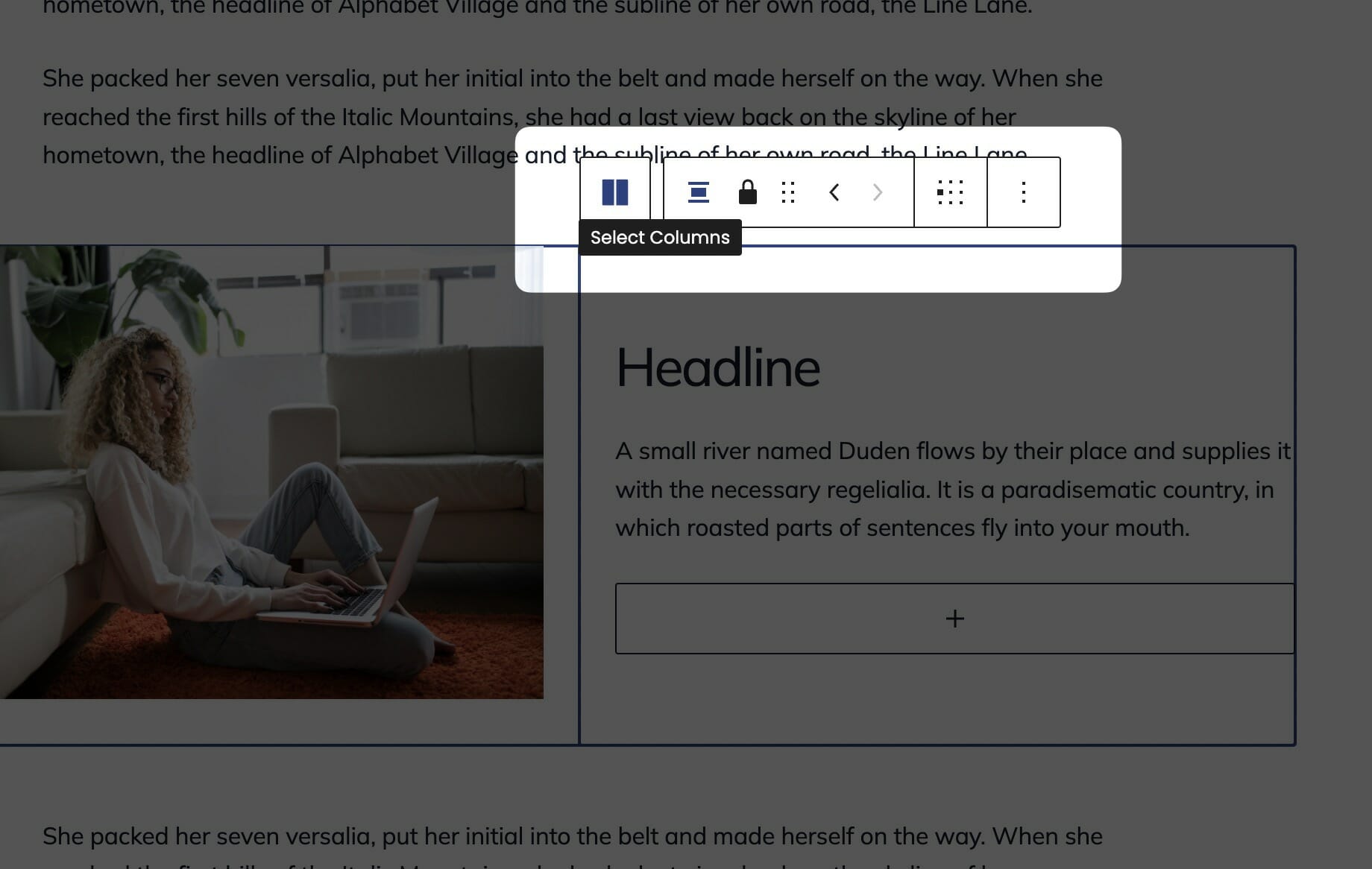
Parent Block
This block consists of the parent Columns block two Column children. You’ll only be able to control block-wide styles from the parent block.
In general, the parent block will handle styling and block options that all the child blocks will inherit. While editing a child block, you’ll be able to change the block settings and content related to that child block only. For example, while editing a card in a Grid block, you’ll be able to change the headline and button link, but you’ll need to select the parent Grid block in order to change the number of cards in each row.
For this reason, you’ll often find yourself selecting the parent block of a child block. There are a couple really simple ways to do this.
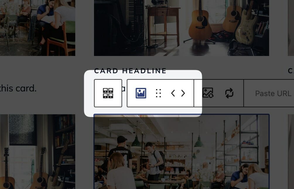
While a child block is selected, the parent block will show up in the block control bar above it to the far left. Click it to quickly select the parent.
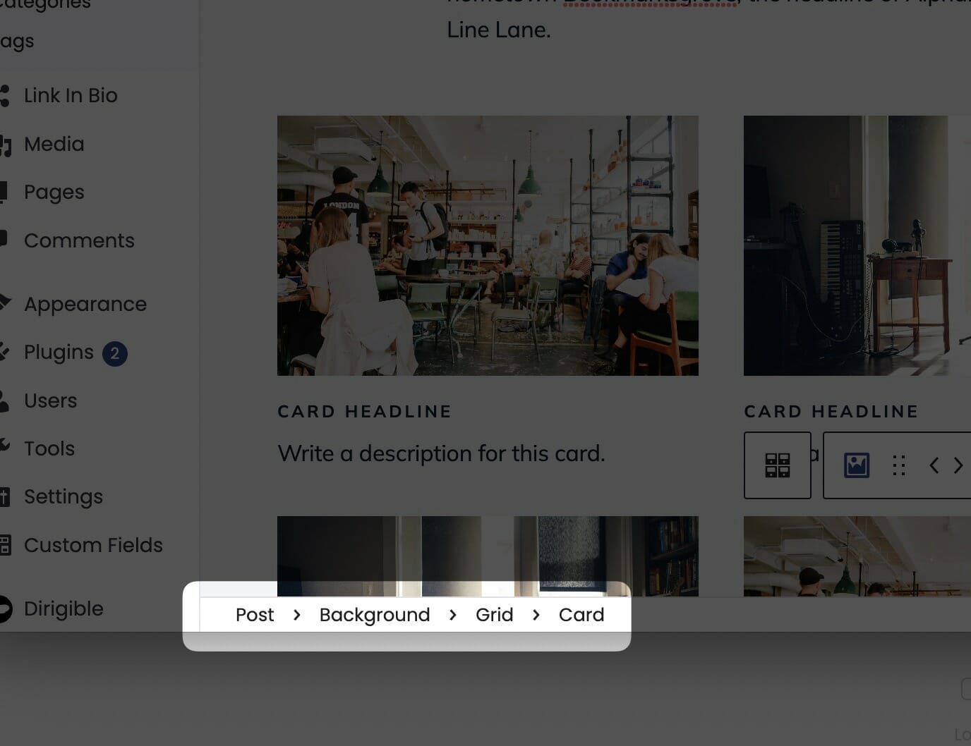
You can quickly traverse up the block tree by clicking on the path bar at the bottom of the page.
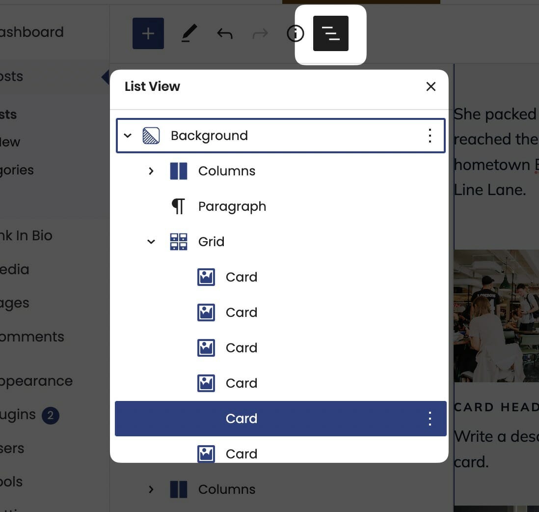
Open list view by clicking its icon in the toolbar to the top left of your page. From there, you can more easily navigate blocks on your page.
Block Width
Blocks can be set to one of three widths in the editor: Default, Wide, or Full. Blocks will interact with adjacent blocks differently depending on their width.
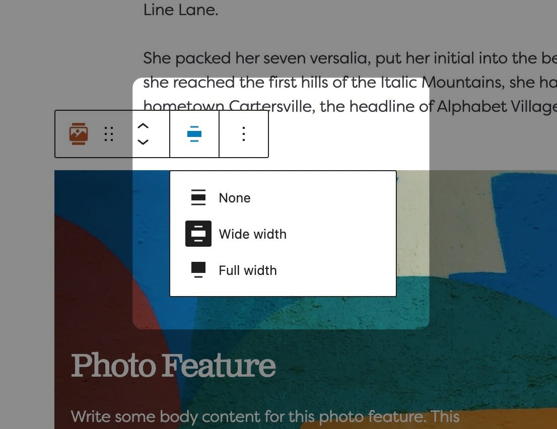
Adjusting Block Width
The block width setting is found in your block context bar, which will show up above the current block that you have selected. A block that supports the block widths will show its current width icon in the context bar, and clicking it will allow you to change the width.
If you have the Top Toolbar setting selected, the block context bar will always show at the top of your page, not at the top of your block.
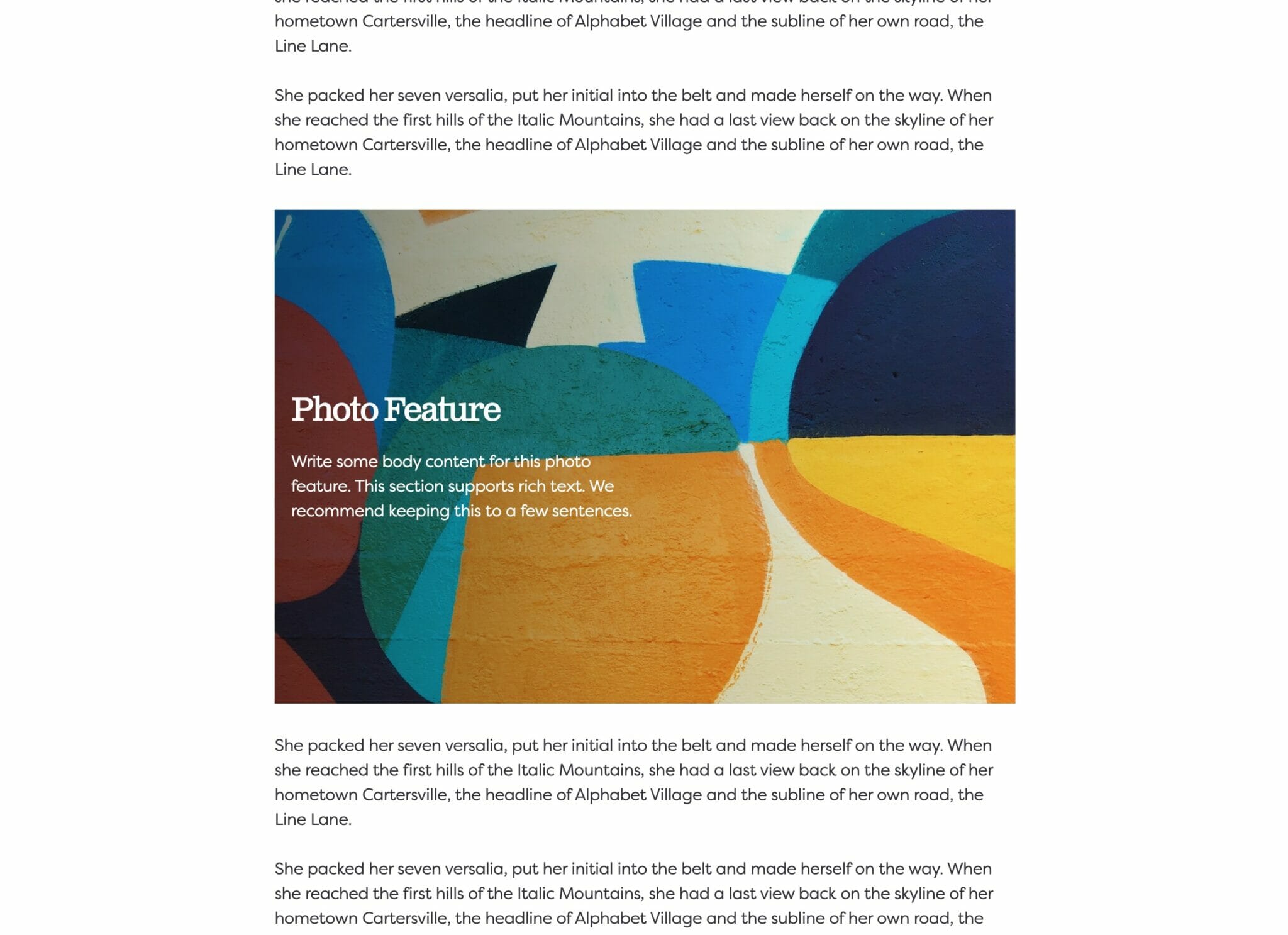
Default Width
The default width of your content is determined by the value set in your Customizer. You can find this setting under Styles » Widths » Content Width. This is the default width of most text-based content and most blog pages. We recommend keeping this set so that your content retains maximum readability, which most studies agree is around 50-60 characters per line.
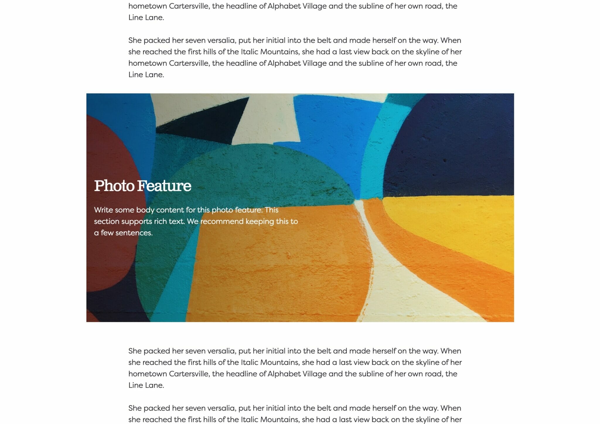
Wide Width
Wide width content will take up 75% of the available width on the page or the default content width set on your site—whichever is larger. In effect, this makes content take up more of the available screen real estate. When used in conjunction with other wide width blocks, you can shape your webpages in many different ways.
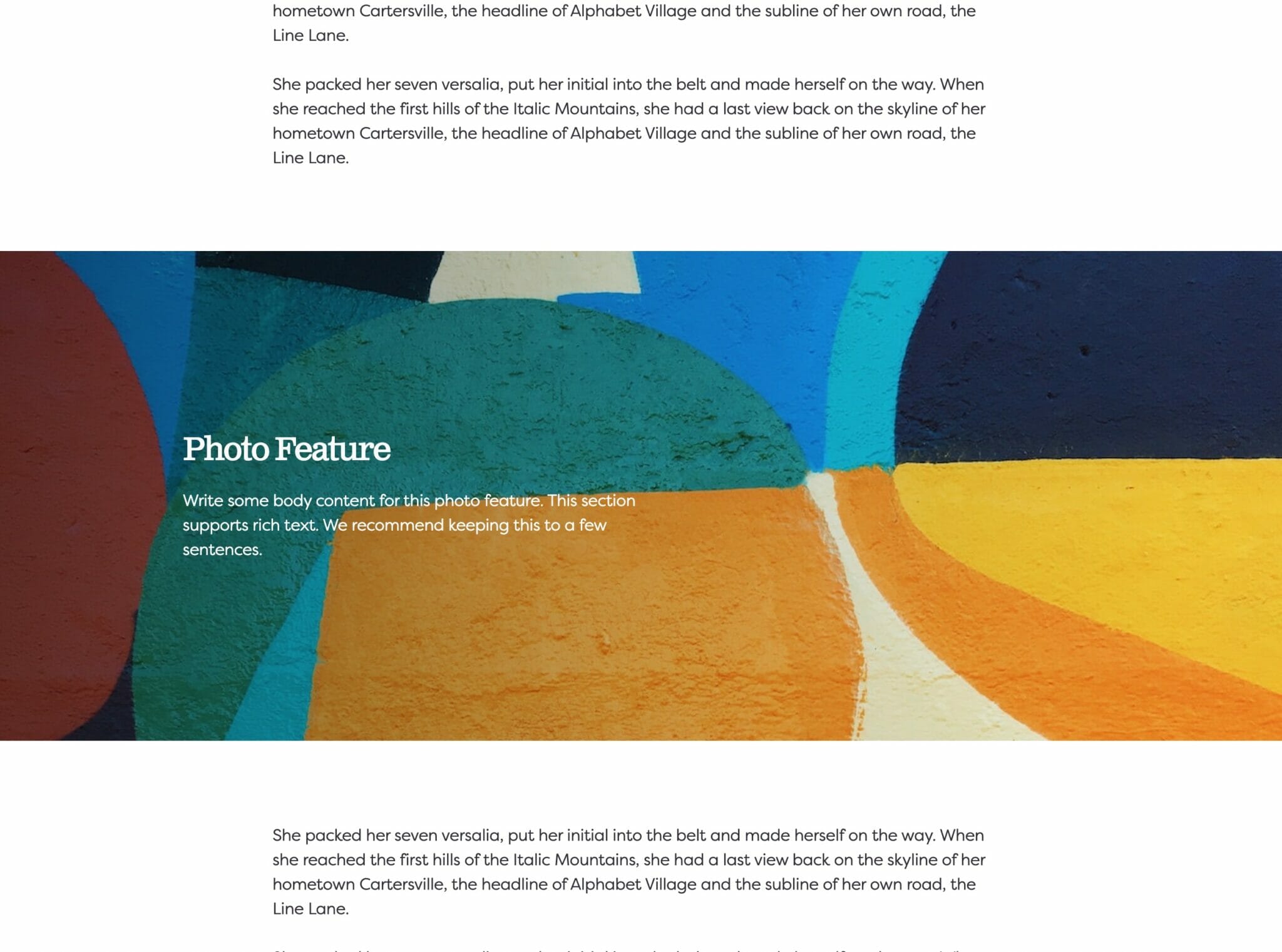
Full Width
Full width content will always take up 100% of the available width on the page. When placed next to default or wide width content, margin will be applied to the full width block to give it some room to breath. When two full width blocks are placed next to each other, however, they will suction together and form a cohesive unit with no margin in between them.
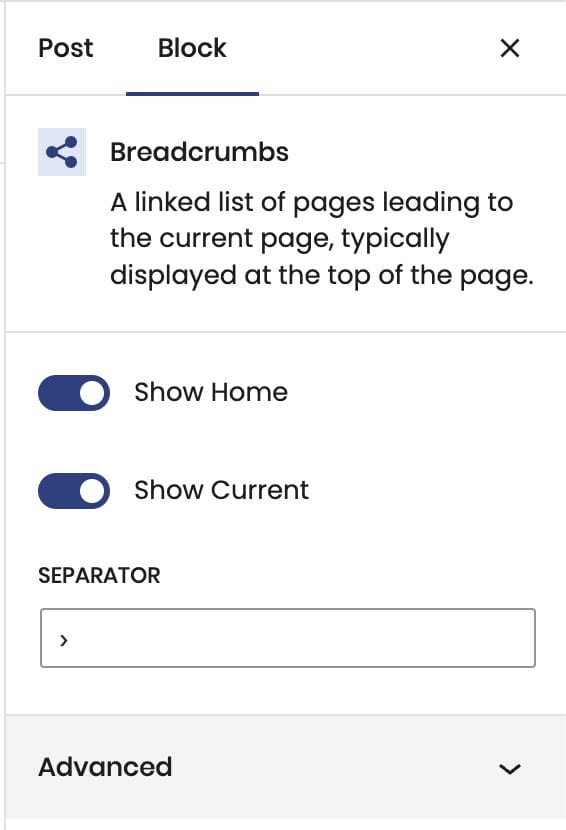
Show Home
Toggled on, this will display a hyperlink to your site’s homepage.
Show current
Toggled on, this will display a hyperlink to the current page.
Separator
Choose a character to delineate the separation between the links of your breadcrumbs (we recommend using “›”).