

Flexible Headers and Mobile Menus
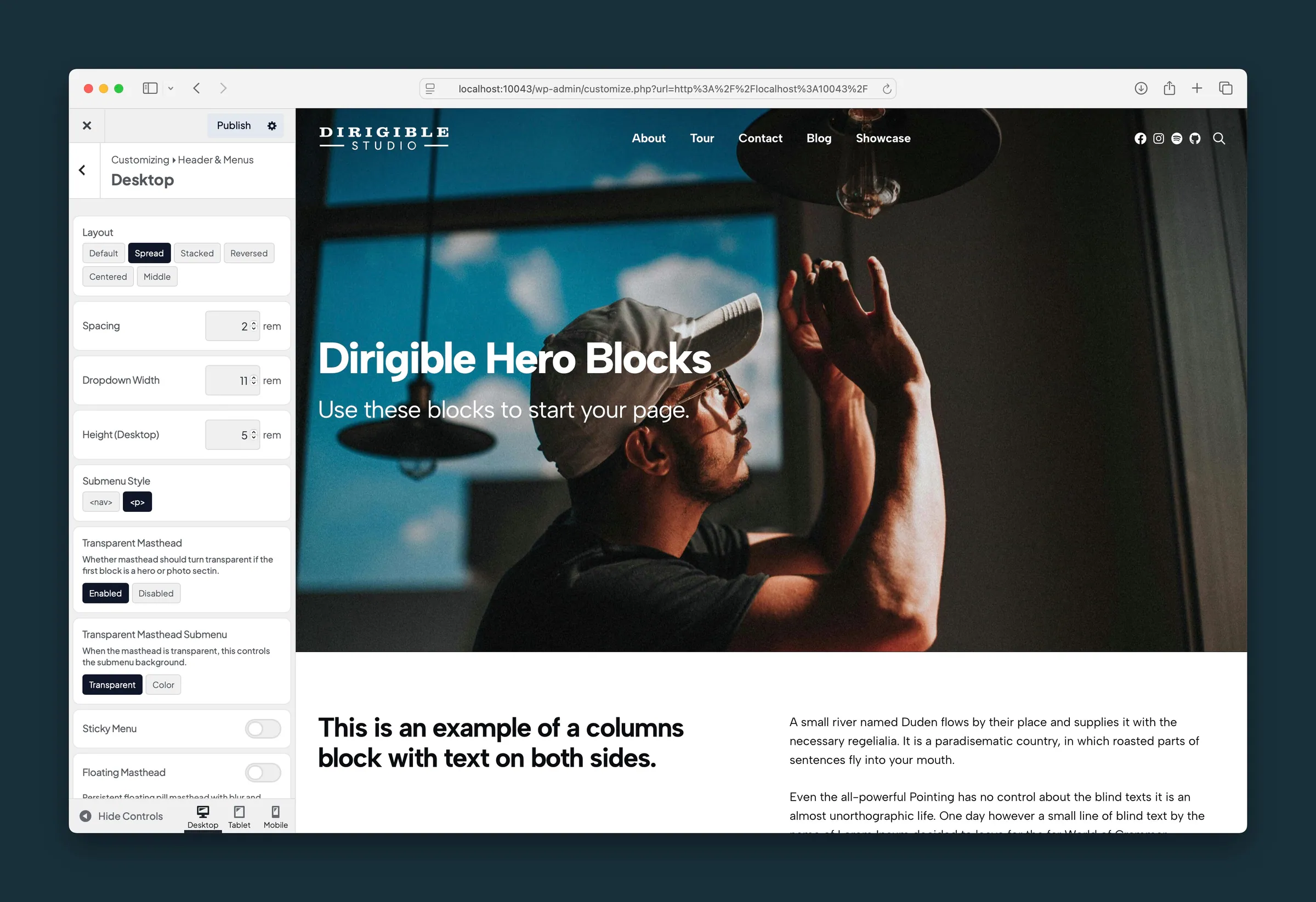
What it helps you do
Build a header that fits your site: full menu links on desktop, a slide-out menu on phones, an optional utility bar, and a transparent header that sits over a hero photo instead of a solid bar.
Where to find it
- Appearance → Customize → Header & Menus
- Desktop: header layout, transparent header, sticky and floating options, link colors.
- Mobile: breakpoint, drawer width and background, link colors, menu and close icons.
- Logo: standard, reverse, and scroll logos, plus mobile and scroll sizes.
- Utility Nav: a slim bar above the header for announcements, social icons, cart, and login links.
- Button: an optional call-to-action button in the header.
- Accent Border: a thin colored stripe above the header.
- Appearance → Menus: assign your menus to Main Menu, Mobile Menu, and the other theme locations.
How to use it
- Create or edit a menu under Appearance → Menus and assign it to Main Menu.
- In Customize → Header & Menus → Desktop, set Transparent Masthead to Enabled if your pages start with a hero or full-width image.
- Leave Sticky Menu on to keep the header visible while visitors scroll, or turn on Floating Masthead for a rounded bar with its own blur and opacity settings.
- Open Mobile to style the drawer: width, background, Link Color, and icon sizes.
- Turn on Utility Nav if you want announcements, cart, or login links above the header.
- Click Publish and test at phone width (or with the Customizer's mobile preview).
What happens automatically
- With Transparent Masthead enabled, the header sits over a hero-style first section instead of pushing it down.
- Sticky Menu keeps the header in view, and the logo can shrink or swap as visitors scroll (set this under Logo).
- With Show on Scroll Up, the sticky header slides away while visitors scroll down and comes back the moment they scroll up. It stays put while a menu is open or a visitor is using it.
- The mobile drawer uses the link colors from Mobile, so links stay readable on light or dark drawer backgrounds.
- In the mobile drawer, a menu item with a submenu works in two parts: tapping its name opens that page, and tapping the arrow beside it opens the submenu. An item without its own page (a Custom Link to
#) opens its submenu either way. - Keyboard visitors can open and close the drawer, move through it with Tab, and close it with Escape. A Skip to Content link appears when they press Tab on a new page.
- Reverse colors switch icons and text to a light treatment when the header sits over a photo.
Things to know
- A transparent header works best when the page starts with a hero, background section, or other full-width layout. Text-first pages usually look better with a solid header.
- Breakpoint sets when the desktop links switch to the mobile menu. Raise it if the menu should collapse earlier on tablets.
- Transparent Masthead Submenu decides whether dropdowns stay see-through or get a solid background over a hero.
- Mega menus from the Dirigible Mega Menu plugin appear in the same header. Assign them under Appearance → Menus.