

Buttons
Usage
Open Appearance → Customize → Styles → Buttons to set the default look of buttons across the site: block buttons, form submit buttons, and WooCommerce buttons.
Choose the Font, Size, Weight, and Transform, then set Horizontal Padding, Vertical Padding, Border Radius, and Border Width for the shape. Color sets the main button color from your Palette. Secondary Buttons sets the color for buttons that use the Alternate style.
When to use it
- After setting your Palette, to match buttons to your brand colors.
- When buttons feel too big, too square, or don't match your form fields. Match Border Radius with Styles → Forms.
- Before styling Hero, CTA, and Grid blocks that offer Button and Alternate link styles.
Tips
- Color fills the button and its border. The button text uses the palette Button Text color, which is set under Palette.
- Blocks set to the Alternate style use Secondary Buttons. Set it to Secondary or Accent for a clear second button color.
- Border Width at 0 with a Border Radius above 0 gives solid pill buttons. A visible border works well for outline buttons over photos.
- Menu items styled as buttons use these settings too. Menu text is set under Styles → Navigation.
Settings
Buttons

Font
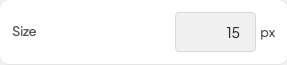
Size
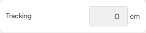
Tracking
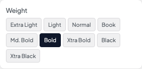
Weight
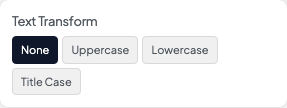
Transform
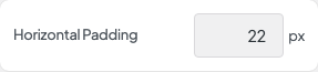
Horizontal Padding
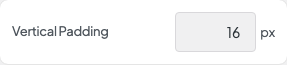
Vertical Padding
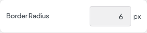
Border Radius
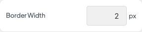
Border Width

Color

Secondary Buttons