Forms

Usage

Open Appearance β†’ Customize β†’ Styles β†’ Forms to shape text fields, selects, textareas, and their labels site-wide. Set Font and padding on inputs, then Input Height, Border Width, Border Radius, Border Color, and Border Color On Focus so fields match your buttons and cards.

Label controls (Label Font through Label Transform) style field titles; the Sublabel group does the same for helper text and descriptions beneath fields. Colors pull from Styles β†’ Palette.

When to use it

  • After contact or checkout forms look out of place next to styled buttons β€” align Border Radius with Styles β†’ Buttons.
  • When required-field labels or hints are hard to read against your Canvas or Body Background.
  • Before launch, to give Gravity Forms and WooCommerce checkout a consistent branded shell without per-form CSS.

Tips

  • Border Color On Focus defaults to Primary β€” a quick way to tie focus rings to your brand without touching palette swatches.
  • Label Weight and Sublabel Color (default Muted) separate titles from helper copy; uppercase Label Transform pairs well with tight form layouts.
  • Form submit buttons use Styles β†’ Buttons, not these controls.
  • Success and error messages use palette Success and Failure β€” tune those under Styles β†’ Palette if validation feedback needs more contrast.

Settings

Forms

Font setting in the block editor sidebar
Font
  • Display
  • Bodydefault
  • Alt
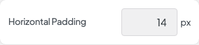
Horizontal Padding setting in the block editor sidebar
Horizontal Padding
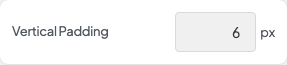
Vertical Padding setting in the block editor sidebar
Vertical Padding
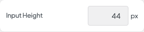
Input Height setting in the block editor sidebar
Input Height
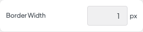
Border Width setting in the block editor sidebar
Border Width
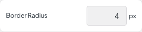
Border Radius setting in the block editor sidebar
Border Radius
Border Color setting in the block editor sidebar
Border Color
  • None
  • White
  • Text
  • Primary
  • Secondary
  • Accent
  • Variant
  • Muteddefault
  • Gray
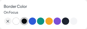
Border Color On Focus setting in the block editor sidebar
Border Color On Focus
  • None
  • White
  • Text
  • Primarydefault
  • Secondary
  • Accent
  • Variant
  • Muted
  • Gray
Label Font setting in the block editor sidebar
Label Font
  • Display
  • Bodydefault
  • Alt
Label Color setting in the block editor sidebar
Label Color
  • White
  • Gray
  • Dark
  • Textdefault
  • Primary
  • Secondary
  • Accent
  • Variant
  • Muted
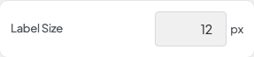
Label Size setting in the block editor sidebar
Label Size
Label Tracking setting in the block editor sidebar
Label Tracking
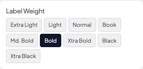
Label Weight setting in the block editor sidebar
Label Weight
  • Extra Light
  • Light
  • Normal
  • Book
  • Md. Bold
  • Bolddefault
  • Xtra Bold
  • Black
  • Xtra Black
Label Style setting in the block editor sidebar
Label Style
  • Normaldefault
  • Italic
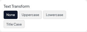
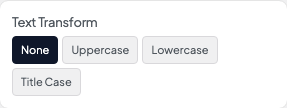
Label Transform setting in the block editor sidebar
Label Transform
  • Nonedefault
  • Uppercase
  • Lowercase
  • Title Case
Sublabel Font setting in the block editor sidebar
Sublabel Font
  • Display
  • Bodydefault
  • Alt
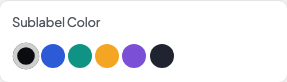
Sublabel Color setting in the block editor sidebar
Sublabel Color
  • White
  • Gray
  • Dark
  • Text
  • Primary
  • Secondary
  • Accent
  • Variant
  • Muteddefault
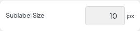
Sublabel Size setting in the block editor sidebar
Sublabel Size
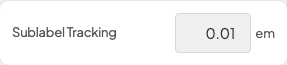
Sublabel Tracking setting in the block editor sidebar
Sublabel Tracking
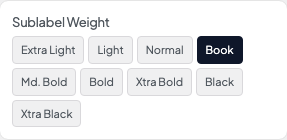
Sublabel Weight setting in the block editor sidebar
Sublabel Weight
  • Extra Light
  • Light
  • Normal
  • Book
  • Md. Bold
  • Bolddefault
  • Xtra Bold
  • Black
  • Xtra Black
Sublabel Style setting in the block editor sidebar
Sublabel Style
  • Normaldefault
  • Italic
Sublabel Transform setting in the block editor sidebar
Sublabel Transform
  • Nonedefault
  • Uppercase
  • Lowercase
  • Title Case