Mobile
Usage
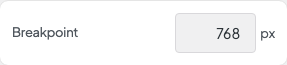
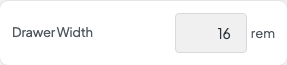
Open Appearance → Customize → Header & Menus → Mobile to control when the site switches to the mobile menu and how the slide-out drawer looks. Set the Breakpoint where the desktop links collapse, then adjust the header height, Drawer Width, and link colors.
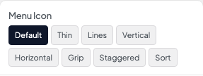
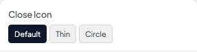
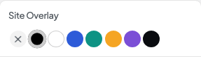
Pick a Menu Icon and Close Icon and set their sizes. Site Overlay and Overlay Opacity dim the page behind the open menu.
When to use it
- After setting up the desktop header, when the phone layout feels cramped or links are hard to tap.
- Sites with photo heroes that need a light menu icon on the first screen.
- Long menus that need a wider drawer.
Tips
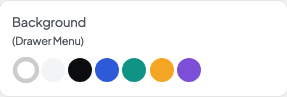
- Background (Drawer Menu) colors the drawer. Drawer link colors are set separately below it.
- Reverse Print here affects the social icons and other text in the drawer. Set the drawer Link Color yourself rather than relying on the desktop colors.
- If the menu switches to mobile too early or too late, change Breakpoint a little at a time and check on a real device.
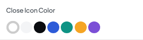
- Set Close Icon Color so the X stays visible against your drawer background.
Settings
Mobile
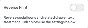
Turn on when the drawer background is dark. Social icons and drawer text switch to white, and links left on the Text color show white too. Other link colors come from the settings below.

Color of the links in the drawer menu. With Reverse Print on, the default Text color shows as white so links stay readable on a dark drawer. Pick any other color to use it instead.