

Button
Usage
Open Appearance → Customize → Header & Menus → Button to add a call-to-action button to the header. Turn on Enable, enter the button Text and URL, then pick a Style.
The button sits beside your main menu on desktop and appears inside the mobile menu on phones.
When to use it
- Booking, donation, or contact links that should be one click away on every page.
- Campaigns with one main action ("Register", "Get a quote").
- Shops that want a shop link separate from the cart icon under Desktop.
Tips
- Keep the text short. Long labels wrap beside the menu on smaller laptops.
- Style uses your button styles from Styles → Buttons. Adjust those first if the colors look off.
- Use a full URL or a page path, and test the link in the preview before publishing.
- If you also show Utility Nav banner text, pick one main message so the header stays calm.
Settings
Button

Enable
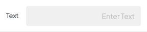
TextAvailable when Enable is “Undefined”
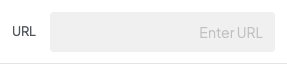
URLAvailable when Enable is “Undefined”
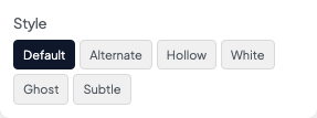
StyleAvailable when Enable is “Undefined”