

Widths
Usage
Open Appearance → Customize → Styles → Widths to control how wide content can get on large screens. Max Site Width caps the whole page. Content Width sets the standard reading column. Gutters add space at the sides so text and blocks don't touch the edge of the screen.
Alignwide Min and Alignwide Max set the range for blocks set to Wide. Hero Content limits how wide the headline and text inside Hero blocks can get on desktop.
When to use it
- Pages feel too narrow or too stretched on large monitors. Start with Content Width, then Max Site Width.
- Wide background or gallery blocks should be wider than your text but not edge to edge.
- Hero headlines stretch across the whole screen. Lower Hero Content to keep lines readable over photos.
Tips
- Site Width under Settings → General (Full or Wide) decides whether the header and footer run edge to edge or line up with your wide blocks.
- Larger Gutters add breathing room at the sides on both phones and desktops.
- Alignwide Min keeps wide blocks from getting too narrow on medium screens; Alignwide Max stops them from growing too wide.
- Hero Content applies on larger screens. On phones, heroes follow the gutters and block padding.
Settings
Widths
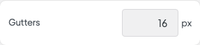
Gutters

Max Site Width

Content Width

Hero Content
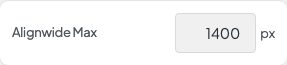
Alignwide Max
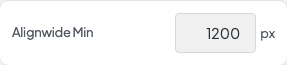
Alignwide Min