

Header 3
Usage
Open Appearance → Customize → Styles → Header 3 to set your mid-size heading style. It applies to H3 headings and the H3 headline style used for card titles, sidebar headings, and the site name beside your logo.
Adjust the Font, Size, Mobile Size, Weight, Style, Transform, Tracking, Line Height, and Color to sit between section titles (H2) and label-style headings (H4–H6).
When to use it
- Card grids, team lists, or pricing tables that need a consistent title size.
- When Header 2 feels too large for repeated subsection titles.
- When the site name in the header should match your card titles. It uses this style by default.
Tips
- H3 is the most common card and sidebar title, so small Size changes show up across archives and related posts.
- It uses the Display font by default. Switch Font to Body or Alternate only if card titles should differ from your main headings.
- Pair with Styles → Paragraphs so text under H3 titles is clearly smaller.
- Any block can use the H3 look without changing its heading level.
Settings
Header 3

Font

Style
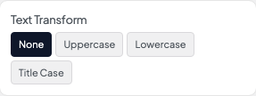
Transform
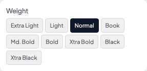
Weight

Color
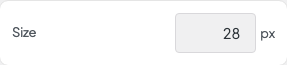
Size
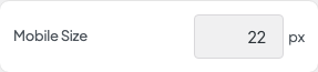
Mobile Size

Tracking
Line Height