

Links
Usage
Open Appearance → Customize → Styles → Links to style standalone text links, the ones that sit on their own rather than inside a sentence. Blocks use this style when their link is set to Understated, common on Grid cards, Heroes, and "Read more" links.
Set the Font (default Alternate), Size, Tracking, Weight, Style, Transform, Color, and Hover Color. By default these links are uppercase and bold, so they read as a call to action without looking like a button.
When to use it
- When "Learn more" links on cards look like ordinary links in text.
- After changing Styles → Fonts → Alternate Font Stack, to keep these links in step with your H4–H6 labels.
- Styling Grid, Media Callout, or Timeline blocks that offer Understated and Button link styles.
Tips
- Inline Links styles links inside paragraphs. This panel styles links that stand on their own.
- Hover Color defaults to Primary, a quick brand accent without a button shape.
- Blocks that offer Button and Alternate styles use Styles → Buttons, not this panel.
- Transform defaults to uppercase. Set it to None for sentence-case "Read more" links.
Settings
Links

Font
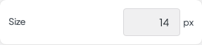
Size
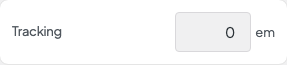
Tracking
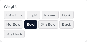
Weight

Style
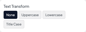
Transform

Color

Hover Color