Tags

Usage

Open Appearance → Customize → Styles → Tags to style filter chips and category pills — elements using .tags, .is-style-tags, or .is-style-tag. Set Font, Size, Weight, Style, Transform, and Tracking, then Horizontal Padding, Vertical Padding, and Border Radius for the pill shape.

Color and Background define the resting state; Color When Active and Background When Active (default White on Primary) apply when a tag carries the active class, such as the selected filter in a portfolio or blog archive.

When to use it

  • Portfolio, publication, or blog blocks with category filters or tag rows.
  • When filter chips should match button Border Radius — compare with Styles → Buttons.
  • After Palette changes, to keep inactive tags (Gray background) distinct from active selections.

Tips

  • Tags are not the same as post Tags in WordPress — this styles the visual pill component wherever it appears.
  • Background defaults to Gray with Text labels; active state flips to your Primary brand color.
  • For uppercase category eyebrows above titles, use Header 4Header 6 instead of tag pills.
  • Increase Border Radius for fully rounded chips; 0 gives rectangular labels.

Settings

Tags

Font setting in the block editor sidebar
Font
  • Display
  • Body
  • Altdefault
Weight setting in the block editor sidebar
Weight
  • Extra Light
  • Light
  • Normal
  • Book
  • Md. Bold
  • Bolddefault
  • Xtra Bold
  • Black
  • Xtra Black
Transform setting in the block editor sidebar
Transform
  • Nonedefault
  • Uppercase
  • Lowercase
  • Title Case
Style setting in the block editor sidebar
Style
  • Normaldefault
  • Italic
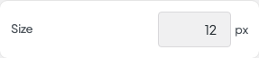
Size setting in the block editor sidebar
Size
Tracking setting in the block editor sidebar
Tracking
Horizontal Padding setting in the block editor sidebar
Horizontal Padding
Vertical Padding setting in the block editor sidebar
Vertical Padding
Border Radius setting in the block editor sidebar
Border Radius
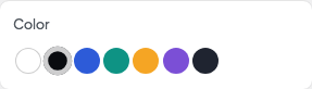
Color setting in the block editor sidebar
Color
  • None
  • White
  • Textdefault
  • Primary
  • Secondary
  • Accent
  • Variant
  • Muted
Background setting in the block editor sidebar
Background
  • Text
  • Primary
  • Secondary
  • Accent
  • Variant
  • Muted
  • White
  • Graydefault
Color When Active setting in the block editor sidebar
Color When Active
  • None
  • Whitedefault
  • Text
  • Primary
  • Secondary
  • Accent
  • Variant
  • Muted
Background When Active setting in the block editor sidebar
Background When Active
  • Text
  • Primarydefault
  • Secondary
  • Accent
  • Variant
  • Muted
  • White
  • Gray