

Header 2
Usage
Open Appearance → Customize → Styles → Header 2 to style your main section headings. These settings apply to H2 headings and to blocks whose headline style is set to H2, a common choice for Hero headlines and section titles.
Set the Font, Size, Mobile Size, Weight, Style, Transform, Tracking, Line Height, and Color one step below Header 1.
When to use it
- After Header 1. Most interior pages lead with H2-sized headings.
- When Hero blocks use the H2 style for their main title, as Theme Setup pages often do.
- Making blog, archive, and section headings share one size and weight.
Tips
- Many blocks default to H2 for their headline, so changes here show up quickly across Heroes, Media Callouts, and Columns.
- Keep Size clearly smaller than Header 1 so the hierarchy is easy to see.
- Uppercase H2s are rare. For label-style headings, use Header 4 instead.
- A block can look like an H2 while using a different heading level. Check the block if heading structure matters for SEO on a specific page.
Settings
Header 2

Font

Style
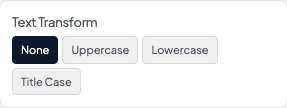
Transform
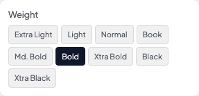
Weight

Color
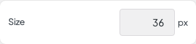
Size
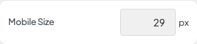
Mobile Size

Tracking
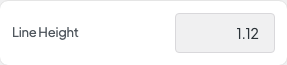
Line Height