

Utility Nav
Usage
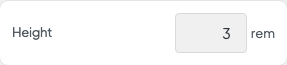
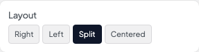
Open Appearance → Customize → Header & Menus → Utility Nav to add a slim bar above the main header. Turn on Enable, set the Height and Background, then choose a Layout.
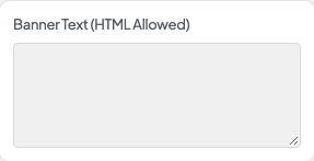
Add Banner Text for short announcements ("Free shipping this week"). Turn Show Social, Shopping Cart, and User Login on or off, and set the link colors. Links come from the menu assigned to Utility Menu under Appearance → Menus.
When to use it
- Promotions or hours that should show on every page.
- Membership or business sites that want a login link without crowding the main menu.
- Shops that want the cart in a slim top bar.
Tips
- Enable on Mobile decides whether the bar also shows on phones or hides there.
- Reverse Print switches to light text and icons. Pair it with a dark Background.
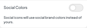
- Social icons need profiles under Settings → Social Media. Turn on Social Colors only if you want each network's brand colors.
- The cart and login here are separate from Show Cart and Show Login under Desktop. Use one place so shoppers don't see them twice.
Settings
Utility Nav

Enable
Height

Enable on Mobile
Layout
Banner Text (HTML Allowed)

Show Social
Social ColorsAvailable when Show Social is “Undefined”
Social icons will use social brand colors instead of yours.

Shopping Cart

User Login
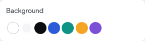
Background

Reverse Print

Link Color

Link Color Opacity

Link Hover Color

Link Hover Opacity