

Navigation
Usage
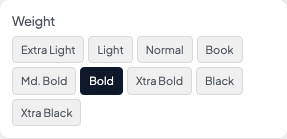
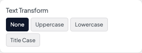
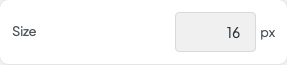
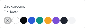
Open Appearance → Customize → Styles → Navigation to set how your main menu links look. Choose the Font, Size, Weight, Transform, and Tracking, then the Padding around each link and a Background On Hover color from your palette.
Link colors are set under Header & Menus → Desktop and Mobile. This panel handles text and the hover background only.
When to use it
- After assigning your menus under Appearance → Menus, when links feel too large or cramped.
- When uppercase menu links should match your Header 4 labels. Line up the Transform and Font.
- Making links easier to tap by adding Padding without changing the header height.
Tips
- Background On Hover defaults to None. Add a subtle Gray or Canvas fill for pill-shaped hover states.
- Menu items styled as buttons use Styles → Buttons instead. Save that for one standout link.
- The mobile menu uses these font settings. Its colors and layout are under Header & Menus → Mobile.
- Utility bar links get their size from Styles → Utility Nav and their colors from Header & Menus → Utility Nav.
Settings
Navigation

Font
Weight
Transform
Size

Tracking

Padding
Background On Hover