

Desktop
Usage
Open Appearance → Customize → Header & Menus → Desktop to set how the header looks on laptops and desktops. Pick a Layout, set the height and spacing between links, then choose whether the header stays on screen while visitors scroll.
For pages that start with a hero, set Transparent Masthead to Enabled so the header sits over the photo instead of pushing it down. Pair it with the Reverse Print link colors and a white Reverse Logo (under Logo) so links stay readable.
When to use it
- After assigning your menus under Appearance → Menus, to arrange the header the way you want.
- Home and landing pages that start with a Hero or full-width image.
- Sites that want a rounded Floating Masthead instead of a full-width sticky bar.
Tips
- With Floating Masthead on, Sticky Menu is hidden. Use the floating opacity, blur, and corner radius settings instead.
- Show on Scroll Up hides the sticky or floating header while visitors scroll down and brings it back as soon as they scroll up. Good for long reading pages; leave it off when the header holds a call to action that should always be in view.
- Show Cart, Show Login, Show Search, and Show Socials add icons to the header. Social icons need profiles under Settings → Social Media.
- The opacity sliders soften link colors over photos without changing your palette.
- Dropdown Width and Submenu Style help when dropdown menus have long labels.
Settings
Desktop
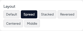
How the logo and main menu share the masthead bar on desktop.
- Default defaultLogo left, menu links on the right.
- SpreadLogo left with menu links spread across the remaining width.
- StackedLogo centered above the menu row.
- ReversedMenu links on the left, logo on the right.
- CenteredLogo centered with menu links split on both sides.
- MiddleLogo and menu grouped in the center of the bar.
Horizontal gap between top-level menu items.
Minimum width of flyout submenus. Widen if dropdown labels wrap awkwardly.
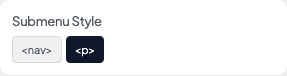
Typography preset for dropdown links. Nav matches main menu styling; Paragraph uses body text styling.
- <nav>Dropdown links use your Navigation style settings.
- <p> defaultDropdown links use paragraph body styling.
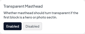
When Transparent Masthead is enabled, the header overlays hero-style first sections instead of showing a solid background bar.
- EnabledHeader overlays hero-style first sections.
- Disabled defaultHeader keeps its normal solid background.
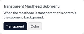
Background for dropdown menus while the masthead is transparent over a hero.
- Transparent defaultDropdowns stay transparent over the hero image.
- ColorDropdowns use a solid background color for readability.

Keeps the masthead fixed at the top while visitors scroll. Hidden when Floating Masthead is on.
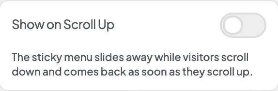
Hides the sticky menu while visitors scroll down and brings it back the moment they scroll up, so long pages get the full screen. Needs Sticky Menu or Floating Masthead.
Replaces the full-width sticky bar with a rounded pill masthead that floats over the page with blur and opacity.
How solid the floating masthead background looks. Lower values feel more glass-like.
Backdrop blur behind the floating masthead. Only visible when opacity leaves room to see through it.
Corner roundness of the floating pill. High values make a capsule shape.
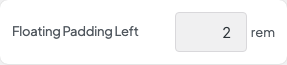
Inner space on the left inside the floating masthead, before the logo.
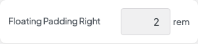
Inner space on the right inside the floating masthead, after the menu.




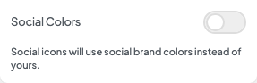
When on, social icons use each network's brand colors instead of your palette link colors.
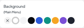
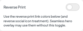
Switches the masthead to reverse-print link and social colors on solid backgrounds. Hero overlays may use reverse colors automatically without this toggle.


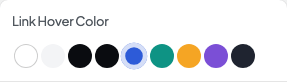


Link color when Reverse Print is on or the masthead overlays a hero.

Opacity for reverse-print links. Lower values soften links on photography.

Hover color for reverse-print links.

Opacity for reverse-print link hover states.

Adds an underline accent on menu hover and for the current page.
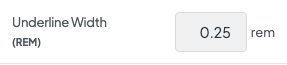
Thickness of the nav underline accent.

Underline color when a visitor hovers a menu item.

Underline color for the menu item that matches the current page.